Style Business Object
Introduction
The Style Business Object allows you to perform a comprehensive styling of components and solutions removing the need to use custom CSS. Therefore, it provides more stability and governance to customers’ solutions.
The styling of components is performed through an intuitive editor that provides an instant preview of how each component looks like in the Workspace.
The Style Business Object concept is based on the following principles:
- Reuse: you can create the style once and then apply it to multiple components of the same type. Reuse allows you to style solutions consistently in accordance with the company branding strategy.
- Inheritance: Style Business Objects can be built on other Style Business Objects, thus making it easy to create variations of existing styles.
- Composition: Complex components can be built on sub-components with their own styling properties.
Main Advantages of the Style Business Object
The Style Business Object allows you to:
- Style solutions in a modeled way
- Ensure stability for software upgrading
- Define and reuse style across the whole application, or on multiple applications
- Perform comprehensive styling with no CSS knowledge
The Style Business Object Editor
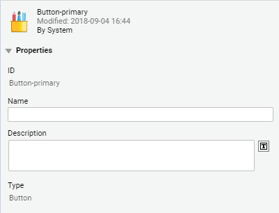
Style Business Objects are stored in the Base Package. By selecting a Style Business Object from the list, you can view the Style properties (ID, Name, Description and Type of Screen Component the Style refers to in the panel on the right).
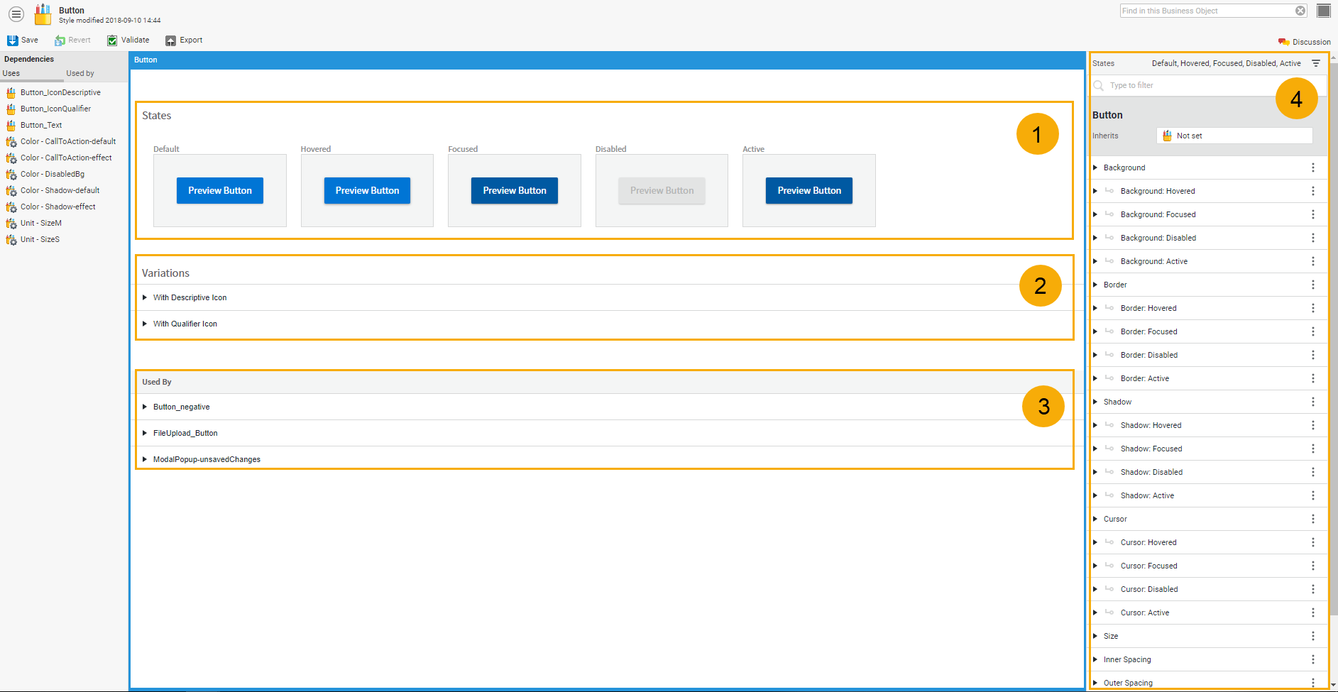
By double-clicking on the Style, you open the Style Business Object editor. The editor has two main sections:
- Preview panel (center) where the component is rendered along all the relevant states and the styling result can be assessed. This panel includes a States area, a Variations area and a Used By area.
- Styling Properties panel (right) where all applicable styling properties are available.
Legend:
- States area
- Variations area
- Used By area
- Styling properties panel
Preview Panel
States area
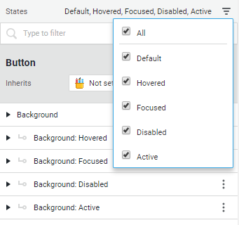
The Preview panel displays different options depending on the component to be edited. For example, a Button component has five different states: Default, Focus, Hovered, Active and Disabled.
Consider that some of these states are inherited from other Style Business Objects referenced in the styling properties. For example, the Hovered state is inherited from a Text Style Business Object.
Variations Area
This area provides previews for component variations that can be achieved by using component configuration properties at screen level.
For example, in the Screen editor, a Button can be configured to have a descriptive or a qualifier icon. The Variations area shows how the component looks like in both cases.
Used By Area
For components referred by other higher-level components (for example, Text is referred by Button), you can see the list of all the components where that Style Business Object is used, including a preview for each of its states.
Styling Properties Panel
The Styling Properties panel on the right is where all the applicable styling properties for each Style Business Object are available. Following is a list of styling properties shared by various Style Business Objects.
Some styling properties vary depending on the component state. For example, the Button Style Business Objects has the following properties to style the button background: Background, Background: Focused, Background: Hovered, Background: Disabled, and Background: Active.
The S icon next to a property indicates you can select a Style Value Business Object as a value. Click on the icon to open the Style value Business Object selector.
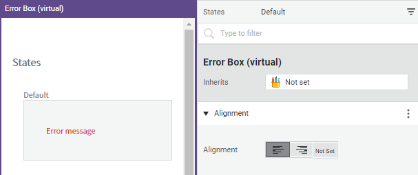
Alignment
- Alignment: Sets the error message alignment for the Error Box Style Business Object, among others.
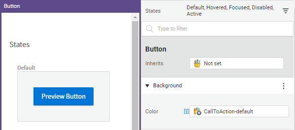
Background
- Color: Sets the background color for Button, Error Box Style Business Object, among others.
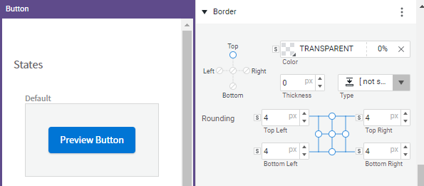
Border
This style allows setting the following properties for one or all the borders of Button and Error Box Style Business Objects, among others:
- Color: Color of the border line/s.
- Thickness: Thickness of the border line/s.
- Type: Type of line (dotted, dashed, and so on).
- Rounding: Border rounding. For more information on this widget, see the Property Connectors section.
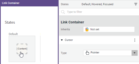
Cursor
- Type: Sets the style of the cursor (text, pointer, and so on) used by the Button, Link Container, Info Table Row Style Business Objects, among others.
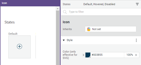
Icon
(Default display name: Style)
- Color (effective only for SVG): Sets the icon color for the Icon Style Business Object, among others.
InnerSpacing
Sets the space between the element inside the component itself and the border. For example, if a button contains some text, the Inner Spacing property defines the space between the text and the button borders. For more information, see the Property Connectors section.
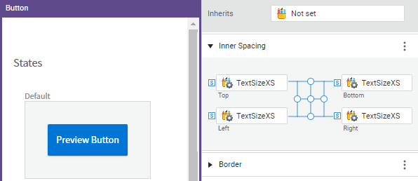
Note on spacing: The Inner Spacing and Outer Spacing styling properties define the space between the component and the border when you apply the current Style Business Object. Consider that you can also define spacing on the Style tab of your screen. In this case, you are defining the space among components at screen level, e.g. the space that separates two or more Button components on the current Screen.
InteractiveElement
This style defines the item the user has to click on. This is the case of the Calendar icon for the DatePicker Style Business Object or the Arrow icon for the DropdownList Style Business Object. The widget allows to actually choose the icon you want to be displayed among the ones available in the DefaultIcons Extension.
This style is used by various Style Business Objects, such as: Anchor Bar, Date Picker, Dropdown List, Filter Tray, Sorting Selector, List Entry, Selected Option, Navigation Menu, Search Field, Info Box, Password Field, and Text Field.
Specific properties are:
- Icon: Allows selecting the icon you want to be displayed among the ones available in the DefaultIcons Extension.
- Icon Color: Allows selecting a Color Style Value Business Object or another color form the selector.
- Outer Spacing: Allows defining the (left and right) space between the icon and the surrounding element, e.g. a text box.
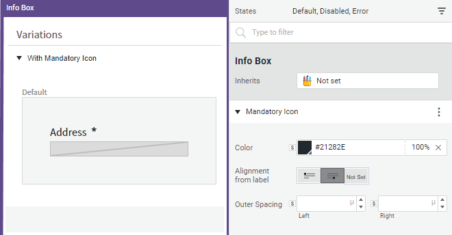
MandatoryIcon
This style refers to the icon that marks a field as mandatory (e.g. the asterisk icon in an info box).
- Color: Sets the icon color.
- Alignment from label: Sets the position of the icon with respect to the text (left, right or not set. In this last case, the style is inherited from the parent component, if any).
- Outer Spacing: Sets the space to the right and left of the icon.
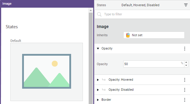
Opacity
- Opacity: Sets the level of transparency (from 0 to 100%) for an Image Style Business Object, among others.
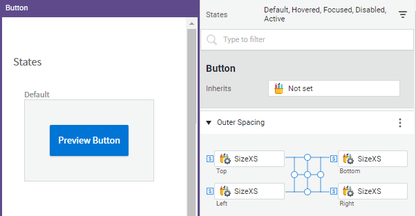
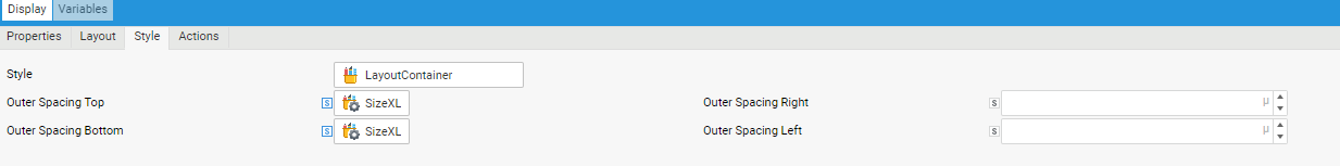
OuterSpacing
This style defines the space between the element outside the component itself and the border. For example, if a button is contained in a layout container, the outer spacing property defines the space between the button border and the container border. For more information, see the Property Connectors section.
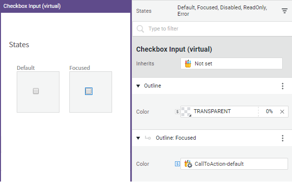
Outline
- Color: Sets the color of the checkbox or radio button item for the CheckboxInput and RadioInput Style Business Objects, respectively.
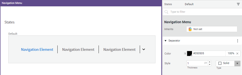
Separator
This style is used to set the style of the line that separates the entries in a menu or bar, for example in the NavigationMenu and the AnchorBar Style Business Objects.
- Color: Sets the color of the line that separates the entries.
- Style: Sets the style (thickness and type) of the same line.
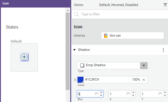
Shadow
This style Sets the shadow effect applied to an icon, link, and so on.
- Type: Sets the type of shadow effect (inner or outer shadow, and so on).
- Color: Sets the color of the shadow.
- Blur: Sets the blur effect of the shadow (in pixels). The highest the value, the more blurred the shadow.
- X / Y: Sets the dimensions of the shadow on the horizontal and vertical axes (in pixels).
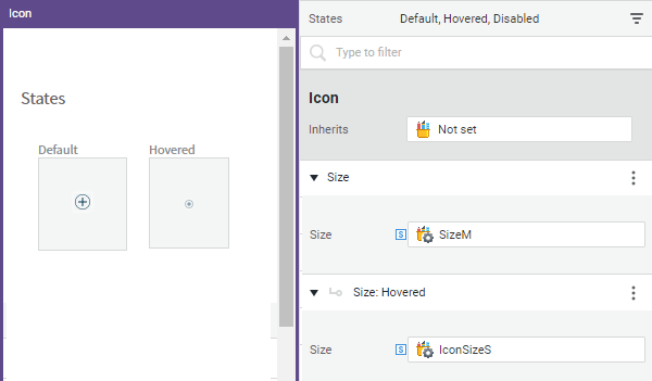
Size
This style sets both the width and height of an object. The available options vary depending on the Style Business Object.
- Width/Height: You can set bot a minimum and maximum width and height for components that grow or shrink dynamically with the screen. In this case, the Fixed option is usually not set by default.
- Dimension: Used when the aspect ratio should be preserved (for example for the Image Style Business Object). In this case, either the width or height is set and the other dimension adapts accordingly.
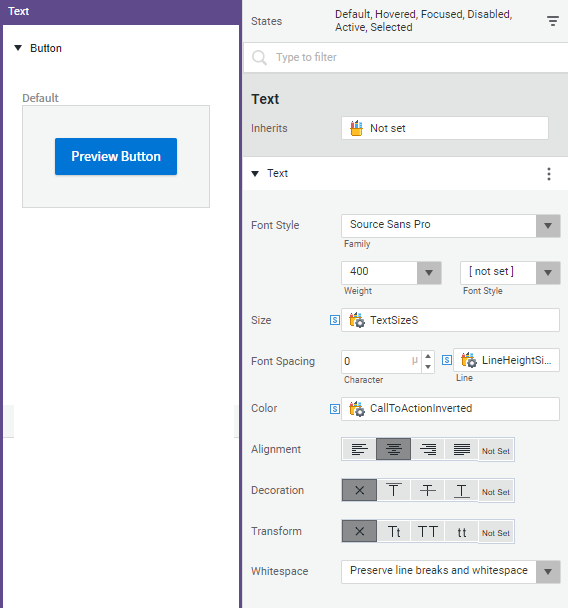
Text
This style defines the text to be displayed, for example, on a button.
- Font Style: Sets the type of font, its thickness (weight), and style (normal, italic, oblique).
- Size: sets the font size,
- Font Spacing: Sets the distance between characters and lines.
- Color: sets the font color.
- Alignment: Sets the alignment of the text with respect to the container.
- Decoration: Allows adding a line under or over the text (underline, overline), a strikethrough line (line through), no line (none), or inheriting the style from the parent component (not set).
- Transform: Allows changing the font to uppercase or lowercase, or capitalizing each word.
- Whitespace:
- Preserve line breaks: Sequences of whitespace collapse into a single whitespace. Text wraps when necessary, and on line breaks.
- Collapse all to single whitespace: Sequences of whitespace collapse into a single whitespace. Text wraps when necessary.
- Preserve line breaks and whitespace: Whitespace is preserved by the browser. Text wraps when necessary, and on line breaks.
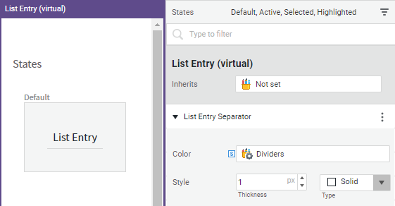
VerticalSeparator
This style defines the line that separates the entries in a list. It is used by the List Entry, Adaptive Flow Layout, Info Table, Phase Chevron Style Business Objects, among others.
- Color: Sets the line color.
- Style: Sets the thickness and type of line.
Filtering Out Styling Options
To display only the styling options relevant to a certain state, select the menu icon at the top, and then select the state you are working on. All the styling options that are not related to this state are filtered out.
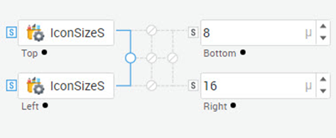
Property Connectors
For some styling properties, such as spacing or borders, we often want to apply the same value to multiple properties. For this purpose, FNZ Studio provides a set of widget connectors which allow the user to visually connect properties together in different ways and modify multiple properties at once.
Corner Connector
In the example illustrated in the figure below, the top and left properties are connected and their values are in sync. Therefore, whenever you change one of them, the other is changed automatically.
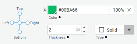
Edge Connector
The Edge connector allows editing the styling properties for all four directions at the same time. In the example illustrated in the figure below, all edges are in sync when modified.
Style Business Objects for Components
FNZ Studio provides a series of predefined Style Business Objects that you can either use directly or customize. For each component there is a corresponding Style Business Object with styling properties relevant for that component. Example of Style Business Object types are: Button, Checkbox, Image, Info Box, Layout Container, Text, and so on.
Naming Conventions
The predefined components provided in your solution use the following naming conventions:
-
[Component] [dash] [modifier]. Example: Button-primary is a Button Style Business Object.
-
[Component] [underscore] [Sub-component] [dash] [modifier]. Example: Button_Text-primary is a Text Style Business Object referred by the Button-primary Style Business Object to specify the style of its label. This naming pattern reflects the fact that the Button-primary Style Business Object is a composition of Button_Text-primary and the icon.
Working with Style Business Objects: Basic Information
Customizing Inherited Style Business Objects
Relevant Style Business Objects for each component (Button, Checkbox and so on) are provided by default. You can use these default Business Objects in your solution or customize them to your needs. To customize your Style Business Object:
- Open the Style Business Object you want to edit, for example a Button.
- In the Styling Properties panel, click on the Inherits field, and choose the desired parent Style Business Object, for example Button-primary. Your Button Style Business Object now inherits the properties of the Button-primary Style Business Object.
- Edit the styling properties according to your needs.
You can choose not to inherit from a parent Style Business Object by using the 'not set' value.
Inheriting Values from a Parent Style Business Object
- Orange dot: When you inherit from a Style Business Object, the editor provides an overview of the inherited values defined by the parent Style Business Object and, thus, a small orange dot is placed at the right of the label of the styling property.
- Black dot: Whenever local values are defined and, therefore, inherited values are overridden, a small black dot is shown at the right of the styling property label. The black dot is also displayed when you define new local-only values.
Style Business Objects for Screen Components: Use Cases
Following are two use cases to illustrate how to use Style Business Objects for Screen components.
Use Case 1: Basic Styling
You want to create a header with a title, a subtitle, a button and an icon. Following is a step-by-step example procedure for creating this screen.
Prerequisites: You need a Style Business Objects for each of the screen components you want to use. You can use the provided Style Business Objects directly or customize them:
- Layout Container Style Business Object
- Icon Style Business Object
- Heading Style Business Object
- Button Style Business Object
Phase 1: Create a header container.
- Drag a Layout Container component into the screen.
- Open your Layout Container Style Business Object (for example, HeaderContainer).
- The Styling Properties panel is displayed on the right. Edit the relevant properties, for example:
- Background
- Inner Spacing
- Outer Spacing
- Size
- Shadow
- Assign the Layout Container Style Business Object to the Layout Container component. To do so:
- In the Screen editor, open the Style tab.
- Select the appropriate Layout Container Style Business Object (HeaderContainer) from the dropdown list.
Phase 2: Add the icon to the header.
- Drag an Icon component inside the HeaderContainer component.
- Open your Icon Style Business Object (for example, HeaderLogo).
- In the Styling Properties panel, edit the relevant properties, for example:
- Style
- Size
- Outer Spacing
- Assign the Icon Style Business Object to the Icon component. To do so:
- In the Screen editor, open the Style tab.
- Select the appropriate Icon Style Business Object (HeaderLogo) from the dropdown list.
Phase 3: Add a title and a sub-title to the header.
- Drag a Heading1 component inside the HeaderContainer component.
- Open your Heading1 Style Business Object (for example, Header_Title).
- In the Styling Properties panel, edit the relevant properties.
- Assign the Heading1 Style Business Object to the Heading1 component. To do so:
- In the Screen editor, open the Style tab.
- Select the appropriate Heading1 Style Business Object (Header_Title) from the dropdown list.
- Repeat these steps for adding the subtitle (you can use the Heading2 Screen component and Heading2 Style Business Object).
Use Case 2: Using Referenced Style Business Objects
In some cases, you have components containing sub-components, such as a button with both text and an icon. When the button is rendered, it renders both the text and the icon, that is, it ‘delegates’ rendering to these two sub-components. This feature improves consistency and allows reusing code.
In terms of style, the Button Style Business Object uses the styles associated with the two referenced sub-components.
In this use case, you want to have a button with some text that changes from gray to black when hovered.
- Open the Button Style Business Object.
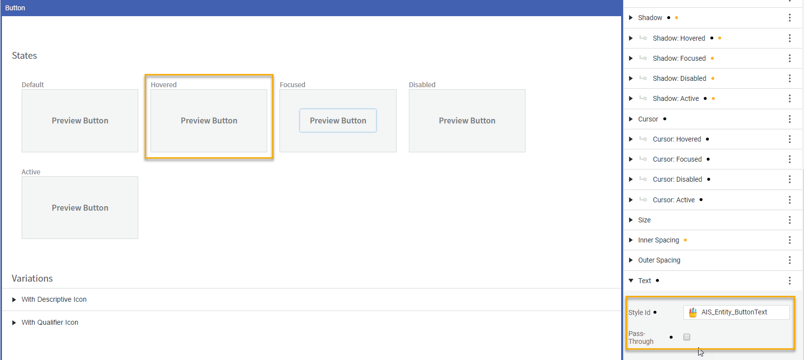
- Open the Text (Default) property and click on the Style Id field to choose the Style Business Object you want to reference, for example Button_Text Style. As a consequence, the button behavior (the text changes from gray to black when hovered) is governed by the Button_Text Style Business Object.
When the Pass-Through check box is selected, states specific to the Button component, such as focused or pressed, are passed to the Text component. A Text component follows this behavior only when it is used by a Button and the Pass-Through option is on (see figure below).
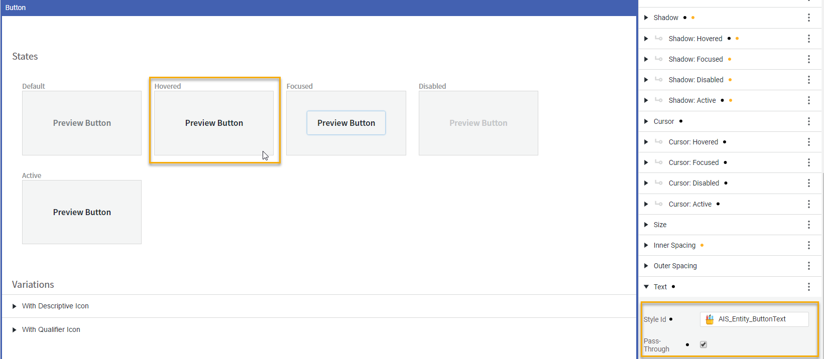
However, if you deselect the Pass-Through check box, the Button_Text Style Business Object properties are not passed to the Button Style Business Object. This means that the properties are not passed from the sub-component to the component as a whole. As a consequence, the text does not change to black when hovering the button (see figure below).
Style Business Objects Referencing Virtual Components
A Style Business Object can refer to two different types of Screen components:
- A 'standard' Screen component that can be used in Screens, for example an Info Box, a Date Picker, or a Text Field.
- A Virtual Screen component that is used as a building block for 'standard' Screen component but cannot be dragged into a Screen, for example an Error Box, a Checkbox Input, or a Tooltip.
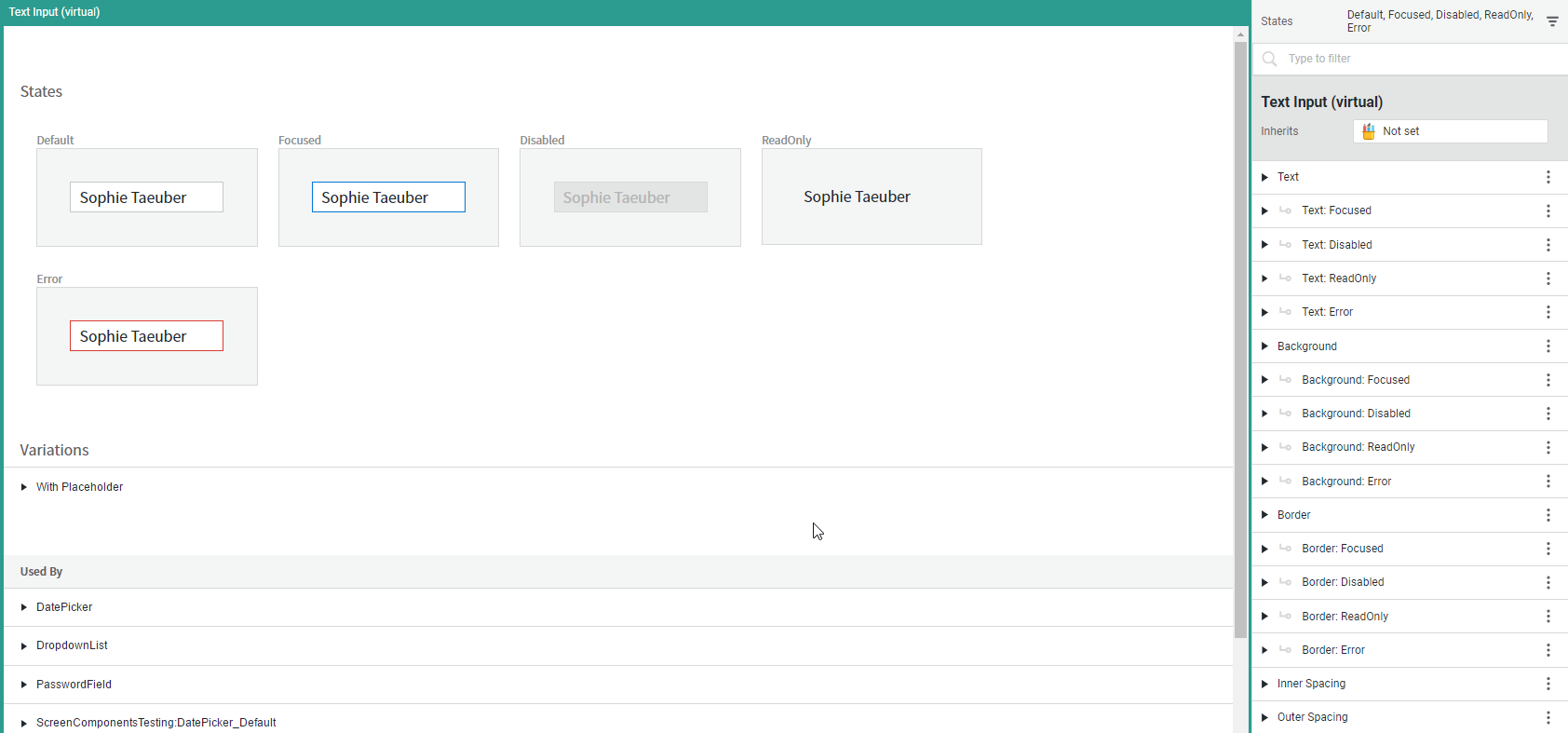
You can use a Style Business Object that is referencing a Virtual component to apply consistent styling across all the Screen components that contain it. For example, the Style Business Object referencing the Text Input Virtual component can be applied to a Password Field, a Search Field, and a Dropdown List.
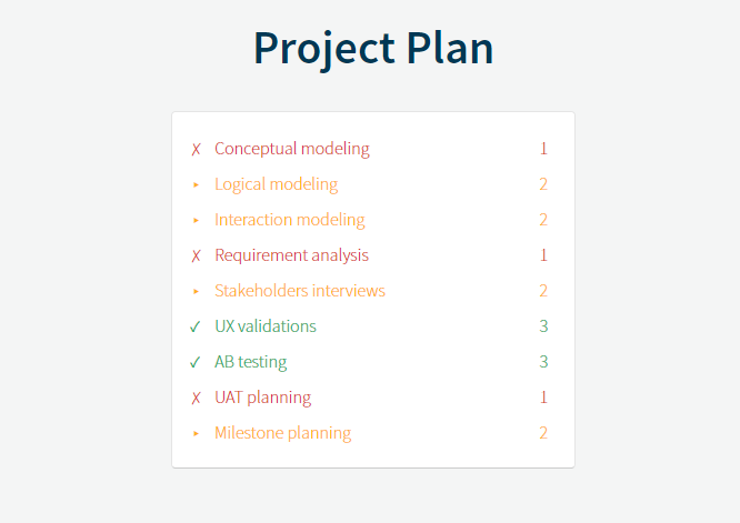
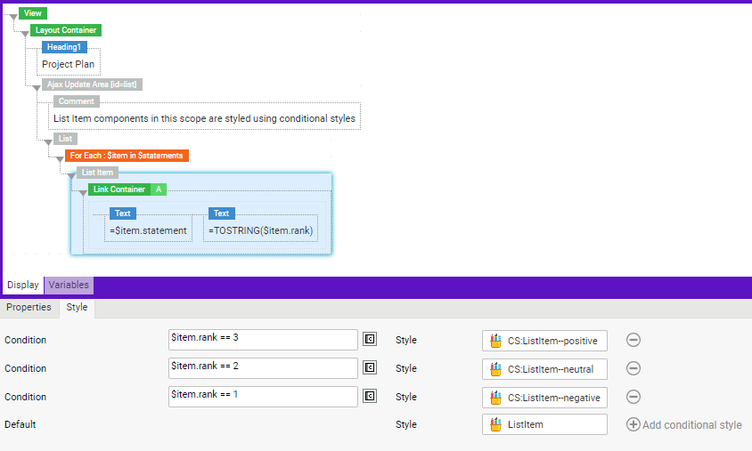
Conditional Styles
Conditional styles allow FNZ developers to apply a certain Style Business Object to a Screen Component only if a given condition is met.
Before Appway 9, one single Style Business Object could be set for each Screen Component, meaning that the developer might need to duplicate the Screen Component each time they wanted to apply a different Style Business Object. This had the disadvantage of creating complex Screen structures, as well as requiring changes to be manually applied to each single Screen Component whenever necessary.
Conditional styles, on the other hand, allow managing the implementation of styles in a neater and more manageable way.
Setting Conditional Styles for a Screen Component
To apply Conditional Styles to your Screen Component, do the following:
- On the Screen Editor, go to the Style tab and click on the Add conditional style ('Plus' icon) button.
- In the Condition field, enter the condition to be evaluated using Appway Script Language (default is
false). In the corresponding Style field, select the Style Business Object to be applied if the condition evaluates totrue(the default value is the Default Style Business Object for that component). - You can:
- Add as many conditions as necessary by clicking on the Add conditional style ('Plus' icon) button.
- Change the order of conditions (with the exception of the Default row) by dragging and dropping the related rows.
- Delete conditions (with the exception of the Default row) by clicking on the Delete ('Minus' icon) button.
- The system applies the following logic:
- Conditions are evaluated in the order in which they are set on the Screen: if the first condition evaluates to
false, the system evaluates the second condition and so on. - The last entry is always the Default value, which has no condition assigned and it applies if no condition evaluates to
true.
- Conditions are evaluated in the order in which they are set on the Screen: if the first condition evaluates to
Note: The conditions are evaluated during the Render phase, that is, when the Screen is rendered by the server, including any time server-side actions are executed, or before an Ajax Update action.
Conditional Styles: Validation Errors, Warnings and Information Messages
A number of validation mechanisms is in place for Conditional Styles. Validation Errors and/or Warnings are issued if the following conditions are not met:
- Both the Condition and Style fields are mandatory and must be filled.
- The selected Style Business Object must be valid and visible from the Package you are working on (Packages).
- Condition must return a Boolean value (
trueorfalse).
Finally, an Information message is issued if:
- The configured conditions are always
trueorfalse.
Interaction of Conditional Styles with Other Styling Features
Interaction with the Style Package
The Style Business Objects defined in the Style Package have priority over the ones defined statically in the Screen Editor.
When Style Packages are defined on a Screen (or on a Screen including it), all Style Business Object IDs are resolved from the Style Package. Only if the Style Business Object is not found in the Style Package, then the ID is resolved from the static reference set in the Screen Component Screen Editor (Style tab).
The above evaluation can be described as the following process:
- Conditional Styles are evaluated, and the ID of the Style Business Object to be assigned is determined.
- A Style Business Object with the ID determined in the previous step is searched in the Style Package and, if found, it is applied.
- If a Style Business Object with such an ID cannot be found in the Style Package, then the one set in the Screen is used.
Interaction with the Set Style Action
The Set Style client-side Action allows an event to trigger a change in the Style Business Object for a Screen Component.
Since the Set Style Action is applied client-side and Conditional Styles are applied after a server round-trip, the implementation of both styling features is likely to lead to unpredictable results.