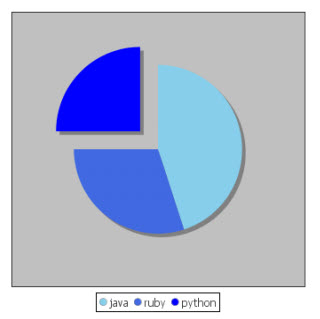
Charting Extension
Introduction
Note: This documentation refers to the ChartingExtension version 3.x or higher, which relies on Workspace version 3 of Appway.
The ChartingExtension adds two Screen components for visualizing data as a line, bar or pie chart. The visual representation of data is an easy way to display distributions, or display the relationship between multiple data streams. The benefit of using the Line/Bar Chart or Pie Chart component is that the represented data can be changed dynamically. With the usage of Appway Catalogs, every data source can be represented as a chart in the Workspace.
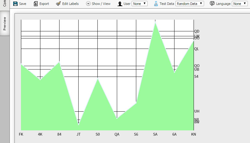
Figure 1: Line chart for the Appway 6.2 workspace
Quick Start Guide
To create and preview your first chart, follow these steps:
-
Upload the latest version of the ChartingExtension into Appway.
-
Right-click on the extension, and select Add a Data Catalog.
-
Fill in the ID and Name of the Catalog object and click on Save Pie Catalog.
-
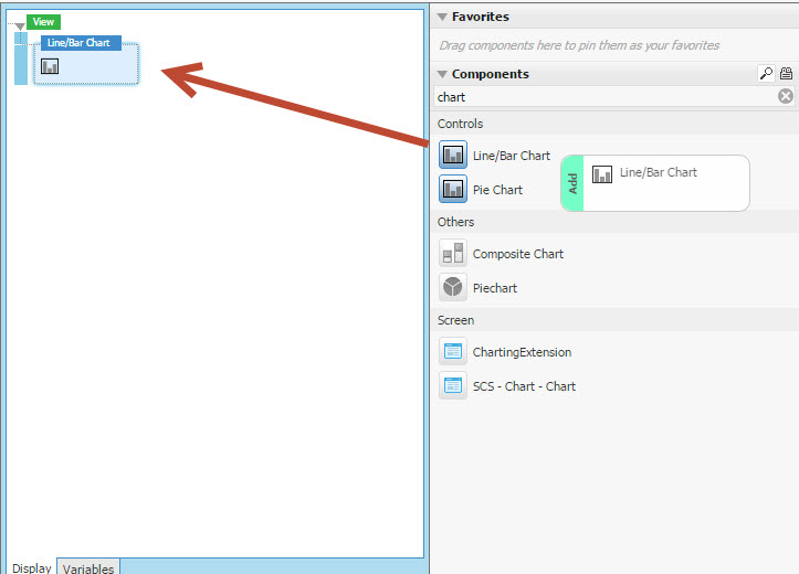
Open a Screen, and drag the Pie Chart component into the composer area
-
Set Chart Data Source Type to Catalog in the component properties.
-
Preview your first pie chart.
This example also applies if you want to generate an example line chart.
Inspecting the generated catalogs helps you see the structure required by the charts.
Displaying Data in a Chart
The example catalog generated in the previous chapter provides only static data. In most solutions, data comes from data sources such as databases or third-party services. Appway Catalogs can dynamically gather and update data from any data source. It is recommended to use a catalog for charts because you gain maintainability, versioning and a visual layer. This is a great advantage over using a script to generate the data.
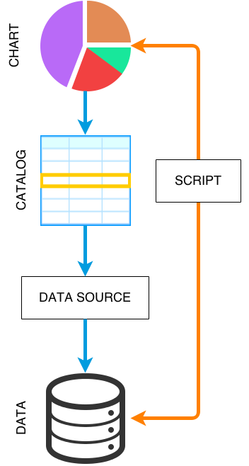
See the Catalog Business Object document for further information on Catalogs and how they gather data from Integration Links and databases.
Line/Bar Chart Catalog Columns
To use a Catalog as line/bar chart source, it should at least contain the following columns:
- id — A unique ID to identify the data point. This value is returned by the binding of the component when a data point is selected.
- x — The "x" value of the data point in the chart
- y — The "y" value of the data point in the chart
- bottom — Defines the starting height of the data point from the x-axis
- xtick — Tick label of the data point on the x-axis
- ytick — Tick label of the data point on the y-axis
- yvalue — Defines the distance of the tick label on the y-axis
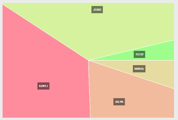
Pie Chart Catalog Columns
To use a Catalog as pie chart source, it should at least contain the following columns:
- id — A unique ID used to identify the section. This value is returned by the binding of the component when a pie chart section is selected.
- value — The value of the pie chart section
- label — The label of the pie chart section
- color — The color of the pie chart section
Charts inside the PDF Output
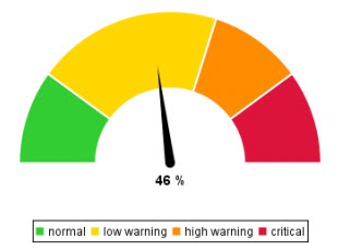
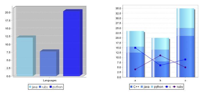
It is possible to create a Tachometer (Gauge) chart, a Composite chart or a Pie chart in Appway PDF Output by using the Graphic component.
- Drag the Graphic component onto the page, and adjust size and positioning of the box. The chart is resized based on the size of the box.
- In the Value Field Parameters tab of the component, specify:
- Listener Name: “tachometer”, “piechart” or “compositechart” (This value has to be exact)
- An adequate resolution (e.g 300)
- Chart expression must be on a single line
- After dragging the component in the PDF Output, it is necessary to define the chart that must be displayed. Use the Data Classes “Chart”, “Dataset” and “ChartValue” to do this.
You can find an example in the “Examples” section.
Note: For detailed documentation on charts in PDF Output, see the other sections of this article.
Properties
Line / Bar Chart
Properties Tab
| Property Name | Tab | Description |
|---|---|---|
| Binding | Properties | Binds the value of the on click callback |
| Width | Properties | The width of the chart canvas |
| Height | Properties | The height of the chart canvas |
| Chart Data Source Type | Properties | Select the data source |
| Chart Data* | Properties | Create a script to generate data.nThe script should return an "SCChartData" type object containing the chart configuration and values. |
| Chart Catalogue Data Source* | Properties | Select a Catalog as data source |
| Label | Properties | Label for naming the data points on the chart |
| Load Data Delayed | Properties | If checked the data from the source is loaded after the website is loaded. |
X Axis Tab
| Property Name | Tab | Description |
|---|---|---|
| Interval Label Color | X Axis | The color of the interval labels of the X-axis |
| Tick Color | X Axis | The grid line (tick) colors of the X-axis |
| Interval Label Position | X Axis | Set the position of the X-axis tick labels |
| Font Size | X Axis | Set the size of the X-axis label font in pixels |
Y Axis Tab
| Property Name | Tab | Description |
|---|---|---|
| Interval Label Color | Y Axis | The color of the interval labels of the x-axis |
| Tick Color | Y Axis | The grid line (tick) colors of the x-axis |
| Interval Label Position | Y Axis | Set the position of the Y-axis tick labels |
| Font Size | Y Axis | Set the size of the Y-axis label font in pixels |
Grid Tab
| Property Name | Tab | Description |
|---|---|---|
| Grid above data | Grid | If checked, the grid lines are laid over the data |
| Background Color | Grid | The color of the grid background |
| Label Margin | Grid | Defines the space in pixels between tick labels and axis line |
| Axis Margin | Grid | Defines the space in pixels between axes when there are two next to each other |
| Border Width | Grid | The width of the border around the canvas.nSet it to 0 to disable the border. |
| Border Color | Grid | The color of the grid border |
| Min Border Margin | Grid | Defines the minimum margin in pixels around the border – it is used to make sure that points aren’t accidentally clipped by the canvas edges, so by default the value is computed from the point radius. |
| Mouse Active Radius | Grid | Defines the radius in pixels around a point which is active when the mouse trigger hovers it. |
| Autohighlight | Grid | If checked, nearby data points are highlighted on mouse-over |
Line Tab
| Property Name | Tab | Description |
|---|---|---|
| Show | Line | If checked, draws a line from data point to data point |
| Fill2 | Line | If checked a surface is drawn between line and axis |
| Width2 | Line | The width of the line |
| Line Color § | Line | The color of the line |
| Fill Color §,† | Line | The color of the surface underneath the line |
| Opacity §,† | Line | The opacity of the surface under the line |
| Steps § | Line | If checked, the line between the data points is only rendered vertically and horizontally |
Bar Tab
| Property Name | Tab | Description |
|---|---|---|
| Show | Bar | If checked, the data point representation is changed to a bar chart |
| Bar Line Width | Bar | The width of the bar lines |
| Bar Line Color | Bar | The color of the bar lines |
| Bar Width | Bar | The width of the lines of the bars |
| Fill | Bar | If checked, the bar is filled in |
| Fill Color | Bar | The color of the bar surface |
| Align | Bar | The bar alignment |
| Orientation | Bar | Select the orientation for bars - vertical or horizontal |
Point Tab
| Property Name | Tab | Description |
|---|---|---|
| Show | Point | If checked the data points are visible as point |
| Border Width | Point | The border width in pixels around a data point |
| Fill | Point | If checked, the points are filled in |
| Color | Point | The color of the data point |
| Radius | Point | The radius in pixels of a data point |
Other Tabs
| Property Name | Tab | Description |
|---|---|---|
| Size | Shadow | The size in pixels for the shadow of data points and lines |
| plotclick | Actions | An action triggered on-click on a data point |
| plothover | Actions | An action triggered if the mouse hovers over an active data point area |
* Depending on the selection of "Chart Data Source Type"
§ Only appears if "Show" is checked in the tab "Line"
† Only appears if "Fill" is checked in the tab "Line"
Pie Chart
Properties Tab
| Property Name | Tab | Description |
|---|---|---|
| Binding | Properties | Binds the value of the on click callback |
| Width | Properties | The width of the chart canvas |
| Height | Properties | The height of the chart canvas |
| Chart Data Source Type | Properties | Select from which source the data is coming |
| Chart Data* | Properties | Create a script to generate data |
| Chart Catalogue Data Source* | Properties | Select a Catalog as data source |
| Load Data Delayed | Properties | If checked the data from the source is loaded after the website is loaded. |
Labels Tab
| Property Name | Tab | Description |
|---|---|---|
| Show Legend | Labels | If checked the legend of the colors is shown |
| Show Section Labels | Labels | If checked the pie chart sections are labeled. The style of the labels can be changed via CSS. Overwrite the “PieChartLegendLabels” class in your CSS file. |
| Radius | Labels | The distance of the pie chart center in pixels where the labels are displaced. |
| Threshold | Labels | The threshold of the label visibility |
Shadow Tab
| Property Name | Tab | Description |
|---|---|---|
| Transparency | Shadow | Set the opacity of the shadow. Note that the shadow only appears if the 'Radius' property in the tab 'Attributes' is less than 1. |
| Offset Top | Shadow | The vertical offset of the shadow in pixel. Note that the shadow only appears if the 'Radius' property in the tab 'Attributes' is less than 1. |
| Offset Left | Shadow | The horizontal offset of the shadow in pixel. Note that the shadow only appears if the 'Radius' property in the tab 'Attributes' has to be less than 1. |
Attributes Tab
| Property Name | Tab | Description |
|---|---|---|
| Radius | Attributes | The radius of the pie in pixels. If the radius is larger than the pie border, a square pie is generated. |
| Tilt | Attributes | Tilt the pie chart backwards. A value between 0 and 1 is required. |
| Highlight Opacity | Attributes | The opacity of the mouse over effect |
| Inner Radius | Attributes | Inner radius in pixels. This value can be used to create a donut chart. |
| Start Angle | Attributes | Factors of PI which indicates the start of the sections of the pie chart. |
| Offset Top | Attributes | The offset from the top in pixels for the center |
| Offset Left | Attributes | The offset from the left in pixels for the center |
| Stroke Width | Attributes | The width in pixels of the stroke between the pie sections |
| Stroke Color | Attributes | The color of the stroke between the pie sections |
Combine Tab
| Property Name | Tab | Description |
|---|---|---|
| Threshold | Combine | All pie sections smaller or equal to the threshold are combined into one section |
| Combine Color | Combine | The background color of the combine section in the Pie Chart |
| Label | Combine | The label of the combined pie section |
| plotclick | Actions | An action triggered on click of a data point |
| plothover | Actions | An action triggered if the mouse hovers over an active data point area |
* Depending on the selection of "Chart Data Source Type"
Examples
The following section shows several example charts. You will find a Screen with all the examples in the following .AWEXPORT file: chartVariationExamples.awexport.
Please, consider this file was created in Appway 7.
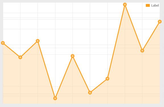
Line Chart
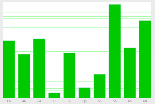
Bar Chart
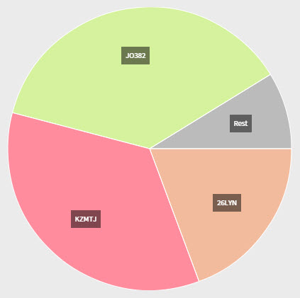
Pie Chart
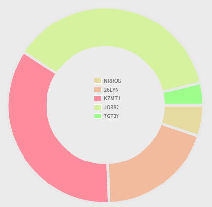
Donut Chart
Square Chart
Line/Bar Chart from a Script
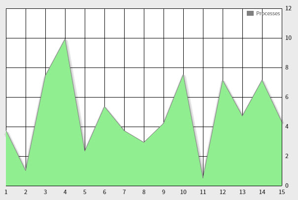
Here is the example script:
SCChartData $chartData := NEW(SCChartData);

//

//line options (for all series)

SCChartOptionLines $lineOptions := NEW(SCChartOptionLines);

$lineOptions.show := true;

$lineOptions.fill := true;

$lineOptions.fillColor := 'lightgreen';

$lineOptions.lineWidth := 1;

//

// data series

SCChartSeries $chartSeriesA := NEW(SCChartSeries);

$chartSeriesA.label := 'Processes';

$chartSeriesA.shadowSize := 10;

$chartSeriesA.lines := $lineOptions;

$chartSeriesA.color := 'grey';

//

SCChartXaxis $xaxisOptions := new SCChartXaxis;

$xaxisOptions.show := true;

//

//

For Integer $i := 1 Condition $i <= 15 Step $i := $i + 1 Do

   // values (with colors)

   SCChartPoint $p := NEW(SCChartPoint);

   SCChartTick $t := new SCChartTick;

   $t.label := $i;

   $t.value := $i;

   $xaxisOptions.xaxis.addElement($t);

   $p.x := $i;

   $p.y := TODOUBLE(RANDOM() * 10);

   $chartSeriesA.data.addElement($p);

End

$chartData.xaxis := $xaxisOptions;

//

$chartData.series.addElement($chartSeriesA);

//

Return $chartData;
Bar Chart from a Script
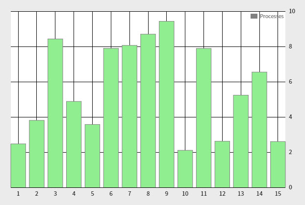
Here is the example script:
SCChartData $chartData := NEW(SCChartData);

//

//bar options (for all series)

SCChartOptionBars $barOptions := NEW(SCChartOptionBars);

$barOptions.show := true;

$barOptions.fill := true;

$barOptions.fillColor := 'lightgreen';

$barOptions.barWidth := 0.8;

$barOptions.lineWidth := 1;

$barOptions.align := 'center';

//

// data series

SCChartSeries $chartSeriesA := NEW(SCChartSeries);

$chartSeriesA.label := 'Processes';

$chartSeriesA.shadowSize := 10;

$chartSeriesA.bars := $barOptions;

$chartSeriesA.color := 'grey';

//

SCChartXaxis $xaxisOptions := new SCChartXaxis;

$xaxisOptions.show := true;

//

//

For Integer $i := 1 Condition $i <= 15 Step $i := $i + 1 Do

   // values (with colors)

   SCChartPoint $p := NEW(SCChartPoint);

   SCChartTick $t := new SCChartTick;

   $t.label := $i;

   $t.value := $i;

   $xaxisOptions.xaxis.addElement($t);

   $p.x := $i;

   $p.y := TODOUBLE(RANDOM() * 10);

   $chartSeriesA.data.addElement($p);

End

$chartData.xaxis := $xaxisOptions;

//

$chartData.series.addElement($chartSeriesA);

//

Return $chartData;
Tachometer Chart in PDF Output
Composite Chart in PDF Output
Pie Chart in PDF Output