Dropdown List Screen Component
The Dropdown List Screen Component in Appway is a versatile form control to let users filter, search, and choose from a list of options. The component displays options coming from any Data Source and provides lazy loading mechanisms to enhance performance.
The Dropdown List is a responsive component which adapts to any screen size including mobile devices and supports various input types like mouse, keyboard, or gestures.
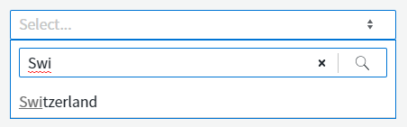
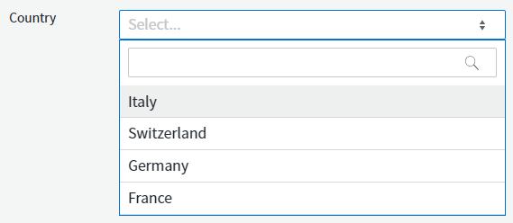
Note: The Dropdown List always displays a Search Field if two or more options are available for selection, ensuring consistency across all Dropdown Lists used in a Solution and a better user experience. Users frequently use search even if there are only a few options available, mainly when they know exactly what they are looking for or if the sorting of the options is not clear to them.
Configuration
Properties
The Dropdown List component has various properties to configure in the Screen Editor:
- Binding — The variable to which the selected value is bound.
- Show As Text If Disabled — Enable this checkbox to show a label instead of a dropdown if the component is disabled.
The aw.DropdownList.textIfDisabled.noSelection label contains the text displayed in the Dropdown List when the following conditions are met:The default value of the label is an empty string, therefore no text is displayed. However, you can set a text for this label (for example, "Select..." or [ LABEL: dropdown.select ]).
- The Dropdown List state is set to Disabled;
- No option is selected in the Dropdown List;
- The Show as Text If Disabled checkbox is selected.
- Allow resetting to empty state marked by placeholder — Displays the text defined in the "Placeholder" property before an option is selected. After selecting an option, users can reset to the placeholder by clicking on the "x" in the dropdown list. If this property is deselected, an option is always selected.
- Placeholder — Placeholder text shown when no option is selected.
- HTML Id — The HTML ID of the component.
Actions
You can choose from the following Action Event Types:
- onchange — This event is fired when an option is selected.
- onblur — This event is fired when the focus leaves the Dropdown List.
- onfocus — This event is fired when the Dropdown List receives a focus.
- onkeyup — This event is fired whenever you type a character into the search field.
Data Sources
The list of options available in the Dropdown List is defined on the Data Source tab of the properties. The following options are available for Data Sources:
- Static — Sets static options as the data source.
- Catalog — Sets a Catalog and a display column as the data source.
- Expression — Reads the options from a collection variable.
- User — Allows defining different options based on the user list.
Dropdown List Style Business Object
The Dropdown List Style Business Object allows applying consistent styling to the Dropdown List Screen Components.
States
The Dropdown List Style Business Object has five different states:
- Focused
- Disabled
- Error
- Hovered
- ReadOnly
Styling Properties
The Dropdown List Style Business Object makes reference to other Style Business Objects, such as TextInput (Virtual), ErrorBox (Virtual), and so on. These are the styling properties for the Dropdown List Style Business Object:
- Arrow Icon (Interactive Element): sets the type and style of the icon you click on to display the dropdown list options.
- Clear Icon (Interactive Element): sets the type and style of the icon you click on to clear the dropdown list option.
- Outer Spacing: defines the space between the element outside the Dropdown List and the border.
- Size: sets both the width and height of the Dropdown List. Consider that default values apply.
- Text Input (virtual): refers to a Text Input (virtual) Style Business Object to define style of the text that displays the selected option.
- Error Box (virtual): refers to an ErrorBox (virtual) Style Business Object to define the style of the Dropdown component and error message when in Error state.
- Pop Up (virtual): refers to a Popup (virtual) Style Business Object to define the style of the popup that displays the list of options.
- List Entry (virtual): refers to a List Entry (virtual) Style Business Object to define the style of the Dropdown List entries.
- Search Field: refers to a Search Field Style Business Object.
Catalog Service
The Catalog Service, in combination with the Dropdown List, allows Catalogs to enhance the performance due to the lazy loading feature. Using a Catalog as a Data Source is a best practice recommended by Appway for two reasons:
- Catalogs can be reused for different Dropdown Lists.
- Catalogs support all integration options that Appway offers.
Prerequisites
To make use of the Catalog Service, the following conditions have to be met:
- The Dropdown List component has Catalog set as its Data Source
- The selected Catalog has an ID column
- The selected Catalog does NOT have any inherited variables without the default value defined
- The selected Catalog can only have assigned variables of immutable primitive types, such as String, Boolean, Integer, Float, Double, Long, Date.
If the points above are fulfilled, then the Catalog Service will automatically filter results and provide an option list to the client Dropdown List.
Lazy Loading
When all the prerequisites are met, then the client automatically filters the results on the server side. In such case, whenever there are more options available in the data source than can be displayed, an HTTP AJAX request is made to the Catalog Service on the server side. The service then fetches all the options from the Catalog. Afterwards, the options are filtered based on the users' search input and reduced to a limit, so that the client does not slow down if there is a huge amount of options. The final option list is then sent back to the client and rendered.
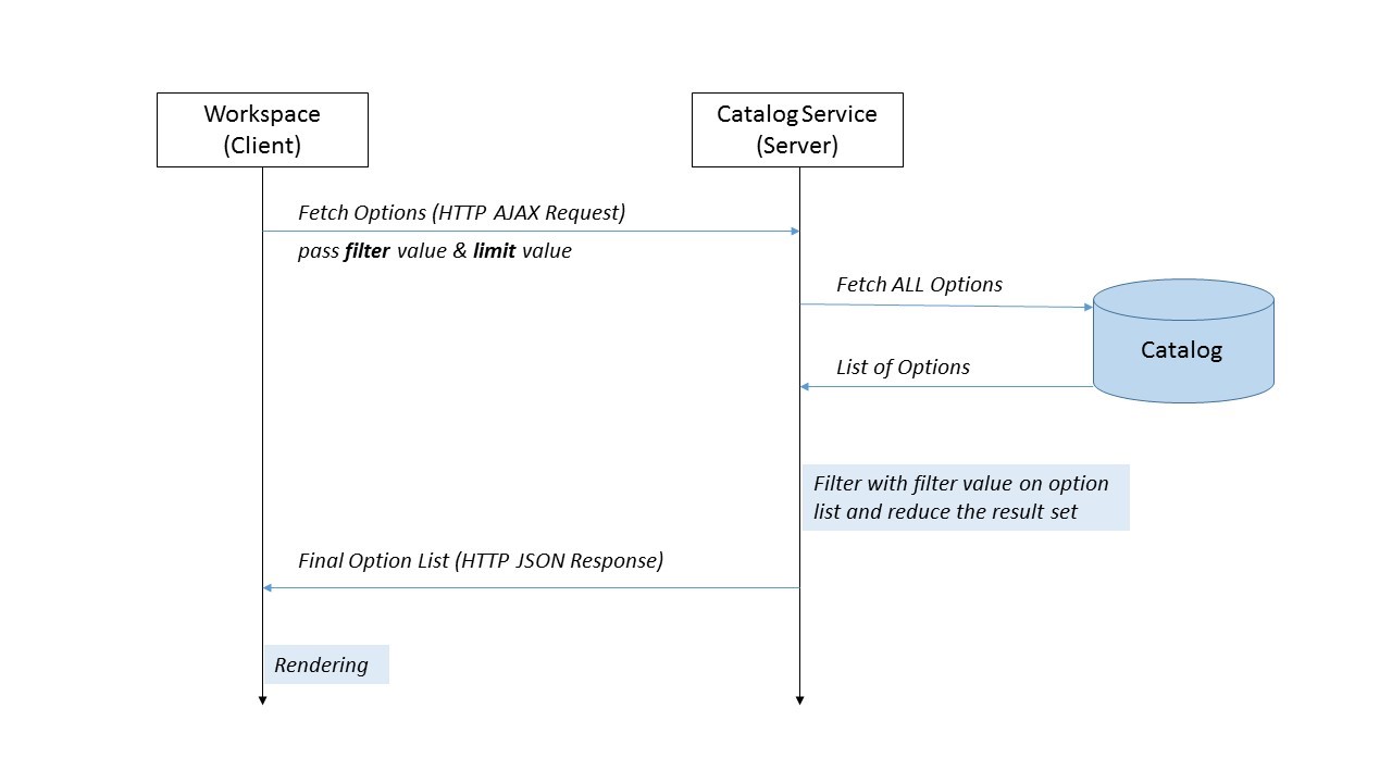
Enhanced Lazy Loading (Custom filter, start and limit variables)
Filtering and reducing the option list after all the options are fetched from the Catalog can slow the solution down if the Catalog relies on third-party systems or the result set is huge. For this reason, a Studio developer has the possibility to implement a custom filter, start and limit mechanism on the Catalog.
The difference is that, instead of fetching all the options from the Catalog and then filtering and reducing, the filtering and reducing takes place directly on the Catalog. This allows a Studio developer to have full control on how the options are fetched. Depending on the Catalog implementation, this allows for better performance when filtering on huge Data Sources.
User Experience Note
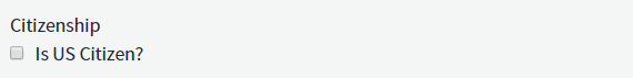
Whenever a user has only a few options to choose from, consider representing the options as radio buttons or as a checkbox. The disadvantage of a Dropdown List is that only one option is visible at a time to the user, instead of all options.
What Appway recommends is to use different Screen Components, depending on the number of available options. If the number of options is not known in advance, the Dropdown List could be the best option.
:-----------| :-----------| |Number of Options |Screen Component |1 |Checkbox |2-3 |Radiobutton |4 or more |Dropdown List
Checkbox

Radio Buttons
FAQ
What if I want to request a database request only when at least 3 characters were typed in the search?
The Catalog Service is called for every character typed in the search field of the Dropdown List. But when you are using the filter variable (see the section on Enhanced Lazy Loading), you can check the filter value character count in the Catalog. Depending on this, either make a database request or return an empty option list.
Does a Cache on the Catalog have any impact on the Catalog Service? No, the only thing you have to be aware of is that the filtering happens afterwards.
Troubleshooting
Dropdown Lists Containing a List of Users
Problem
Is there a simple way to create a Dropdown List that contains a list of users?
Solution
Appway Solutions often contain Dropdown Lists populated with users of the Appway platform. It's really easy to create this kind of Dropdown List in Appway:
-
Add a Dropdown List Screen Component to your Screen.
-
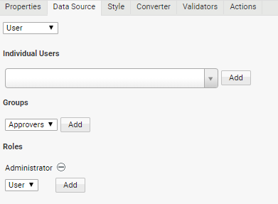
In the Dropdown List's properties, go to the Data Source tab and select the User option. This displays the User Data Source properties.
-
In the User Data Source properties, you can:
- Select individual users that you want to appear in the Dropdown List
- Select Groups and Roles whose members you want to appear in the Dropdown List.
-
In this example, the Administrator role was added:
-
Click on the Start Screen button available in the top toolbar of the Screen editor to render the Screen and verify that the Dropdown List contains the users you defined.
Note: This works with any Screen Component that supports Data Sources, e.g. you can easily populate Checkbox Lists with users.
Making a Dropdown List React to the Selection of another Dropdown List
Problem
As a Screen Developer, I need to implement a page where the content of a dropdown list depends on the selection of another dropdown list. How do I implement this in Appway?
Solution
The Dropdown List Screen Component and its Data Source capabilities provide all the necessary functionalities to implement a cascading selection of items.
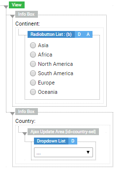
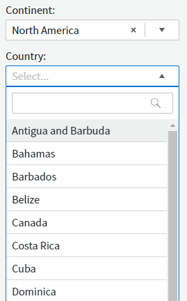
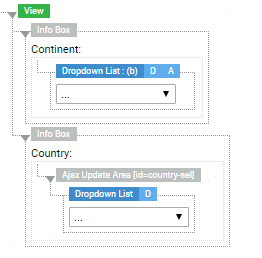
In the example below, the 'Country' Dropdown List depends on the 'Continent' Dropdown List, so that the available countries are pre-filtered based on the selection of the continent.
To create this implementation, follow these steps:
-
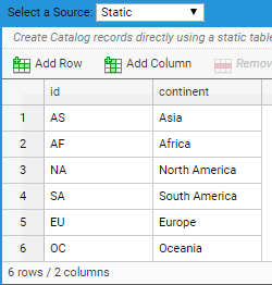
Create a Catalog Business Object containing the list of continents that will be linked to the 'main' dropdown list (see step 3). The Catalog can be named, e.g ' Continents'.
-
Create another Catalog containing a list of each continent's countries to be linked to the 'dependent' dropdown list (see step 3). The Catalog can be named, e.g. 'Countries'. In this Catalog, you must:
- Assign a variable (Variable tab) of type String such as $continentFilter. This is used as a filter variable in the Expression filter (see third bullet point below).
- Add a column containing the continent IDs. The IDs must match the ones contained in the 'Continent' Catalog (see image below).
- Set the Expression filter (Properties tab), which allows you to manipulate records. In this case, set the following Expression (see image below):
Copy
        Record $record;
        Return FILTER($records, $continentFilter == TOSTRING($record.getValue('continent_id')), $record)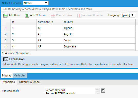
-
Create a Screen containing the Dropdown Lists corresponding to the already-created Catalog Data Sources:
- Define the $selectedContinent variable of type String and scope Local.
- Create the 'Continent' and a 'Country' Dropdown Lists and link them to the 'Continent' and 'Country' Catalogs, respectively, from the Data Source tab.
- For the 'Country' Dropdown List, set the $selectedContinent Expression for the $continentFilter Variable Name from the Variable Assignment tab.
- Bind the 'Continent' Dropdown List to the $selectedContinent variable.
-
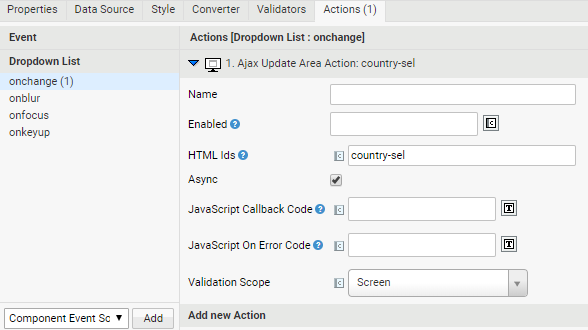
Add an Ajax Update Action to the relevant dropdown list. The main dropdown list, in this case the 'Continent' Dropdown List, is linked to an Ajax update Area Action triggered by an onchange Event, so that it is refreshed when the item selection changes.
-
Insert the Screen into a Process and run it.
-
For lists with a limited number of options, you can easily switch from a Dropdown List to a Radiobutton List (Radiobutton and Radiobutton List Screen Components) from the Screen Editor. The Radiobutton List works with the same binding, Data Source and Actions as the Dropdown List.