Search Field Screen Component
The Search Field component is a text field whose appearance, controls and configuration properties are designed specifically for searching data.
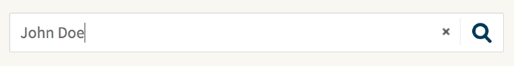
The Search Field component in Workspace (desktop version):
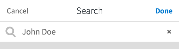
The Search Field component is designed to appear on the page header. This is rendered as an icon on mobile devices. Click the icon to open the Search Field in a full screen popup:

The Search Field popup (mobile version):
Actions
The Search Field component exposes the onsearch action:
- Trigger Condition on a Desktop Device
One of the following conditions:
- The Search Field has focus and the user presses the Enter key.
- The Search Field icon has focus and the user presses the Enter key or the Space key.
- The user ends typing, the property Search When The User Ends Typing is checked, and there are at least three characters in the field (see Properties, below).
- Trigger Condition on a Mobile Device
One of the following conditions:
- The popup is open, the Search Field has focus and the user presses the Enter key.
- The popup is open and the user clicks the Done button.
Properties
Following is a description of the Search Field properties:
- Binding – The variable the component is bound to.
- Placeholder – The text to display in the empty Search Field.
- Search When The User Ends Typing – Whether the Search Field triggers the onsearch action when the user types in the text field, after 500 milliseconds of inactivity.
- Icon On Mobile View – Whether to render the component as an icon on mobile devices. When the user clicks the icon, the search field opens in a full screen popup.
Valid Binding Data Types
The Search Field binding property accepts a variable of type String or SearchFieldContent.
The SearchFieldContent data type can be instantiated programmatically:
SearchFieldContent $s := new SearchFieldContent(‘search text’);
Method: String getValue()Description: Gets the search text.
Search Field Style Business Object
The Search Field Style Business Object has 3 states, besides the Default state:
- Focused
- Disabled
- Error
Styling Properties
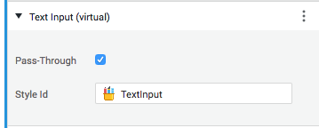
Text Input (virtual)
The Search Field Style Business Object uses the same Text Input virtual component used in the Text Field or in the Password Field Style Business Object:
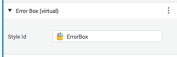
Error Box (virtual)
The error message appearing below the Search Field can be styled through the Error Box virtual component:
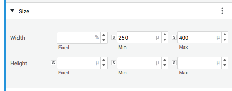
Size
The Size widget allows you to apply size properties to the Search Field:
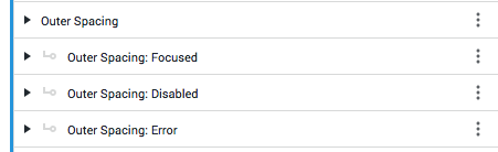
Outer Spacing
The Outer Spacing widget allows you to apply outer spacing properties to all of the Search Field states:
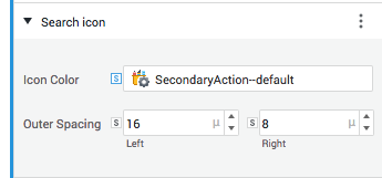
Search icon
The Search icon widget allows you to customize color and outer (horizontal) spacing properties for all of the Search icon states:
Color and outer spacing properties:
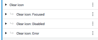
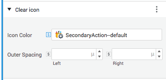
Clear icon
The Clear icon widget allows you to customize color and outer (horizontal) spacing properties for all of the Clear icon states:
Color and outer spacing properties:
Related Links
For design suggestions, see the Search Field section of design.appway.com.