Screen Business Object
Screen Editor
Like all Business Object Editors, the Screen editor is divided into four parts:
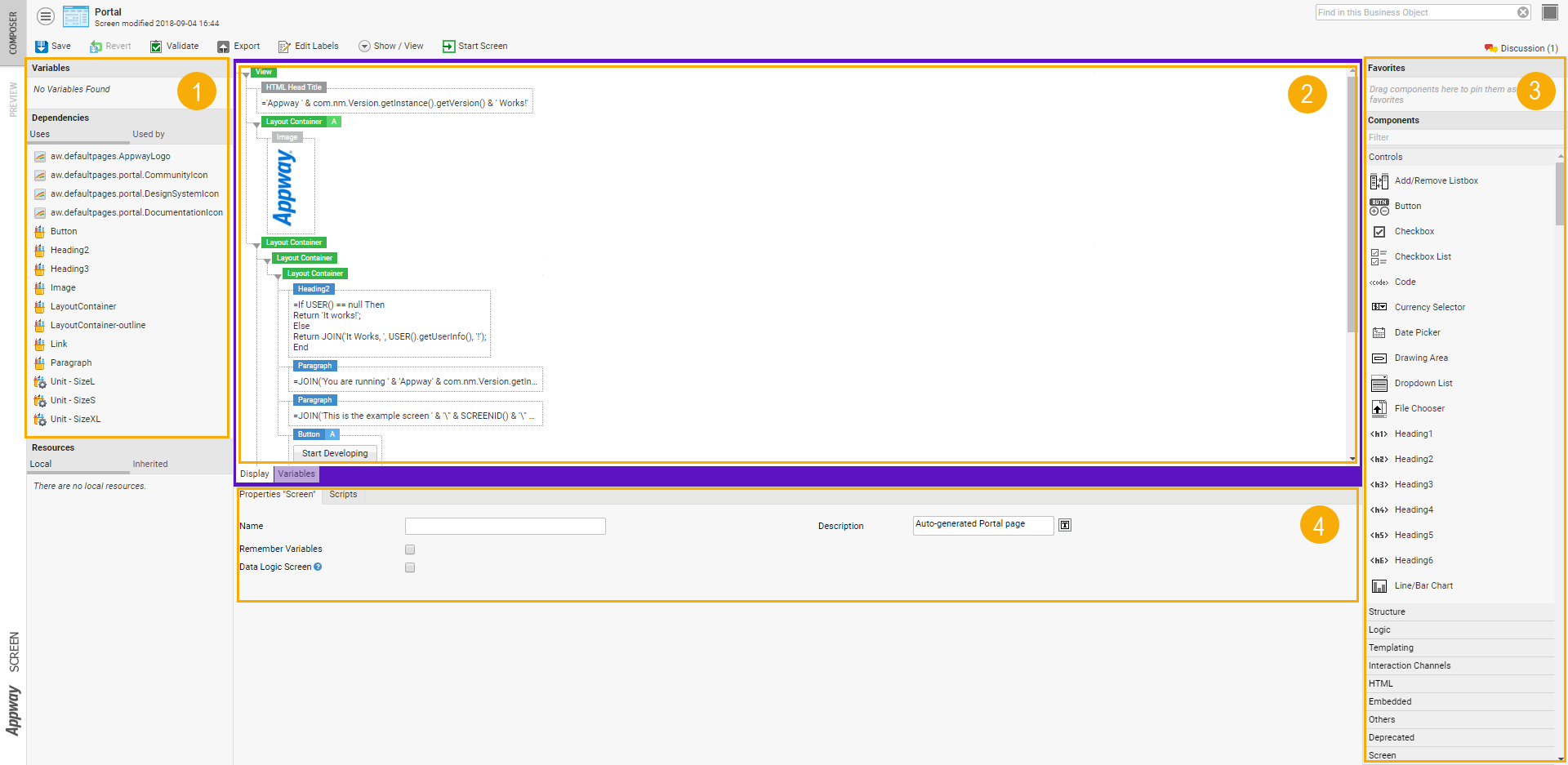
- On the left, you'll find assigned variables and dependencies.
- On the right, the Component Library shows a list of all Components you can use to assemble your Screen.
- The actual Screen is in the center of the editor
- At the bottom, you'll see properties for the currently selected Screen Component or Components. If no Component is selected, the Screen properties are shown.
Resizing Editor Areas
All four areas of the Editor can be resized. Depending on what you are doing, different functions of the editor may be more important to you. Resize areas to suit your current task:
- Move your mouse near the border between different areas.
- As soon as your mouse icon turns to the "resizer" icon, click and drag.
Keyboard Interaction
Selecting Multiple Components
You can select several Screen Components at the same time. To add or remove a Component from the list of selected Components, do the following:
- Hold down the CTRL key
- While keeping the CTRL key pressed, left-click on the Component
Removing Components
In order to remove one or several Components, do the following:
- Select the Component or Components you wish to delete.
- Either right-click on a Component and select Remove Component or Remove Components, or simply hit the Backspace or Delete keys.
Copying Components
To create copies of Components, do the following:
- Select the Component or Components and start dragging them.
- Press the Alt key and keep it pressed.
- Drag the selected Components over a purple drop target which turns blue if the copy action is possible.
- Release the mouse button while the Alt key is still pressed.
Alternatively, you can use the copy and paste functions (Ctrl+C/V or right-click options) to copy Components or some of their Properties.
Screen Properties
Screens, as well as most Screen Components, have a set of Properties. If one or more Components are selected, Component Properties are shown. If no Component is selected, Screen properties are displayed.
General Properties
The General Properties of a Screen correspond to the properties available in the Studio for this Screen object:
- Name – Name of the Screen
- Description – Description for this Screen object
Scripts
There are four special Scripts that can be used to execute arbitrary scripting actions in different phases of the Screen Life Cycle. Use these Scripts to initialize or clean up resources used by the Screen:
- On Load Script – Executed when the Screen is rendered the first time. If the Screen has to be rendered a second time (e.g. because of validation errors), the Script is not executed anymore.
- Before Render Script – Executed directly before the Screen is rendered
- After Process Script – Executed directly after all Screen events have been processed (see Appendix "Screen Life Cycle")
- On Unload Script – Executed after firing a Navigation Action. This will cause the Screenflow Engine to present the next Screen to the user.
Variable Definitions
Variables which are used in a Screen have to be defined in the Variable Definition section. This document will give only a brief overview over Variable Definitions. See Variables and Scopes.
Name
A variable must have a unique name. A variable name must start with a character or with an underscore ("_") and may contain only characters, digits and underscores. Valid variable names are: account, PersonType, user_id, _invoice01 etc. Invalid variable names are: 01ticket, legal-form, account.number etc. Variable names are checked automatically when they are entered and the editor will show an error message if the name is not valid.
When a variable is used in an Expression or a script, the variable name has to be prefixed with a dollar sign "$". However, when the variable is defined, only the variable's name has to be specified. Entering the variable's name with a starting "$" will cause an error message to appear.
Type and Collection Type
Every variable must have a declared type. This information is used in many situations. Based on this information, the Expression Editor can suggest code completion and the system can inspect the Screen and detect outgoing dependencies. A type declaration consists of two parts:
- Base type information
The base type can be a predefined simple data type such as
Boolean,Date,Integer, orString. It can also be a complex data type based on a Data Class defined by the user, e.g.Account,Person, orOrder. - Collection type information
The collection type states if the variable holds only one instance of the base type ('Single Element'), or if the variable holds a collection of instances of the base type. A collection can contain an arbitrary number of instances (including none). There are two types of collections:
- Collection with Indexed Entries This collection type is similar to a list or to an array.
- Collection with Named Entries This collection type is a kind of map, hash, hash table, or associative array. See the documentation about the Script Language for more details.
Inherited, Assigned or Local
If the variable has already been defined in a higher scope and should also be accessed in the Screen, the variable has to be flagged as being inherited. This way, the Screen engine knows that the variable already exists and that it doesn't have to create it.
Conversely, local and assigned variables only exist inside the current Screen.
Default Expression
If there is no Variable Assignment for an assigned variable when the Screen is displayed, or if an inherited variable doesn't exist in a higher scope, or if the variable is local, the default Expression is used to initialize the variable with a value. See Variables and Scopes.
Component Model
The Screen design is based on a Component Model. The elements or 'building blocks' of a Screen are called Components. A Screen may contain Components of many different types, and Components can be nested to create advanced designs. Every Component has a set of properties used to configure its layout and behavior. There are two special groups of Components: Containers and Controls.
Containers Containers are used to nest Components: a Container Component can contain other Components. There are different types of Containers, which are used for different purposes:
- 'Decorative' Containers like Frame, Info Box and Scroll Pane. They are used to change the looks of a Screen
- Layout Containers like Flow Layout and Table; used to arrange Components in a certain order
- Logic Containers like For, For Each and If; used to change the structure of the Screen
Most Containers may contain arbitrary Components including other Containers. But some Containers restrict the types of Components allowed as children:
- A Table may contain only Rows, a Row may contain only Cells
- A Template may contain only Template Areas
- A Portlet may contain only Portlet Areas
An exception to the restriction on Tables and Rows are the Logic Containers like If and For. They may be used inside a Table or a Row to build tables with a dynamic number of rows or columns. However, even Logic Containers can not be used to "violate" the Component content rules. For example, you could not insert a Cell directly into a Table using an If Container.
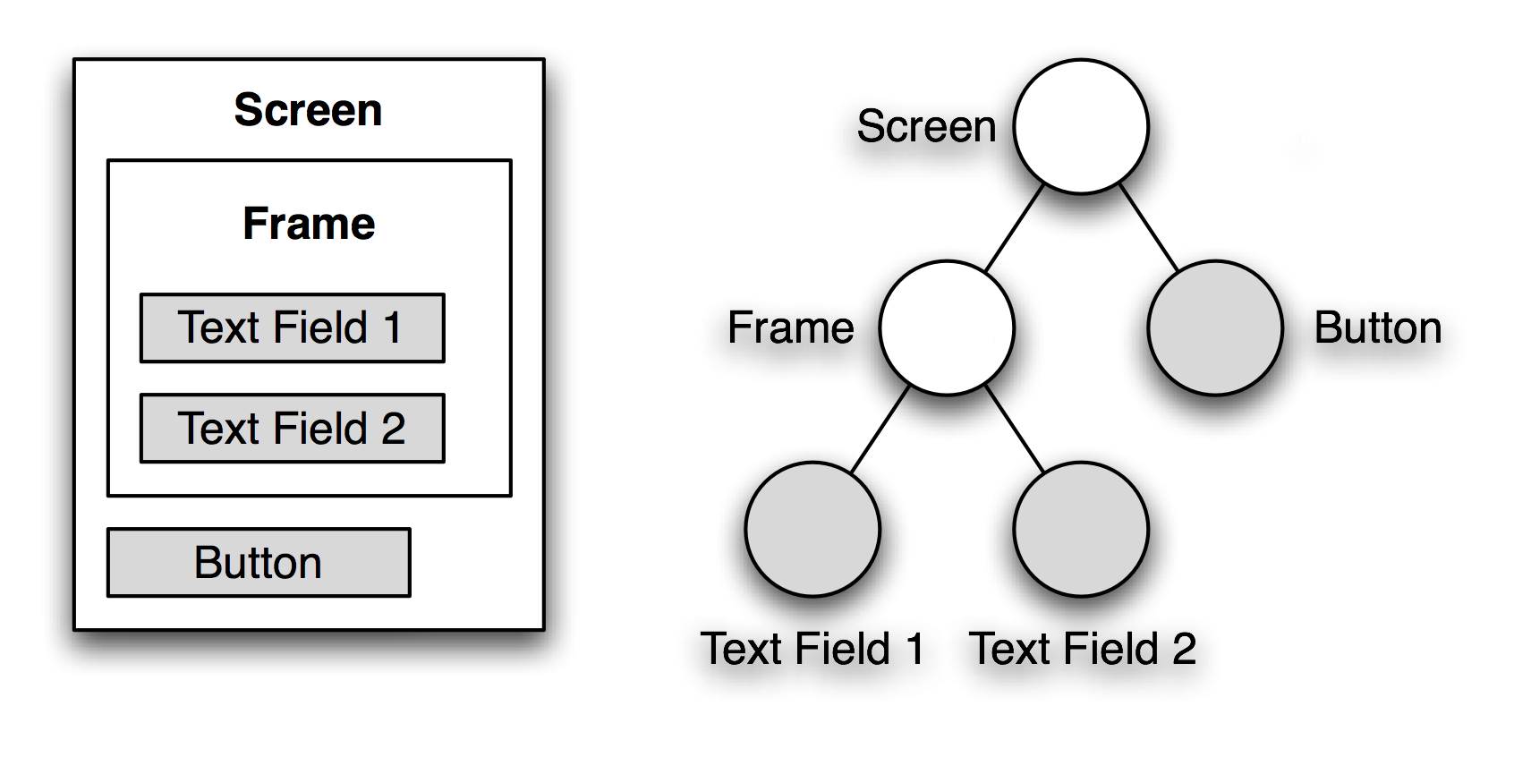
An example Screen containing a Frame (Container), two Text Fields (Controls) and a Button
Controls Controls are Components used to display and change data on the screen. They are the primary Components with which the end user interacts. Typical examples of Controls are: Text Fields, Text Areas, Checkboxes, Dropdown Lists.
These Components can be bound to Properties in the Data Model, and Converters and Validators can be defined on them.
Types of Screen Component
Screen Components are ready-to-use building blocks called for Screens. A Screen can contain nested components of many different types.
Screen Components are classified by type in FNZ Studio Composition:
- Control Screen Components are used to display and change data on the screen.
- Embedded Screen Components are used to embed other content into a Screen.
- HTML Screen Components map to standard HTML elements.
- Logic Screen Components modify the Screen's structure: they can be used to repeat parts of the screen, or to retain parts of the screen.
- Structure Screen Components allow you to build your screen
- Templating Screen Components can be used to achieve a modular Screen structure.
Previewing your Screen
The Screen Editor provides different ways to help you see how your Screen will look and behave when the user interacts with it: the Preview tab and the Start Screen button to render the Screen.
To render your Screen, click on the Start Screen button in the upper toolbar. To render your Screen using Test Data, select the Screen in the Business Object library, and pick the Test Data to use in the right sidebar before selecting the Start Screen button available there.
Other features include: display Screens in different languages and collapse components.
Display Languages
Labels are used to translate your Business Application to different languages. Instead of entering text, use Labels and enter translations for all required languages. See Languages, Labels and Translations.
To enter a Label into a text field, follow these steps:
- Right-click on the Text Field.
- Choose Label from the context menu.
- Start typing the label you're looking for into the Text Field.
- A list of labels matching the text you have entered is displayed. Click on the desired label.
- If the desired label is not displayed, click New and enter the translations. Then, click Add.
- To edit the translations for all the labels you have used in your Screen, click on Edit Labels, available both on the Composer tab, and on the Preview tab.
Collapse Components
The editor view can become unwieldy, containing many nested structures. To get a better overview of how the Screen will look to the end user, while still being able to edit the screen, right-click on a component and select Collapse.
Keyboard Shortcuts
Like all Editors, the Screen Editor provides a number of keyboard shortcuts. Following is a full list of all keyboard commands:
- Alt-F – Focus on the Component List Filter Field
- Ctrl-S – Save the Screen
- Ctrl-A – Select all Components
- Ctrl-W – Close the Screen Editor
- Ctrl-C – Copy the selected Component(s)
- Ctrl-X – Cut (Copy and Delete) the selected Component(s)
- Ctrl-V – Paste the object currently in the Clipboard. If a Component was copied, it will be pasted after the currently selected Component or at the end of the Screen if no Component is selected. If Actions or Styles were copied, they will be added to the selected Components. Use the context menu for more pasting options
- Delete or Backspace – Delete the selected Components
- Holding down Ctrl key while clicking on a Component – Toggle the Component's selection (i.e. add it to the selection if it was unselected, or remove it from the selection if it was selected)
- Holding down Alt key while dropping a Component – Copy the Component instead of moving it
Layout Rules
Component Arrangement
By default, Components within a Container (Frame, Cell, Group etc.) are arranged below each other. Exceptions from this rule are the Flow Layout and the Row. The Components within the Flow Layout Container and the Cells within a Row are positioned side by side. Other exceptions are Components like Template Area or Portlet Area, where the contained Components are not shown at the same time.
Automatic Spacing Rules
In order to generate a nice-looking screen, the Components within a Container get separated from each other by automatically generated Space Components. By default, a Space with a height of 5 pixels is added between the Components. This rule applies only to the space between two child Components, not to the space before the first Component or after the last Component in a Container. Exceptions:
- Components without a visual representation (Script, HTML Head Title, Keyboard Shortcut etc.) are ignored in this process.
- Spacing between Rows inside a Table and between Cells inside a Row is controlled by the Table's properties "Row Spacing" and "Column Spacing."
- Spacing between Components within a Flow Layout is controlled by the Flow Layout's property "Spacing."
There are two mechanisms to modify the automatic spacing rule:
- If a Space Component is added between two Components, no extra Space is added. Therefore adding a Space Component with a height of 0 (zero) pixels will make the two Components stick together as close as possible.
- If a Style property named "spacing" is defined on the Container, the value of this property is used as spacing size instead of the default spacing size of 5 pixels. Setting a Style "spacing" to 0 (zero) or less will deactivate the automatic spacing rules on this Container.
Screen Life Cycle
Phases
See also Screen Phases.
Every call to the server contains a Process Instance Id and a Process Session Id. These two values are used to find the Process Session the user is currently working on. The Process Session contains a Screen Task Token, and this Token contains information about which Screen to present to the user. More information on Process Instances, Sessions and Tokens can be found in the documentation about Processes.
A call from the client to the server is either a Screen Request or a Screen Response. Besides some general Screen processing activities, Screen Requests and Responses will cause the Screen Components to generate HTML code and to execute Server-Side Actions. These activities are executed in four main "Phases": Render Phase, Update Phase, Validate Phase and Process Phase. The Render Phase is executed only for Screen Requests, the other three phases only for Screen Responses.
Components may be nested using Container Components. In every phase, processing starts at the root Component, which is the Screen (remember that the Screen itself is a Container too). Every Container is responsible for processing its child Components. The result of this behavior is that every Component within the Screen is processed. For a Screen Response, this means that all Components first go through the Update Phase. If the Update Phase has finished, all Components go through the Validate Phase. And finally, all Components go through the Process Phase.
An example:
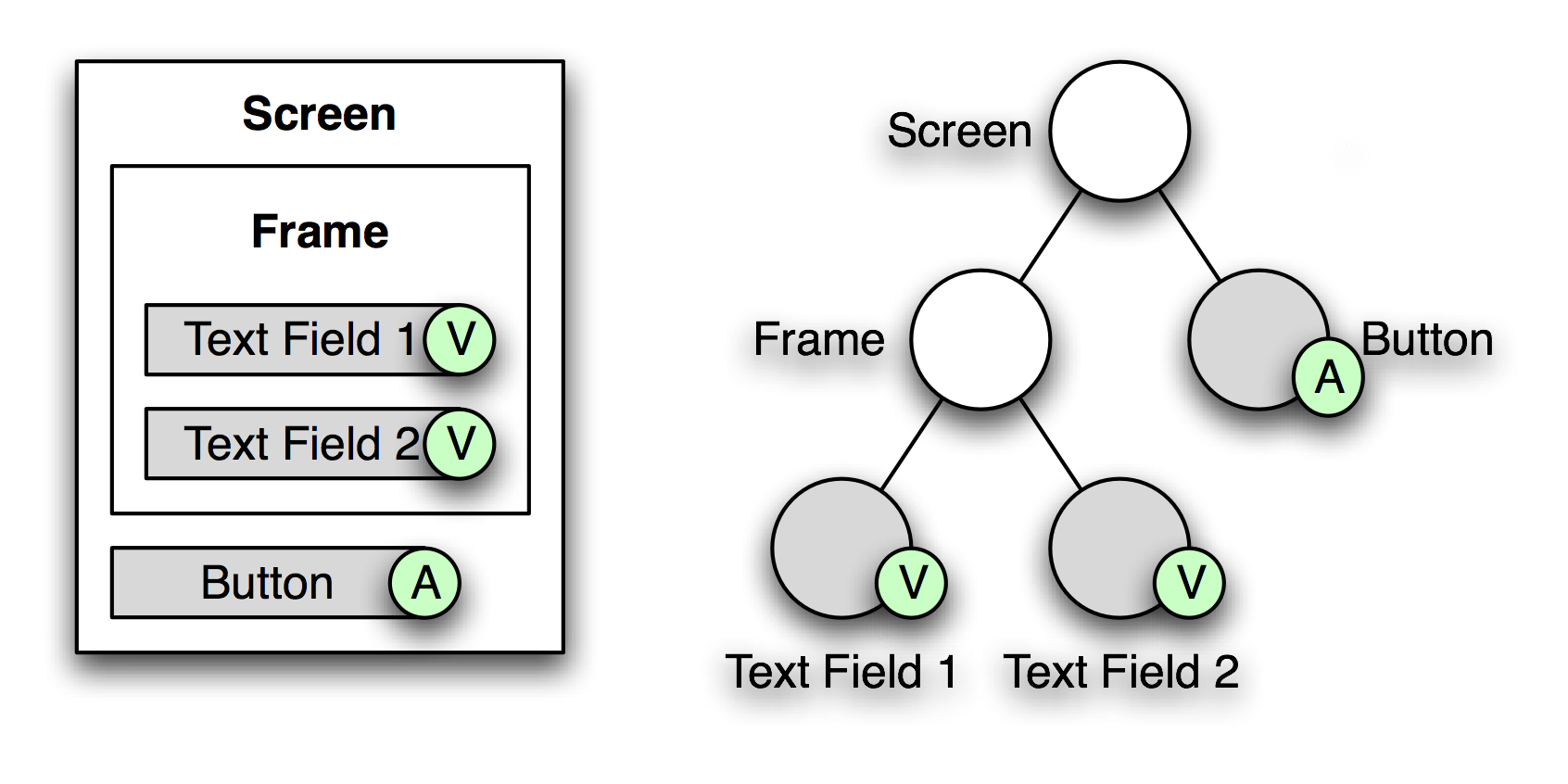
In every phase, processing starts at the root Component (the Screen). The Screen will initiate processing of the Frame and the Button. The Frame will initiate processing of the two Text Fields. Therefore, the Components are processed in the following order: Screen, Frame, Text Field 1, Text Field 2, Button. The markers with the "A" and the "V" indicate that there are Validators and Actions defined on them.
Screen Request
A Screen Request tells the server to render the Screen that is currently "active" in the Process Session. The Process Session is identified by a Process Instance Id and a Process Session Id. When processing a Screen Request, Screen Components have to produce their HTML code and register resources like style sheets or Java Script files in the HTML Head section. This is done in the Render Phase. But before this, some general Screen processing activities have to be executed.
Screen Scripts (Part 1)
Before the Screen is rendered, the Screen's On Load and Before Render Scripts are executed (if they are defined). While the Before Render Script is executed on every Screen Request, the On Load Script is executed only if this is the first Screen Request to this Screen. We will see later that a Screen may be redisplayed multiple times because of validation errors or because no Navigation Action has been triggered. The Screen Service, which is responsible for processing Screen Requests and Screen Responses, is able to detect if a Screen Request is a "reload" and will skip the On Load Script's execution.
The Variables defined by the Screen have already been initialized when the Scripts is executed. Initialization of the Screen's Scope is the Screenflow Engine's responsibility.
Render Phase
The Render Phase is where the HTML output of the Screen is generated. Most Components produce their code by themselves. If a Component is a Container, it usually will cause the child components to render themselves and then aggregate their HTML outputs and integrate them into its own. Because the Screen itself is a Container too, the Screen Service will cause the Screen to render itself and all Components included in the Screen will follow. Besides generating HTML code, Components may also register resources to be included in the HTML Head section or Java Script code to be executed if the HTML is loaded or unloaded. But not all Components will produce HTML code in this phase. The Script Component for instance will simply executed an Expression Script (if its property "Phase" is set to "Always" or "Render"). And not all Containers will render their child Components. The If Component for instance will evaluate its condition and if the result is false , it will omit rendering its child Components. The For Component in contrast might render its child Components multiple times. Controls have an other special task to perform in the Render Phase. They have to evaluate the Binding Expression and convert the resulting model value into an input value which can be displayed on the rendered Screen. HTML code generation is controlled by the HTML Render Kit. Theoretically, Screens could be displayed using other display technologies. The Screen Service is decoupled from the presentation technology. There are some built-in Components which make sense only if HTML is generated (e.g. HTML Head Style). A Render Kit is used to "transform" the component instances into display instances. The HTML Render Kit as one implementation of a Render Kit is used to generate HTML code. But the HTML Render Kit does not produce the HTML code itself. Instead, a Renderer is installed in the HTML Render Kit for every Component: there is a Button Renderer for the Button Component, a Text Field Renderer for the Text Field Component and so on. Whenever the HTML Render Kit is requested to generate HTML code for a given Component, it will search for a registered Renderer for this Component. The Renderer will then produce the HTML code. The HTML Render Kit has two more functions to perform. First, if "hidden mode" is active (a Group component has been used to hide parts of the screen), the HTML Render Kit has to make the generated HTML artifacts invisible. Second, if this is a redisplay of the Screen and the Component currently being rendered generated errors in the previous Screen Response processing (conversion or validation errors), the HTML Render Kit will decorate the Component's HTML code with an error box (a red frame).
Post-Processing
After generating the HTML code for the Screen, some post-processing has to be performed before the output can be sent to the client. First of all, additional Java Script code is generated to place the focus inside the first input control on the HTML page. If this is a redisplay of the Screen and there have been errors in the previous Screen Response processing, the focus is placed inside the first input control that has caused an error. In addition to this, if there are scroll offset restore informations (x and y coordinates), addition Java Script code is generated to scroll to the requested position on the screen. The final step to perform is the screen translation. All Language Label references within the HTML code have to be replaced by their corresponding translated texts. The language to translate into is read from the current user's preferences. If the user has no language preference, the system's default language will be used.
User Interaction
The HTML code is presented to the user by the browser. The user may enter data into the controls or modify existing data. Some interactions may trigger Client-Side Actions. But as soon as the user triggers an Event for which a Server-Side Action is registered, the Screen's data is submitted to the server using a Screen Response.
Screen Response
A Screen Response is used to submit the Screen's data to the server. This data contains the input values of all the Controls on the Screen as well as information about Events triggered by the user. Again, Process Instance Id and Process Session Id get submitted as well to allow the Screen Service to find the active Screen Task and with it, the active Screen. The Screen Response is processed in three main phases: Update, Validate and Process.
If the user has triggered a Skip Phase Action, the Screen Service will not executed the phases defined by the action. The information on which phases should be skipped is contained within the Screen Response sent by the client.
Although Server-Side Actions are executed by default in the Process Phase, the Screen designer may change this behavior by specifying another phase on the Server-Side Action (property "Phase"). If another phase is selected, the Server-Side Action of a Component is executed before all other activities of this Component in this phase are executed. Besides processing of Server-Side Actions, Controls have to process input values and Scripts might have to be executed (depending on their "Phase" property).
Update Phase
In the Update Phase, the input values of the Controls are converted to model values and stored according to the Binding Expression. If a conversion can not be performed (either because there is no Converter or because the input value is not within the allowed range), a Converter Error is generated and saved in the View State. The Converter Error is saved together with the input value and information about the Component.
Validate Phase
In the Validate Phase, all Control model values get validated (if there is a Validator defined on the Control). Keep in mind that the input values have already been saved in the Data Model and can thus be shown to the user. If validation fails, a Validation Error is generated and saved in the Screen State. The Validation Error is saved together with the input value and information about the Control.
Process Phase
The Process Phase is the default phase for the execution of Server-Side Actions. This can be changed by modifying the property "Phase" on the Server-Side Action. Server-Side Actions always get executed in the context of the Component they belong to. While the execution of a Script Action has an immediate effect, Navigation Actions like Process Action and URL Action are collected in the Screen Context for later processing.
Screen Scripts (Part 2)
After the Process Phase has ended, the Screen's After Process Script is executed. Then, the collected Navigation Actions in the Screen Context are analyzed. If there are no errors recorded in the Screen State, the first Navigation Action is selected as the one to be executed. If there has been at least one error, the first Navigation Action with the "Ignore Errors" flag set is selected to be executed. If a Navigation Action has been selected, it means that the current Screen will be left. Therefore the Screen's On Unload Script is executed too.
Post-Processing
The result of the Process Phase is the Navigation Action selected to be executed. If no Navigation Action can be selected but the Screen Task in the Process Model has the "Auto-Submit" property set to "true," a Process Action is auto-generated. The next step is to execute the Navigation Action. There are two types of Navigation Actions: URL Actions and Process Actions.
URL Action Processing
Processing of an URL Action is simple. An HTTP Redirect to the URL configured within the URL Action is sent to the client. If the "Logout" flag is set, the user's HTTP Session is invalidated.
The Screen Task Token within the Process Session is still active after an URL Action has been executed. If the user opens the Workitem again, the Screen that was displayed before the URL Action was triggered, will be displayed again.
Process Action Processing
The Process Action has two properties called "Action Variable" and "Action Value" which are used to distinguish between different Screen outcomes. If the variable denoted by "Action Variable" exists, it will be set to the value denoted by "Action Value." Keep in mind that the variable should be defined on the Process or on the Workflow. If the variable is defined on the Screen itself, it will go out of scope when the Screen is left. If this occurs, the Process Service can not make decisions based on the action variable's value. After the variable has been set, the Process Service is called to update the Process Session. Since the Screen Task Token has completed, the Process Model has to be interpreted to find the next Screen to display to the user. If such a Screen can be found, a small piece of HTML code is generated and sent to the client. This code will cause the client to immediately submit a Screen Request to the server, where a new Screen Life Cycle starts. If the Process Session has ended (the token has reached an End Event in the Process Model), the system checks whether there are other, non-temporary Process Sessions in the same Process Instance. If this is not the case, the whole Process Instance has completed. If the Process Instance has been started because of a Process Task in a Process, the Process Instance will be updated now. After updating the Workflow Instance, the Worklist of the current user will be checked. If there are Workitems of type Process Task coming from this Workflow Instance, a Screen Request for the Screen denoted by this Process Task is generated and sent to the client. From the user's perspective, he will get a seamless transition from one Process Task into the next Process Task. In all other situations, the Complete Action defined in the Window State is executed. These situations include:
- Process Instance has not completed (there are other, non-temporary Process Sessions in the Process Instance)
- Process Instance has completed but is a standalone Process Instance (has not been started by a Process Task in a Workflow)
- Process Instance has completed and has been started by a Process Task, but there are no more Workitems for the current user in this Workflow Instance or the Workflow Instance has completed itself
There are three different Complete Action types:
- "Show Portal" will display the Portal. Actually, it will generate an anonymous Process Instance based on the Process with the id "Portal" and then display the first Screen of this Process.
- "Show URL..." will send an HTTP Redirect to the location specified by the Complete Action Parameter to the client.
- "Close Window" will send a small piece of HTML and Java Script code to the client, causing the browser to close the current window.
Complete Actions get saved in the Window State when a Display Workflow Action, a Display Process Action or a Display Workitem Action is executed, or when a Workflow Include, Process Include or Workitem Include Component is embedded within a Screen. All these Actions and Components allow the definition of a Complete Action that is executed when the system "doesn't know where to go or what to display next." If no Complete Action is defined, the Portal is displayed.
Screen Context, Screen State and Window State
There are three special structures used to store information during Screen processing. A new Screen Context is created for every incoming Screen Request or Screen Response. Beside some internal functions, it is used to collect Navigation Actions triggered during Screen Response processing. Whenever a Navigation Action like a URL Action or a Process Action is triggered, it is added to the list of Navigation Actions in the Screen Context. When Screen Response processing has finished, the collected Navigation Actions will be used to determine which Screen to present to the user next. Screen State and Window State can be used by Components to save information. While the Screen Context is dropped at the end of Screen Request or Response processing, the Screen State is kept for the whole Screen Life Cycle. Components can use the Screen State to remember state information. An example of this is the Portlet Component. The Portlet has an icon in the title bar to minimize the Portlet's visible area. Whether or not the Portlet is currently minimized is stored in the Screen State. The Portlet Renderer will check the Screen State and render the Portlet in the requested mode. The Window State is very similar to the Screen State. It is not dropped at the end of a Screen Life Cycle like the Screen State, but is kept as long as the current window is open. Both Screen State and Window State are used for system specific purposes as well. The Screen Service uses the Screen State to collect Converter and Validator Errors during the Update and Validate Phase, and the Window State is used to save the Complete Action to be performed at the end of a Process Session. Screen State and Window State are not saved on the server side (e.g. in the user's HTTP Session). Instead, they are serialized, base64-encoded and appended as hidden fields to the HTML output generated by the Screen Service. Therefore the sizes of the Screen State and Window State have a direct impact on the amount of data transmitted between the client and the server.
Special Screens
The Login page and the Error page are implemented as Java Server Pages by default. However, in order to change their appearance and make them comply to a given layout, both pages can be implemented using Screens and Screen Components. But there are some special rules that apply to these Screens.
Both Screens have to be activated explicitly. This is done by registering them in the Configuration. The properties nm.login.screen and nm.errorpage.screen are undefined by default. To activate a special Screen, set the corresponding configuration property to the Screen's Id.
Example:
nm.login.screen = MyLoginScreen
nm.errorpage.screen = MyErrorPageScreen
Login Screen
A "Login on Enter" mechanism can be implemented using a Keyboard Shortcut Component for the Enter key with a Java Script Action containing the code "exec()".
Instead of the HTML Text Field and HTML Password Field, other plain HTML Components may be used as well, as long as the names will remain the same.
But be careful. If the Login Screen is not properly defined, you may not be able to login anymore. If this happens, follow the steps below to unregister the Login Screen:
- Stop the web application (or shut down the application server)
- Edit the configuration files by hand. Depending on the section the configuration has been made in, one of the following files has to be changed:
$NM_DATA_HOME/conf/conf.propertiesor$NM_DATA_HOME/content/content.properties. Remove (or comment out) the line withnm.login.screen. - Start the web application. The default Login page should be displayed
Custom Login Screen with an Error Message
When using a custom login page based on a 'Screen' Business Object, it is possible to create an error message which is displayed to the user if the login fails (e.g. the user enters a wrong username or password).
Follow these steps:
- Open the Screen used as login page.
- Add a new variable
$errorof the typeBooleanwith the mode Inherited to the Screen. - Add an If container to your Screen with a condition set to
$errorso that its content is rendered only if there has been a login error. - Add other components (e.g., texts) into the If container to design your error message.
- Save and commit the Screen.
- Test it.
Note: This functionality is not supported for the default login page.
Error Page Screen
The Error page is displayed whenever an error occurs that cannot be handled by the application. Such an error might be technical (not enough memory or disk space, access denied, etc.) or it may be caused by a design error (syntax error in Expression, forward to a non-existing screen etc.). The Error Page Screen gets information about the error and its reason through several variables: Error Page Screen Variables are:
$id– The error id (every error gets a unique id)$code– By default, the HTTP Response Code is used for this variable. Examples: "404" for "File not found", "403" for "Access denied" or "500" for "Internal Server Error"$title– The error code plus a human readable text description (e.g. "404 - File not found")$url– The URL of the location the error occurred at (e.g./workspace/public)$reason– This variable contains additional information about the error (e.g. exception type and message)$information– An instance of the Java classcom.nm.filter.ErrorFilter.ErrorInformationwith runtime information collected at the moment the error occurred: request parameters and attributes, session attributes, stack traces etc.
In order to use this information on the Error Page Screen, define the variables listed above in the Variable Definition section of the Screen. All variables should be of type String, except $information which should be of type Any. All variables must have the inherited flag set to inherit the variables from the calling scope.
The data in $information can be accessed using the Expression Language:
$information.getSessionAttributes().get("user.id");
$information.getRequestParameters().get("param1");
$information.getExceptionInformation().getClassName();
...
Instead of designing a complex screen to display the data from $information, a predefined Java Server Page can be called to show this technical information. The following URL can be used to link to this page: /errors/details.jsp?id=<ID> where <ID> has to be replaced with the error id. You can either create a Link or a Button to open this URL in a new window, or you can include this URL directly using a Web Include Component. The URL can be constructed as follows: JOIN('/errors/details.jsp?id=',$id)
Admin Render Mode
When you see rendered Screens, it can sometimes be hard to figure out where different parts of a rendered Screen are coming from, especially if you use many nested templates. To help you find out how a Screen is rendered, FNZ Studio can render Screens in an "Admin Mode." You can activate this mode in the Screen editor's preview mode by clicking on "Admin Mode," or you can activate it in the Workspace by appending "?adminMode=true" to the current address in your Browser.
Note that you need to be signed in as an Administrator in order to activate Admin Mode.
While you're in Admin Mode, you'll see the following information:
- The name of Includes, Templates and Placeholders as well as borders indicating their scope
- The time used to render individual elements (use this to find out where to add Cache Components)
- The approximate size of individual elements' HTML code
While you're in Admin Mode, you can click on the borders to either collapse them, or open their respective Screens in the Screen Editor. In addition to the aforementioned ways of enabling Admin Mode, you can also
- Set the HTTP session attribute "adminMode" to "true"
- Set an HTTP cookie with the name "adminMode" and the value "true"
- Set an user preference with the name "adminMode" and the value "true"