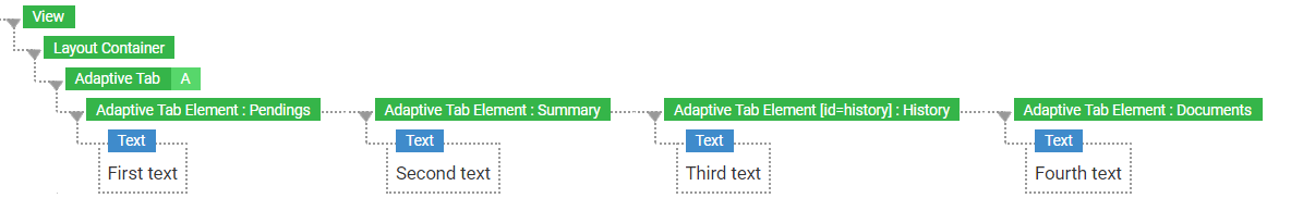
Adaptive Tab Screen Component
Introduction
The Adaptive Tab Screen Component helps provide access to information and metadata when space on a Screen is not readily available. For example, it can be used to show different types of information in a sidebar.
When you drag an Adaptive Tab Screen Component to your Screen, two Adaptive Tab Elements Screen Components are automatically added. You can add as many Adaptive Tab Elements as required, as well as other components.
Use the Adaptive Tab only to organize informational content, not to organize forms or interactive content.
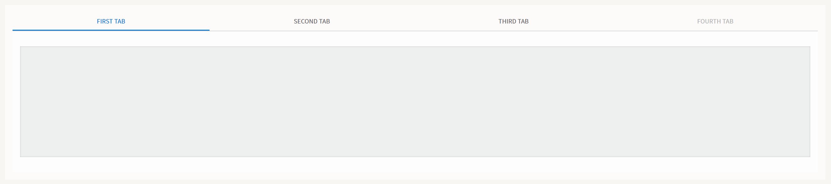
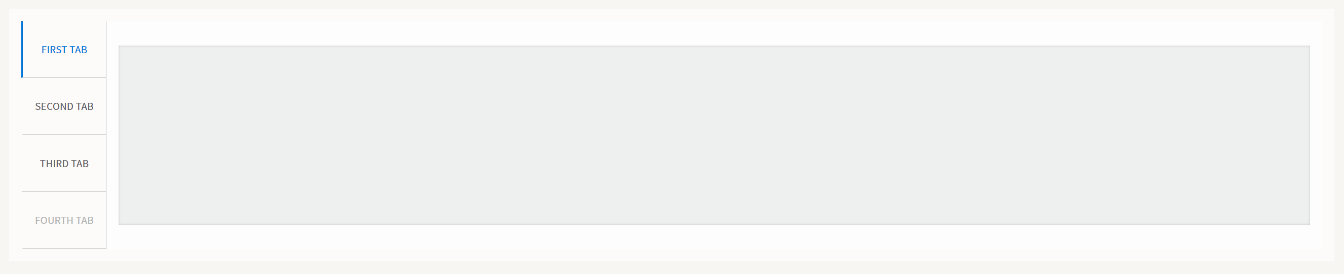
According to their configuration, tabs can be set to appear on top, above the content, or to the left of the content, as illustrated below:
The Adaptive Tab component automatically adapts to screen size and space available. Content adjusts to the height and width of the browser window.
When tab names can no longer be rendered properly due to lack of space, the component adjusts the tabs accordingly: all tabs collapse under the uppermost tab. The uppermost tab then appears above the content, across the width of the Screen. This uppermost tab has an icon indicating that further tabs are available.
- If tabs are displayed horizontally, adaptation occurs once window or screen dimensions no longer allow all tab names to appear in full.
- If tabs are displayed vertically, adaptation occurs once window or screen dimensions no longer allow content to be displayed at a reasonable width.
Properties
Adaptive Tab
Properties:
- Selected Tab — Determines which Adaptive Tab Element is displayed to users first. Enter the HTML ID of the chosen Adaptive tab Element. The property can be dynamically defined through an expression.
- Tab Position — Set where the tabs are displayed in relation to the content:
- Choose Top to display the tabs above the content.
- Choose Left to display the tabs to the left of the content.
Adaptive Tab Element
Each Adaptive Tab Element is a container component and corresponds to a tab displayed in the Workspace.
- Tab Name — The text used as the label for the tab.
- Disabled — Checkbox to disable the tab. Disabled tabs are greyed out and not clickable.
You can use script expressions to assign permissions to certain users, groups or roles to allow them to view disabled tabs.
- HTML Id — The HTML ID of the element. The Adaptive Tab component uses the HTML ID to preselect the tab to display when the browser window opens.
Adaptive Tab Style Business Object
Styling Properties
- Tab Entries Popup Trigger — Sets the icon (type, color and spacing) that is displayed when the component is in compact mode and that allows displaying the popup.
- Background — Sets the background color for the entire Adaptive Tab area.
- Border — Sets the color, thickness and type of line (dotted, dashed, and so on) for the Adaptive Tab area borders. It also sets border roundings. See also the Property Connectors section.
- Border Tab Content Area — Sets the color, thickness and type of line (dotted, dashed, and so on) for the border between the tab bar and the actual tab content area. It also sets border roundings. See also the Property Connectors section.
- Outer Spacing — Sets the space between the Adaptive Tab area and the component around it.
- Tab Entries Popup (virtual) — Refers to a Popup (virtual) Style Business Object to set the popup that is displayed when the component is in compact-view mode (only the Selected Tab is visible and all the others tabs are moved to the popup).
- Adaptive Tab Entry (virtual) — Refers to an Adaptive Tab Entry (virtual) Style Business Object to define the style of single entry in the tab bar.
Adaptive Tab Entry (virtual) Style Business Object
States
The Adaptive Tab Entry (virtual) Style Business Object can have these different states (apart from the Default one):
- Hover — Style of the Tab Entry when hovered.
- Selected — Style of the Tab Entry when selected.
- Disabled — Style of the Tab Entry when disabled.
Styling Properties
- Background — Sets the background color for the single Tab Entry for all its different states.
- Border — Styles the border of the single Tab Entry for all its different states.
- Cursor — Sets the style of the cursor (text, pointer, and so on) used by the single Tab Entry in all its different states.
- Inner Spacing — Sets the space between the title label inside the Tab Entry and the border.
- Tab Entry Text — Refers to a Text Style Business Object to define the style of the title label of the Tab Entry.
Actions
The Adaptive Tab Screen Component triggers a specific Screen Event: ontabclick — The event is triggered when you click on a Tab Entry.
Usage
Following are some best practices to get the most out of the Adaptive Tab component:
-
Avoid using tabs to organize informational content only. We recommend never using tabs to organize forms or interactive content. In particular, tabs should not be used to hide form fields. Instead of using tabs, you can use Groups that are shown below each other for the following reasons:
- Having forms that span over a large vertical area is perfectly acceptable.
- While filling in a form, it is easier for users to scroll through a form from top to bottom than to switch between different tabs.
- Tabs can hide validation errors.
-
Consider splitting the content across multiple screens. All tab content loads at runtime, therefore, inserting a lot of content in multiple tab elements can cause performance issues.
-
Avoid inserting fields for validation inside an Adaptive Tab Element: validation on invisible content is hard for users to track.
-
Avoid inserting important content, or a navigation menu, inside a tab: important content should always be visible.
-
Avoid nesting an Adaptive Tab inside another Adaptive Tab component as this leads to confusing user interfaces.
Related Links
See the Adaptive tab section in design.appway.com for design suggestions.