File Chooser
Introduction to the File Chooser
The File Chooser Screen Component is a Control component used to create a file upload area in Appway Screens.
This component consists of a drop/upload area where the Workspace user can drag and drop one or more files to be uploaded, or browse for them through a specific action that can be executed, e.g. when clicking on a button. Moreover, the progress of file upload can be checked through a Progress Bar.
Note: Multiple file uploads are restricted to photos on mobile browsers with some mobile operating systems, other file types need to be uploaded one by one.
The Actions and Events provided by the component are designed to support solution-level customization to achieve advanced capabilities. Moreover, it provides the same styling capabilities as the Layout Container, in addition to styling features specific to the component.
Client-side validation can be set for media types and file size. Additional server-side validation can be implemented in the solution through Appway Scripts and Actions.
The component introduces and uses the Unsaved Changes Notifier, an Appway safety mechanism that notifies the Workspace user of any destructive action happening on the Screen while an upload process is in progress.
File Chooser Properties, Style and Actions
The following images illustrate a basic example of a File Chooser Screen Component. For more information, see the File Chooser Configuration: Guidelines section.
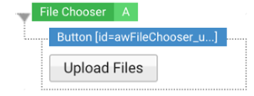
File Chooser: Composer Mode in Studio. When you drag a File Chooser Screen Component into a Screen, this comes with a Button component preconfigured to use the File Chooser capabilities.

File Chooser: Preview Mode in Studio
Properties Tab
- Allowed Media Types – This field allows you to select the Catalog Business Object containing the list of media types you want to allow for upload. Examples of media types (formerly known as mime-types) are image/png, application/pdf, or text/csv.
- Column – Once the Catalog has been selected, this dropdown list displays the names of its column headers. Select the name of the column that contains the list of media types.
- Max File Size – Validation field where you enter the maximum size (integer value) allowed for each single file. You can specify a file size among KB, MB (default value), and GB.
Properties Configuration Notes
- Catalogs must have already been created, as they cannot be changed at runtime.
- Placeholders for Media Types are also supported in Catalogs, e.g. image/* allows all image types, while */* allows any type of file.
- If no Catalog is set in the Allowed Media Types field, all types of files are allowed for upload.
- If a Catalog is set in the Allowed Media Types field, but the Column field is not set, the Column value is non existing or it does not contain a correct media type, no file is accepted for upload and a validation error is raised.
- If the file upload session contains multiple files and at least one of them does not meet the constraints set in the Allowed Media Types or Max File Size fields, the whole session is stopped and a validation error is raised.
Layout Tab
The File Chooser is a container component with the same layout capabilities as the Layout Container. See the Layout Container configuration section for complete information.
Style Tab
File Chooser Style Business Object
File Chooser States
The File Chooser Style Business Object has two states apart from the Default one:
- Disabled – State of the component when it is included in a disabled Group.
- Drag – State of the component when you are dragging a file in the browser window, but not yet over the drop/upload area.
- Drop – State of the component when you are dragging a file over the drop/upload area.
File Chooser Styling Properties
These are the properties that allow customizing the File Chooser component:
- Drop Area Icon – Sets the icon that is displayed when the user hovers over the file drop/upload area.
- Background – Sets the background color for the container.
- Border – Sets the color, thickness and type of line (dotted, dashed, and so on) for the container (available for the Drag and Drop states).
- Drag Overlay Background – Sets the background color of the overlay that is displayed when the component is in Drag state (the file has been dragged on the browser window but not yet over the drop/upload area).
- Drop Overlay Background – Sets the background color of the overlay that is displayed when the component is in Drop state (the file has been dragged over the drop/upload area but not dropped yet).
- Size – Sets both the width and height of the container.
- Inner Spacing – Defines the space between the element inside the container itself and the border.
- Outer Spacing – Defines the space between the element outside the container itself and the border.
- Progress Popup (virtual) – Refers to the Progress Popup (virtual) Style Business Object that syles the popup message that is displayed when the uploading phase starts. See the Progress Popup section for complete information.
- Modal Popup Unsaved Changes (virtual) – Refers to the Modal Popup Unsaved Changes (virtual) Style Business Object that styles the popup message that is displayed when a destructive action is performed on the Screen. See the Modal Popup section for complete information.
Progress Popup (virtual) Style Business Object
The Progress Popup defines the style of the popup that is displayed as soon as the uploading phase starts.
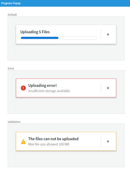
The Progress Popup has two states apart from the Default one:
- Validation – Displays a warning message, e.g. when a file cannot be uploaded (see the full list of messages).
- Error – Displays an error message, e.g. when the permanent storage location is full or the connection is down (see the full list of messages).
The Progress Popup has the following styling properties:
- Background – Sets the color for the whole Progress Popup component.
- Border – Sets the border for the whole Progress Popup component.
- Discard Popup Icon – Defines the icon (button) that allows closing the popup. Note it is mandatory to set an icon.
- Popup Type Icon – Defines the icon that determines the type of popup (warning or error). Note it is not mandatory to set an icon.
- Shadow (only for the Default state) – Sets the shadow for the whole Progress Popup component.
- Size (only for the Default state) – Sets both the width and height of the container.
- Inner Spacing (only for the Default state) – Sets the space between the border and the loading bar.
- Progress Bar (only for the Default state) – Refers to the Progress Bar (virtual) style Business Object to define the style of the progress bar. See the Progress Bar section for complete information.
- Title Text – Sets the style of the main text displayed on the popup (e.g. a summary sentence for the action being performed, like 'Uploading n files' or for the error or warning like ‘Uploading Error’).
- Supporting Text – Sets the style of the secondary text displayed on the popup (e.g. the reason for the error or warning).
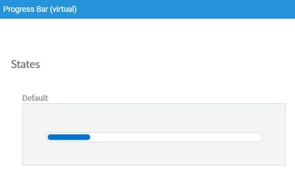
Progress Bar (virtual) Style Business Object
The Progress Bar defines the style of the file upload progress bar.
The Progress Bar styling properties are:
- Background – Sets the color of the whole Progress Bar component.
- Bar Background – Sets the color of the loading bar. This color should be different from the background color.
- Border – Sets the border for the whole Progress Bar component.
- Inner Spacing – Sets the space between the border and the loading bar.
- Outer Spacing – Sets the space between the Progress Bar component and the elements around it.
Modal Popup - Unsaved Changes (Virtual) Style Business Object
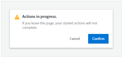
The Modal Popup – Unsaved Changes (Virtual) Style Business Object defines the style of the warning popup that is displayed when a destructive action is performed on the File Chooser component, e.g. the Screen is refreshed while files are still being uploaded.
The Modal Popup has the following styling properties:
- Popup Type Icon – Defines the type of icon. Note it is not mandatory to set an icon.
- Background – Sets the color for the whole Modal Popup component.
- Border – Sets the border for the whole Modal Popup component.
- Shadow – Sets the shadow for the whole Modal Popup component.
- Size – Sets both the width and height of the container.
- Inner Spacing – Sets the space between the border and the actual popup.
- Confirm Button – Refers to a Button style Business Object to set the style of the button that confirms the action being performed.
- Cancel Button – Refers to a Button style Business Object to set the style of the button that cancels the action being performed.
- Title Text – Sets the style of the main text displayed on the popup (e.g. a summary sentence for the action being performed, like 'Actions in progress’).
- Supporting Text – Sets the style of the secondary text displayed on the popup (e.g. 'If you leave this page, changes will not be saved).
For more information on Virtual Style Business Objects, see the related article.
Actions Tab
The File Chooser Screen Component provides Actions and Events designed to handle multiple file uploads and to provide solution-level customization of the component itself.
Events
The following event on the File Chooser component can trigger Actions on the Screen:
- onfilesuploaded – The event is triggered once an upload session is completed (e.g. once all the files dragged into the container at the same time are uploaded). This event allows you to perform an action related to the files being uploaded, e.g. save them in the desired permanent storage location or update an Ajax Update Area showing the list of uploaded files.
Actions
The following actions are specific to the File Chooser Screen Component:
- Open Upload Dialog – Opens the file upload dialog provided by your Operating System where you can select the files to be uploaded.
- Save File Script Action – Script Action that can be used to save the files uploaded to a permanent storage location (e.g. a Cluster File). Unlike other Script Actions, the Script in this action provides an implicit variable called $uploadedFiles of type IndexedHttpFileUpload . The implicit variable contains the reference to the permanent storage location of the files being uploaded during that session.
For more information on Action configuration, see the Action Configuration Notes section.
File Chooser Configuration: Guidelines
The example illustrated in the images below is a sample use case of the File Chooser Screen Component. The implementation described here creates a drop/upload area containing a Button to upload files.
When you drag a File Chooser Screen Component into a Screen, this comes with a Button component preconfigured to use the File Chooser capabilities. The Button has an auto-generated HTML ID, and the File Chooser is listening to its onclick event to open the Operating System File Browser Dialog. This is one of the simplest configurations of the component, and it is already provided by default. However, you can change it based on your specific requirements.
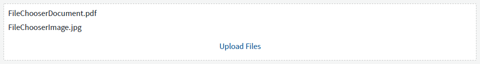
The files being uploaded are saved as Cluster files and listed as links in the drop/upload area.
File Chooser Configuration Example: Composer Mode in Studio

File Chooser Configuration Example: Preview Mode in Studio
Action Configuration Notes
Following is some information you need to take into account when configuring the Actions for the File Chooser Screen Component.
Save File Script Action
The Save File Script Action is used to execute tasks like reading the file content or copying it to a different location.
- If a file is selected for upload, a new directory under
$DATA_HOME/work/tmpis created. The content of the file is stored in this directory asfile.datand additional information like content type and original file name is stored in a Java Properties file calledfile.dat.propertiesin the same directory. The absolute path tofile.datis stored in the Data Property bound to this Component. - Files within the directory
$DATA_HOME/work/tmpare by default automatically deleted if they have not been modified in the last 24 hours. - In a clustered environment, it is necessary to move the file to a shared location (among the nodes). Otherwise, the files can be cleared after 24 hours.
Here is an example for a File Chooser component bound to a variable named $uploadedFiles. This Script moves the uploaded file to a new location within the file system.
ForEach HttpFileUpload $fileToUpload In $uploadedFiles Do

   If $fileToUpload != null Then

      If FILEEXISTS($fileToUpload.filePath) Then

         // Define the destination directory and file name

         String $destinationPath := 'FileChooserDemo/' & FILENAME($fileToUpload.originalFileName);

         COPYFILE($fileToUpload.filePath, $destinationPath);

         // Create a LocalFile instance referencinf the newly copied file

         LocalFile $localFile := NewObject(LocalFile, $destinationPath);

         // Remove the temporary HttpFileUpload file

         DELETEFILE($fileToUpload.filePath);

         // Add the LocalFile to some, pre-exising, Indexed List of LocalFiles

         $localFileCollection.addElement($localFile);

      End

   End

End
Open Upload Dialog Action
The File Chooser contains a Button component that is declared as an Event Source. The event associated with the Button is the onclick event, which triggers the Open Upload Dialog Action.
Ajax Update Area Action
The onfilesuploaded event on the File Chooser triggers the Ajax Update Action that displays the uploaded files in an Ajax Update Area on the page. For this reason, you need to add an Ajax Update Area Screen Component to the File Chooser container.
Unsaved Changes Notifier for Actions/Events
The Unsaved Changes Notifier is a mechanism that triggers a warning before executing any action that could possibly cause any active File Chooser component to be destroyed. Possible destructive actions are:
- A page is unloaded due to user actions such as a reloading, or changing a page.
- The File Chooser is a descendant of an Ajax Update Area that is being updated.
In such case a warning message is displayed and the user can decide whether to cancel or continue the process. For information on specific warning messages, see the full list of messages).
Unsaved Changes Notifier Example:
If the following conditions apply:
- You have two pending uploads (Upload1 and Upload2) for a File Chooser component.
- Upload1 finishes and there is a list of actions associated with the onFilesUploaded event.
- One of these actions (e.g. a Process Action) causes the destruction of the File Chooser.
Then:
- A warning is displayed with two options (at this time, none of the actions in the list has been executed yet):
- Cancel: Discards the whole list of action and Upload2 proceeds. The onFilesUploaded event for Upload1 is not triggered again. All the files associated with Upload1 are lost.
- Continue: Proceeds by executing the list of actions. The files related with Upload1 are processed correctly while Upload2 is discarded.
File Chooser Labels
The File Chooser Screen Component is associated with some specific Labels used in validation (warning) and error messages:
- The file(s) cannot be uploaded [aw.FileChooser.warningTitle]: (One or more of the) file(s) being uploaded exceed the maximum allowed size or (one or more) files belong to a file type that is not allowed. A warning message is displayed.
- The file type is not allowed [aw.FileChooser.warningFileType]: The file being uploaded belongs to a file type that is not allowed. A warning message is displayed.
- One or more file types are not allowed [aw.FileChooser.warningFilesType]: One or more of the files being uploaded belong to a file type that is not allowed. A warning message is displayed.
- The file size exceeds the maximum allowed size [aw.FileChooser.warningFileSize]: The file being uploaded exceeds the maximum size. A warning message is displayed.
- One or more file sizes exceed the maximum allowed size [aw.FileChooser.warningFilesSize]: One or more of the files being uploaded exceed the maximum allowed size. A warning message is displayed.
- Running upload(s) canceled [aw.FileChooser.errorTitle]: The connection is interrupted or the permanent storage location is full while one or more files are being uploaded. The uploading process is killed and an error message is displayed.
- Your running uploads have been canceled due to an error [aw.FileChooser.errorSupportingText]: One or more files are being uploaded but an error occurs (the permanent storage location is full or the connection is interrupted). The uploading process is killed and an error message is displayed.
- Actions in progress [aw.UnsavedChangesPopup.title]: An action reloads a page while the uploading process is not complete. An ‘Unsaved Changes’ popup message is displayed.
- If you leave this page, your started actions will not complete [aw.UnsavedChangesPopup.supportingText]: An action reloads a page while the uploading process is not complete. An ‘Unsaved Changes’ popup message is displayed.
File Chooser Example: Step-by-Step Configuration
The following example illustrates the steps to create and configure a Screen containing a basic File Chooser that meets the following requirements:
- It uploads multiple files
Note: Multiple file uploads are restricted to photos on mobile browsers with some mobile operating systems, other file types need to be uploaded one by one.
- The files that can be uploaded are: images and PDFs
- It displays the names of the uploaded files
The figure below represents the File Chooser component we want to implement in our Screen:
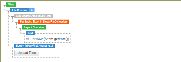
1.Declare Screen variable
-
Drag a File Chooser Screen Component onto the Screen. The component comes with a pre-configured Button.
-
At the Screen level, declare the variable
$localFileCollection, of type LocalFile, Collection Type Indexed Elements, Scope Assigned.
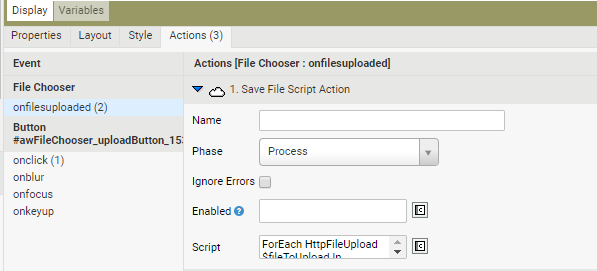
2.Set Actions for the File Chooser
- For the File Chooser Screen Component, set the following:
- Event: onfilesuploadedevent
- Action: Save File Script Action. In the Script field, enter the script that saves the uploaded files in the backend (see the Save File Script Action section for more information).
- The Button acts as an Event Source for the File Chooser and is preconfigured as follows:
- Event: onclick
- Action: Open Upload Dialog. This opens the file upload dialog provided by your Operating System (see the Open Upload Dialog article section for more information).
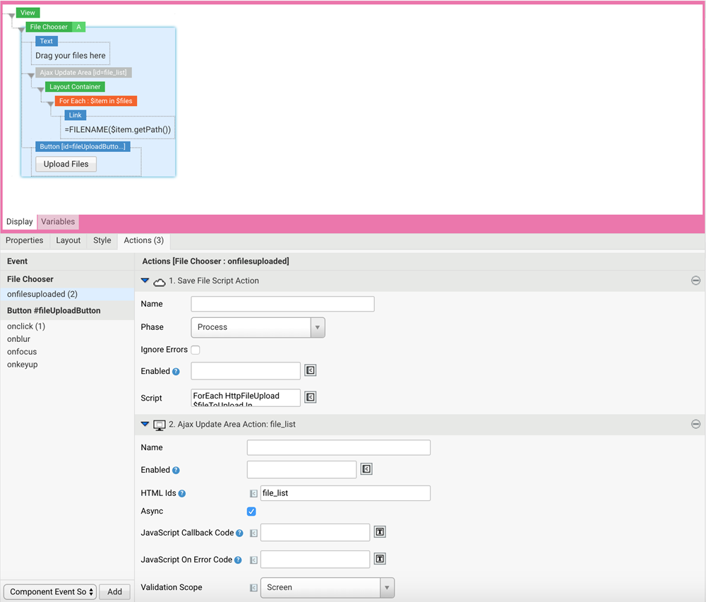
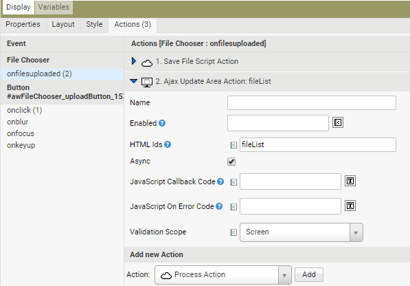
3.Add an Ajax Update Area to show information about the uploaded files To show information on the uploaded files (number of uploaded files, names of the uploaded files and so on), you need an Ajax Update Area that is updated whenever files are uploaded. In this example, we add an Ajax Update Area to show the name/s of the uploaded file/s (see the Ajax Update Area Action section for more information).
-
Drag an Ajax Update Area Screen Component onto the Screen. On the Properties tab, fill in the HTML Id field for the Ajax Update Area Screen Component (in our example, the HTML ID is fileList).
-
In the File Chooser Actions tab, configure the Ajax Update Area Action that triggers a refresh of the Ajax Update Area on the page as in the figure below:
-
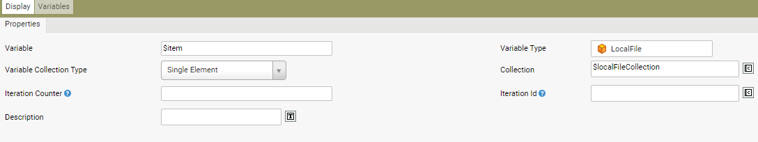
To display information for each uploaded file, we need a For Each Screen Component that iterates over the collection. Drag it into the Ajax Update Area and set its properties as in the figure below.
-
To display the name/s of the uploaded file/s, drag a Text Screen Component inside the For Each and set the Text property, e.g. FILENAME($item.getPath()).
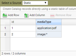
4.Set the File Chooser Properties Go to the Properties tab. In our example, we want to apply some restrictions on the types of files that can be uploaded (only images and PDFs). To do so:
-
In the Allowed Media Types field, select the Catalog Business Object that contains the information on the allowed types of files. In our case, we want to allow all types of images (image/*) and PDFs (application/pdf). See an example in the figure below:
-
In the Column field, enter the header of the Catalog column that contains the allowed media types. In our example, enter mediaType.
-
Set any other necessary properties for the File Chooser, such as Style and Layout.
5.Add the Screen to a Process
-
Add the newly created Screen to a Process.
-
At the Process level, declare the variable $localFileCollection, of type LocalFile, Collection Type Indexed Elements, Scope Assigned.
-
In the Screen Task, go to the Variable Assignment tab, and assign $localFileCollection as an expression.
-
Start the Process: you can now upload multiple files or drag and drop them into the File Chooser Area.
Related Links
- For design suggestions, see the File Chooser section of design.appway.com.
- File Upload Solution Component documentation. The DesignSystem Package contains two ready-to-use Solutions based on the File Chooser Screen Component: the 'SingleFileUpload' and the 'MultipleFileUpload'.