Layout Container Screen Component
Introduction
The Layout Container is a container component which allows you to layout content in your screen in a flexible way. It differs from the deprecated Div component in its ability to organize content with a set of useful properties for positioning and alignment. Unlike other specialized layout components such as the Border Layout Manager or the Adaptive Flow Layout, which are meant to be used for very specific layout structures, the Layout Container allows you to achieve most of the desired layouts, from very simple to complex, as they can be nested one inside the other as it feels appropriate to the developer.
Creating a Layout Container
Simply drag the Layout Container within your screen and insert the components that need layouting inside it. Tweak the different properties to achieve the desired positioning of the elements.
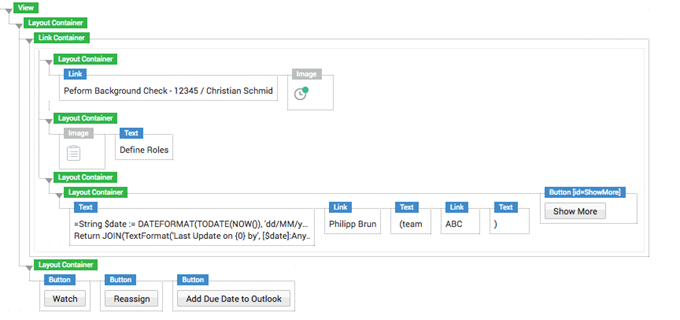
Figure 1: Layout Container example
Layout Container Configuration
You can define the Layout Container settings from the Properties and Layout tabs:
-
HTML Id – Sets the HTML Id of the component.
-
Children direction
 Copy
CopyEstablishes the direction of the direct children components. -
Vertical alignment
 Copy
CopySets the vertical alignment for the direct children components.nThe first list of options is shown when the direction is set to vertical.nThe second list of options is shown when the direction is set to horizontal. -
Horizontal alignment
 Copy
CopySets the horizontal alignment for the direct children components.nThe first list of options is shown when the direction is set to vertical.nThe second list of options is shown when the direction is set to horizontal. -
Grow to the remaining available space
 Copy
CopyThe element grows to occupy all of the parent Layout Container’s space after it has been distributed appropriately to its siblings. -
Wrap Elements – When you have a horizontal Layout Container containing a series of components, you can decide whether you want to allow them to wrap in case they do not fit their container.
-
Width – The width of the Layout Container.
-
Minimum width – The minimum width of the Layout Container.
-
Maximum width – The maximum width of the Layout Container.
-
Height – The height of the Layout Container.
-
Minimum height – The minimum height of the Layout Container.
-
Maximum height – The maximum height of the Layout Container.
The following sections provide more information on some of the properties mentioned above:
Children direction
-
Horizontal
 Copy
CopyPositions elements one next to each other. When they do not fit, they wrap to a new line. -
Vertical
 Copy
CopyPositions elements one below the other.
Alignment for horizontal direction
If you have set the children direction to Horizontal, the following settings apply:
1 Vertical
-
Top
 Copy
CopyPositions the direct children to the top. -
Middle
 Copy
CopyPositions the direct children to the middle. -
Bottom
 Copy
CopyPositions the direct children to the bottom. -
Stretch
 Copy
CopyStretches the direct children to the full height of the container. -
Baseline
 Copy
CopyPositions the direct children to the baseline.
Horizontal
-
Left
 Copy
CopyPositions the direct children to the left. -
Center
 Copy
CopyPositions the direct children to the center. -
Right
 Copy
CopyPositions the direct children to the right. -
Space between
 Copy
CopyDistributes elements horizontally with equal spacing between them.
Wrap Elements
When you have a horizontal Layout Container containing a series of components, you can decide whether you want to allow them to wrap in case they do not fit their container:

- Do Not Wrap: All the components contained in the Layout Container stay side by side in all cases. When the components reach their minimum size, a scrollbar is displayed. For example, if you have an Image, a Button, and a Paragraph containing some long text, the text is not wrapped at the bottom.
- Wrap: The components contained in the Layout Container do not need to be on the same line. For example, if you have an Image, a Button, and a Paragraph containing some long text, the text is wrapped at the bottom.
Alignment for vertical direction
If you have set the children direction to Vertical, the following settings apply:
3.3.1 Vertical
-
Top
 Copy
CopyPositions the direct children to the top. -
Middle
 Copy
CopyPositions the direct children to the middle. -
Bottom
 Copy
CopyPositions the direct children to the bottom. -
Space Between
 Copy
CopyDistributes elements vertically with equal spacing between them.
3.3.2 Horizontal
-
Left
 Copy
CopyPositions the direct children to the left. -
Center
 Copy
CopyPositions the direct children to the center. -
Right
 Copy
CopyPositions the direct children to the right. -
Space between
 Copy
CopyStretches the direct children to the full width of the container.
Grow to the remaining available space
-
Not Set
 Copy
CopyNothing happens. -
Grow
 Copy
CopyThe element grows to occupy all of the parent Layout Container’s space after it has been distributed appropriately to its siblings.
Example 1: Centering Layout Container elements one below the other
The following procedure describes how we can position components one below the other and centering them. Follow these steps:
- In a screen, drag in a Layout Container.
- Make sure the direction is set to Vertical.
- Inside the Layout Container drag in two components, i.e. a Button and a Text.
- Set the horizontal alignment to Center.
- Preview the screen. You will have achieved a button on top and a text below, horizontally centered with one another.
Example 2: Positioning Layout Container elements side by side with a space between them
The following procedure describes how we can position components side by side and how we can set them to have a space between them. Follow these steps:
- In a screen, drag in a Layout Container.
- Set the direction to Horizontal.
- Inside the Layout Container drag in two components, i.e. a Button and a Text.
- Set the horizontal alignment to Space Between.
- Preview the screen. You will have achieved a button on the far left of the Layout Container and a text on the far right.
Layout Container Style Business Object
You can define the Style Business Object the Layout Container uses on the Style tab.
States
The Layout Container Style Business Object only displays the Default state.
Styling Properties
- Background: sets the background color for the container.
- Border: sets the color, thickness and type of line (dotted, dashed, and so on) for the container. It also sets border roundings. See also the Property Connectors section.
- Shadow: sets the color, type and blur effect of the shadow applied to the container.
- Cursor: sets the style of the cursor (text, pointer, and so on) displayed when you hover over the container.
- Size: sets both the width and height of the container.
- Width/Height: You can set bot a minimum and maximum width and height for the container, which grows or shrinks dynamically with the screen. In this case, the Fixed option is usually not set by default.
- InnerSpacing: defines the space between the element inside the container itself and the border.
- OuterSpacing: defines the space between the element outside the container itself and the border.
For more information on styling properties, see the Style Business Object: Styling Properties section.
Layout Container Actions
Some actions available on the Actions tab are specific to Layout components such as the Layout Container:
A full overview of all actions is available in the article on Events and Actions.
Related Links
- Screen Components: Scroll Pane and Link Container: The Scroll Pane and Link Container Screen Components also provide layout capabilities and offer additional functionalities.
- For design suggestions, see the Layout Containers section of design.appway.com.