Data Layout Business Object
Introduction
Important notes:
>
- The overall page layout (header, navigation, tabs and so on) is currently out of scope for the Data Layout editor. Please, refer to App Tasks: Common Configuration for page layout.
- This feature is currently available only through custom renderers and is available if the feature toggle
nm.featuretoggles.datalayout.areDataLayoutFeaturesEnabled(System Configuration > Configuration Properties) is set totrue(falseby default).
The Data Layout Business Object allows defining the layout of specific parts of pages in Solutions built with FNZ Studio. In line with our data-driven model, the Data Layout Editor supports a low-code, declarative and visual approach, and allows replacing any existing layouts created with custom renderers or tags, thus reducing development effort.
The Data Layout Editor allows defining imperative layout information for data produced by the Data Logic Business Object. Note that it is possible to use Data Layout in a fully custom way (only for selected pages or for certain parts of the page, while the rest can be implemented with the centered layout provided out of the box). Optionally, it can also be used to override the standard layout provided by the Data-Driven Workspace (App Tasks).
Data Layout Concept
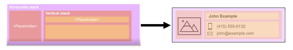
Data Layout is based on the concept of stack, which represents how information is structured on a page or part of it.
Data Layout and Data Logic
In the example above, the dynamic image or name (or other data) of the client is indicated by a placeholder, which denotes that such data needs to be filled. Actual data is populated by the Data Logic Business Object (BO).
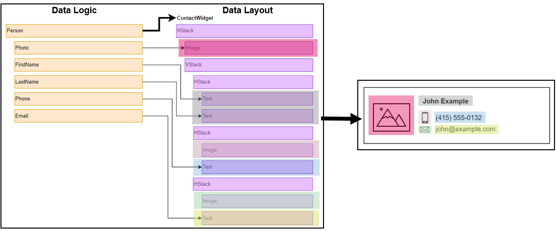
With this approach, we maintain a very clear separation between the business logic layer and the presentation/structure layer.
Data Layout Editor
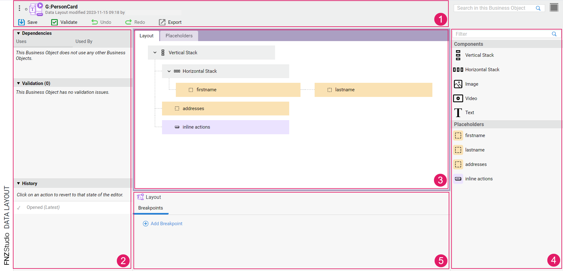
- Header: The header background color indicates whether you are in edit mode (gray) or read-only mode (red). When hovering the Data Layout BO id, a copy icon is displayed, which allows copying the BO id. Various actions are possible, including:
- Validate: Allows validating your edits on the Data Layout. The Validate icon is instantly updated upon your changes, thus providing immediate validation feedback (see Validation details below):
- red: highlights an error, the Data Layout or part of it is invalid.
- yellow: highlights a warning, the Data Layout is still valid but action is required.
- green: the Data Layout is valid.
- Undo/Redo: Allow undoing/re-doing the latest operation performed. Ctrl+Z and Ctrl+Y shortcuts are also supported.
- Validate: Allows validating your edits on the Data Layout. The Validate icon is instantly updated upon your changes, thus providing immediate validation feedback (see Validation details below):
- Left sidebar: Contains Dependencies and Validation information.
- The Validation section contains validation messages for the current Data Layout. The Data Layout Editor supports instant validation: every time an action that triggers a validation issue is performed, the panel is updated with the corresponding information to allow quicker response. The Validation header indicates the total number of validation messages in the Data Layout. Types of message are:
- Error: (red icon) the issue requires immediate action, and makes the Data Layout (or part of it) invalid.
- Warning: (yellow icon) the issue requires immediate action, but the Data Layout can be still used to create a working Data Model.
- Info: (gray icon) the issue does not require immediate action, but consider fixing it to have a Data Layout that complies with best practices.
- The Dependencies section lists the Business Objects that depend (Used by section) on the current Data Layout and viceversa (Uses section). Dependencies are updated instantly whenever you perform any changes.
- The History section shows a list of (up to 100) operations performed in the Editor. The first state in the History section is always Opened, and it refers to when the editor was first opened. Note that the list of operations disappears once you close the Editor. By clicking on any operation in the list, you revert it to its previous state, and a message is displayed containing the details of the operation. Moreover, by clicking on the View button, the change is highlighted in the editor. Note the following icons:
- Tick: Current Data Logic Editor state
- Full circle: Operation that has been performed on the Data Logic Editor
- Empty circle: Operation that has been undone
- The Validation section contains validation messages for the current Data Layout. The Data Layout Editor supports instant validation: every time an action that triggers a validation issue is performed, the panel is updated with the corresponding information to allow quicker response. The Validation header indicates the total number of validation messages in the Data Layout. Types of message are:
- Modeling Area: Central area containing the content of the Data Layout. It contains two tabs:
- Layout: Developers can drag in stacks and nest them as necessary. It is also possible to add static images, videos and texts (e.g., in case of logos or titles that do not change). See the Layout Tab section for details.
- Placeholders: Placeholders indicate that an area must be filled in with dynamic data coming from the Data Logic Business Object. See the Placeholders Tab section for details.
- Right sidebar: Library containing the Components and Placeholders that can be added to the respective tabs. See sections below for details.
- Properties Area: (available for the Layout tab) The Properties area of the Layout BO allows defining breakpoints, which determine the ranges of a container size in cases where layout might change depending on the available space (see the Properties: Breakpoints section for details). If a specific Component (Stack, Image, and so on) is selected, the Properties area displays different configuration options, such as Margins and Tags.
Layout Tab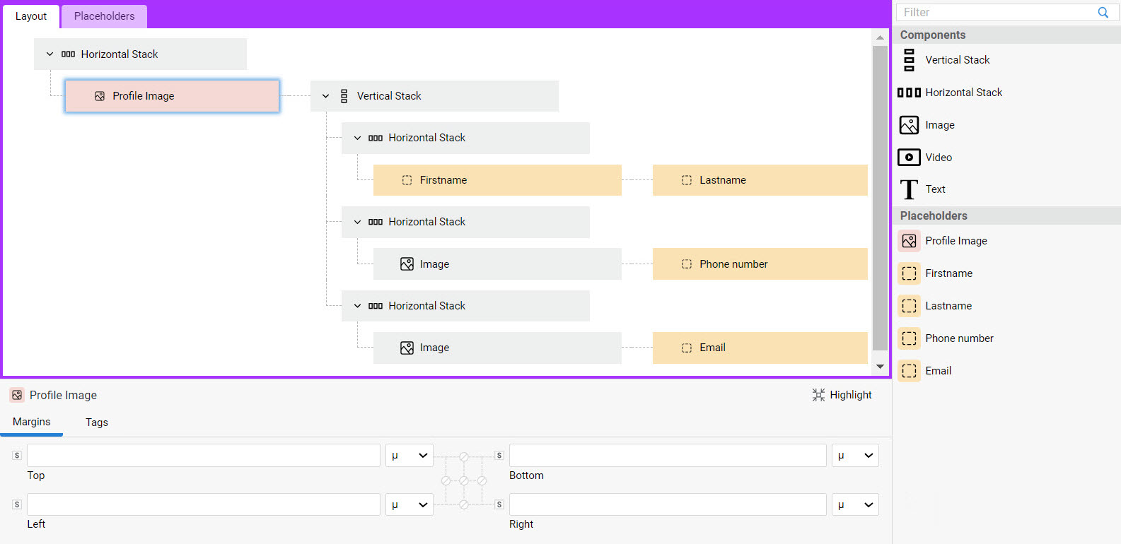
The Layout tab allows outlining the layout of your page through a combination of Components and Placeholders. Moreover, it allows creating different layouts for different page sizes. See all details in the sections below.
The context menu for Layout items allows the following options: Copy (C), Paste, Delete (D). Copy/Paste actions are also supported by the related shortcut keys.
Layout Properties: Breakpoints
Each Data Layout BO can define multiple layouts, depending on the horizontal size of the container element in which the layout is included at runtime. Breakpoints define size ranges for the layout container and determine when to switch layout at runtime. For example, define a breakpoint with value 480 to produce two different layouts depending on whether the current element is included in a container narrower or wider than 480 pixels.
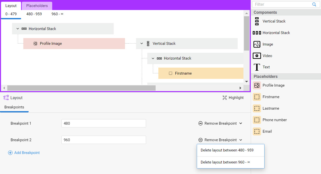 Breakpoints are configured for the Layout overall, therefore the Breakpoints tab is visible when no Component/Placeholder is selected in the modeling area. To add a breakpoint:
- Click on the Add Breakpoint button.
- In the related field (e.g., Breakpoint 1) enter the max container width (in pixels). Add additional breakpoints, if necessary.
- The Layout tab now displays a tab for each width range where you can configure your layout details.
- If you add, edit, or remove a Breakpoint at a later point, note the following:
- Adding a new breakpoint: If you already filled some content in the Breakpoint 1 Layout tab, and you then add Breakpoint 2, the content of Breakpoint 1 Layout tab is copied over to Breakpoint 2 Layout tab.
Note: Currently, the content of the Layout tab cannot be copied/pasted in bulk. For this reason, if you plan to have slightly different layouts for each breakpoint range, we recommend that you first add the desired content in the Layout tab, and then you add the desired Breakpoints. This way, you will only need to edit the content in Breakpoint 2, Breakpoint 3 (and so on) Layout tabs, instead of filling them from scratch.
- Editing the value of an existing breakpoint: The new value cannot be higher than the following breakpoint or lower than the previous one (e.g., if Breakpoint 1 is 480, Breakpoint 2 must be a higher value).
- Removing an existing breakpoint (Remove Breakpoint button): If you filled some content in Breakpoint 1 and Breakpoint 2 Layout tabs, and then you remove, e.g., Breakpoint 2, you will need to choose which Layout tab content you want to delete (see image above).
Components
The Components available in the Layout tab allows defining a different layout for each size range created by the Breakpoints specified above.
Following is a list of available Components that can be dragged into the modeling area to define a layout:
- Vertical Stack — A vertical stack of elements (the elements contained in it are aligned vertically in the runtime UI). Note that an implicit Vertical Stack is added at runtime if a layout contains multiple "root" (i.e. top-level) elements.
- Horizontal Stack — A horizontal stack of elements (the elements contained in it are aligned horizontally in the runtime UI).
- Image — A static/fixed image (it does not change based on user activity). If you want to insert a dynamic image, use an Image Placeholder and populate it using Data Logic Controls, instead (see Placeholders section). In the Type field (Properties area), you must choose the source of the image. Possible options are:
- Resource — Select a Resource Business Object
- Icon — Select the icon
- URL — Enter the image URL
- Video — A static/fixed video (it does not change based on user activity). If you want to insert a dynamic video, use a Video Placeholder and populate it using Data Logic Controls, instead (see Placeholders section). In the Type field (Properties area), you must choose the source of the video. Possible options are:
- Resource — Select a Resource Business Object
- URL — Enter the video URL
- Text — A static/fixed text (it does not change based on user activity). If you want to insert a dynamic text, use a Text Placeholder and populate it using Data Logic Controls instead. In the Properties area, you can select:
- Label — Select the Label BO containing the static text
- Heading level — Select the header level (normal text or heading from 1 to 6)
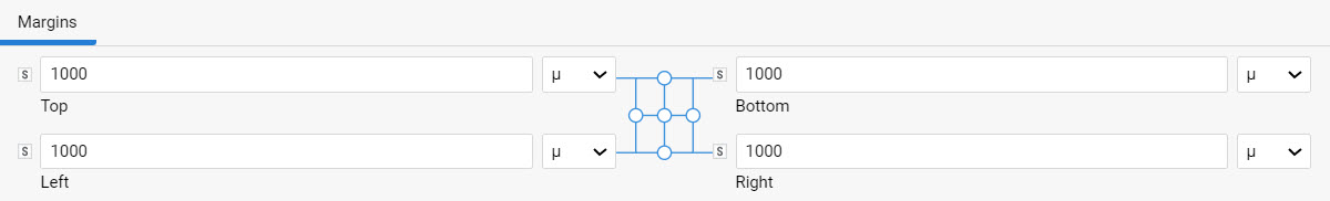
Component Properties: Margins
For each Component selected in the modeling area, you can define custom margins in the Margins tab.
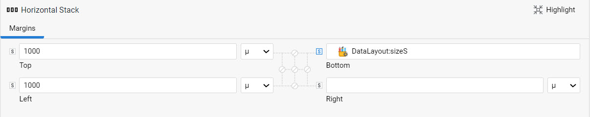
As illustrated in the image above, you can enter the desired values directly using the available units of measurements (% and µ) or you can click on the s icon next to your property to select a Style Value Business Object from your library.
For some styling properties, such as spacing or borders, you may want to apply the same value to multiple properties. For this purpose, widget connectors are provided, which allow modifying multiple properties at once:
- The corner connector allows syncing two styling properties (e.g., the top and bottom margins). Whenever you change one of the properties, the other is changed automatically.
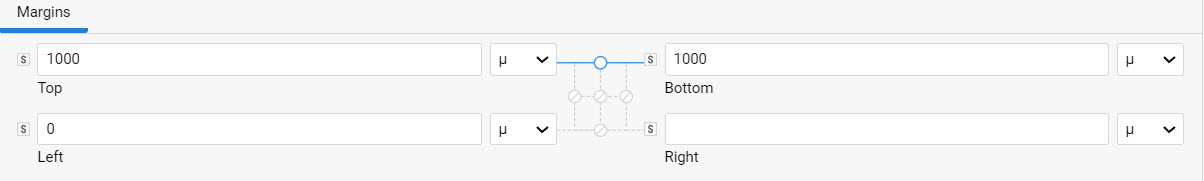
- The edge connector allows syncing all styling properties at the same time.
Component Properties: Tag
For each Component selected in the modeling area, you can define custom tags in the Tags tab. This feature allows setting tags on Components to customize the rendering (structure and styling) of the corresponding elements in the UI. This customization is achieved, for example, using Control Injection. See the Custom Tags article for details
Placeholders Tab
Placeholders are used in Layouts to indicate that a certain area must be filled in with dynamic data coming from a Data Logic Business Object For example, you will create an Image Placeholder instead of adding an Image Component to the Layout tab when you need to add a dynamic (instead of static) image to your page.
The context menu for Placeholder items allows the following options: Copy (C), Paste, Delete (D). Copy/Paste actions are also supported by the related shortcut keys.
Once you add and configure your Placeholders in the Placeholders tab, these are displayed in the right-sidebar library and can be used to fill in the Layout tab. You can reorder Placeholders through drag-and-drop. Each Layout in the Layout tab can use all or a subset of the Placeholders defined in the Placeholders tab. In turn, each Placeholder can be used in each Layout multiple times.
Note that when a Placeholder is deleted from the Placeholder tab, all its usages in the Layout tab are also removed.
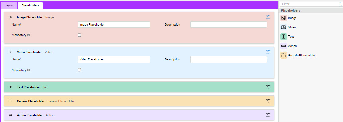
For each Placeholder, the following properties can be defined:
- Name — (mandatory) Placeholder name, it must be unique in a Data Layout BO.
- Description — (optional) Placeholder description.
- Mandatory — (optional) If selected, the placeholder must be assigned to a Data Logic Control when using the Data Layout BO.
Following is a list of available Placeholders that can be dragged into the modeling area (details on Controls are illustrated in the Data Logic Configuration section below):
- Image — Used for areas that should contain dynamic images. It can only be populated using the content of Image Controls in the Data Logic BO.
- Video — Used for areas that should contain dynamic videos. It can only be populated using the content of Video Controls in the Data Logic BO.
- Text — Used for areas that should contain dynamic text. It can only be populated using the content of Text Controls in the Data Logic BO. For a Text Placeholder, you can define a Heading level (normal text or heading from 1 to 6).
- Action — Used for areas that should contain Inline Actions. It can only be populated using the actions of Data Controls and Data Logic Include Controls in the Data Logic BO.
- Generic — It can be populated with any type of Data Logic Control.
Layout Example
The following example illustrates how to create a card layout in the Data Layout Editor by using Components and Placeholders (click on the image to zoom in).
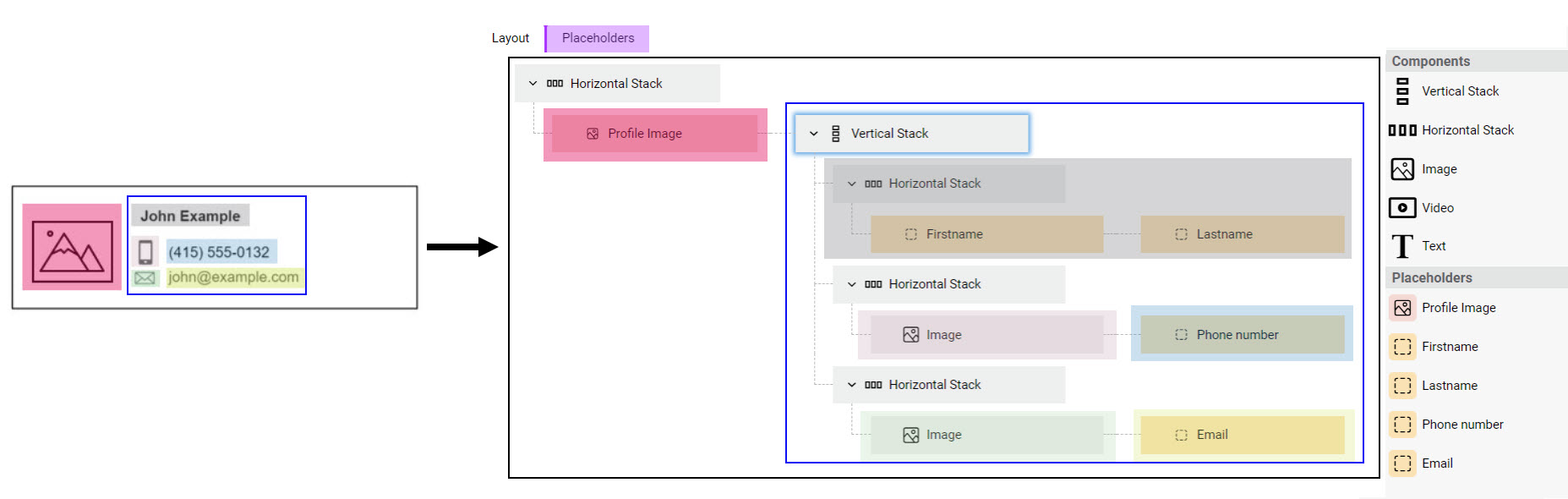
- Create a new Data Layout B0, e.g. User's Card.
- In the Layout tab, you can build the desired layout for your card.
- Drag in a Horizontal Stack Component to create the overall container.
- To have a dynamic image, which changes based on the selected user, you need to configure an Image Placeholder in the Placehoders tab. You can add a Name (e.g, Profile Image) and a Description (e.g., This is the user's profile image), which will help you identify your placeholder.
- Go back to the Layout tab, where your Profile Image is now displayed in the right-hand Placeholders section.
- You now need to create a container for the other card elements (user's name, mobile phone, email address), which are aligned vertically. Drag in a Vertical Stack and place it to the right of your Profile Image.
- The first elements you need to add are the user's first name and last name. These elements are aligned horizontally, therefore you will need to add a further Horizontal Stack. In the Placehoders tab, add two Generic Placeholders called e.g., Firstname and Lastname. Back to the Layout tab, you can drag the two placeholders into your horizontal stack.
- The same steps apply for the remaining elements. Note that the mobile phone and email address icons are static images, therefore you can use Image Components from your library.
- Once you have created your layout, you will need to link it to your Data Logic BO, as explained in the Data Logic Configuration section.
Data Logic Configuration
After configuring your Data Layout BO, you need to create a link to the Data Logic BO:
- To apply the new layout to part of a page, you need to set the Data Layout BO on the Data Logic Control (Data Layouts tab) corresponding to the section to be customized.
- To fill your layout with data, you need to assign Data Layout Placeholders to Data Logic Controls (Placeholders tab).
All details are illustrated in the sections below.
Data Layout Tab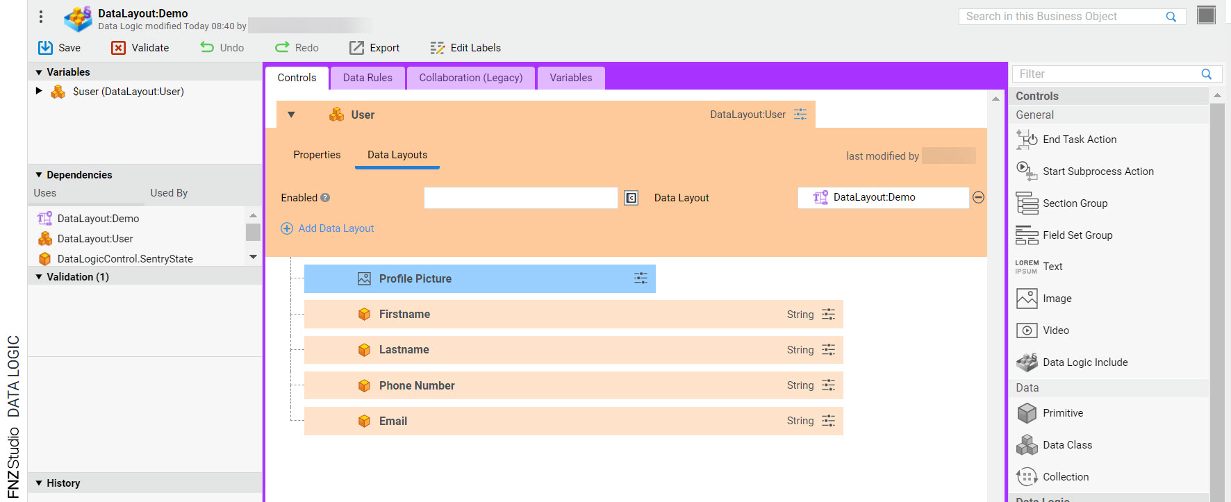
All "container" Data Logic Controls, i.e., Group, Collection, and (unfolded) Data Class display a new tab called Data Layouts in their configuration panel. By linking a Data Layout BO to a "container" Data Logic Control, you apply the corresponding layout to the section to be customized.
Note that Data Layouts can be set at any level of the Controls tree in the Data Logic BO (parent and children) and can also be nested on each Control.
You can set one or more Data Layouts for each "container" Control (although only one of them can be enabled at runtime):
- Click on the Data Layouts tab.
- In the Enabled field, you can enter an expression that sets the conditions under which the Data Layout is applied. It should:
- Return
true(default value) if the Data Layout is always applied. Only one Enabled expression for each Control may returntrueat runtime. If no Enabled expression returnstrue, no Data Layout is applied. - Return
falseif the Data Layout is not applied.
- Return
Placeholders Tab
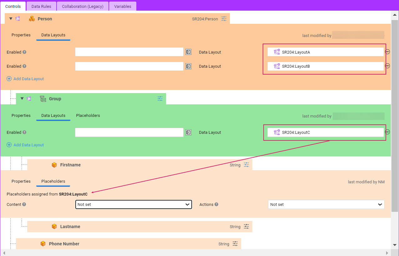
All child Data Logic Controls (except End Task Action and Start Subprocess Action Controls) display a new tab called Placeholders in their configuration panel. By specifying a Placeholder in a Data Logic Control, you fill your layout with dynamic data. Note that the Placeholders tab is visible when at least one Data Layout is set on a parent Control.
For each Data Layout selected in the parent Data Logic Control, you can specify two types of Placeholder (if compatible) for each child Data Logic Control: If you assign any invalid Placeholders, a warning icon is displayed and the context menus Remove Invalid Placeholders and Remove Invalid Placeholders from Children allow removing them conveniently.
- Content assigns the main content of the Control to the placeholder (e.g., a Person's FirstName or LastName to a Generic placeholder). Note that:
- All types of Controls are compatible with Generic Placeholders.
- Image Controls are compatible with Image Placeholders.
- Video Controls are compatible with Video Placeholders.
- Text Controls are compatible with Text Placeholders.
- Actions assign the inline actions of the Control to the placeholder, therefore they are only available for Controls with potential Inline Actions associated, i.e. Data Controls and Data Logic Include Controls. Note that:
- The Actions Placeholder selector are compatible with Generic or Action Placeholders.
Further Notes on Placeholders:
- If a Placeholder is set on a Data Logic Include Control, it is applied to all root Controls of the included Data Logic at runtime.
- As mentioned above, Data Layouts can be set at any level of the Controls tree in the Data Logic BO (parent and children) and can be nested on each Control. In this case, only the Placeholders of the Data Layout set on the innermost (closest) container are available (see image below).
Shortcut Keys in the Data Layout Editor
The following table provides and overview of the shortcut keys (or shortcut key behaviors) specific to the Data Layout Editors.
For information on shortcut keys common to other Business Object Editors, see the Shortcut Keys in Editors document.
| Tab | Item | Shortcut | Operation |
|---|---|---|---|
| Layout/Placeholders | All | Backspace/Delete key | Deletes Layout Components/Placeholders |
| Layout/Placeholders | All | Shift | Selects multiple adjacent Layout Components/Placeholders |