App Tasks: Common Configuration
Introduction to App Tasks
An App Task is a category of Process Tasks that comes with its own User Interface (UI) built as a single-page application. Such UI is not based on Screen Business Objects but, rather, it is entirely generated based on Data Class Business Object and Data Logic Business Object.
App Tasks can be combined with other App Tasks and "traditional" Process Tasks in the same Process Instance to cover all the requirements of Solutions.
Currently, available App Tasks are:
- Data Gathering, used within the Data Gathering Application Business Component
- Data Review, used within the Business Data Comparison (v4 and higher) Application Business Component
- Digital Binder, used within the Digital Binder (v5 and higher) Application Business Component
- Loading App Task
- Relationship Definition and Relationship Review, used within the Relationship Definition Application Business Component
This document guides through the features and configurations that are common to all or a set of (where indicated) App Tasks with links to specific documents.
Documentation Resources
This article guides you through configurations common to all App Tasks. Refer to the documentation of each separate Application Business Component and App Task for specific information:
- Data Gathering ABC / App Task
- Business Data Comparison ABC / Data Review App Task
- Digital Binder ABC / App Task
- Loading App Task
- Relationship Definition ABC / App Task
Installation and Upgrade
App Task Access
The access to an App Task is managed through Users, Groups and Roles. As with all types of Process, you can define a Swimlanes in your App Task, and each Swimlane can be associated with one or multiple Participants. Such Participants are the Users/Groups/Roles defined in FNZ Studio for Access Control.
Anonymous User Access
Anonymous users can access specific features of selected App Tasks. This is to allow unregistered users to access some specific tasks. Note, however, that access is limited to:
- Data Gathering App Task, (with the exclusion of some specific features illustrated in the linked document).
- Loading App Task
- Relationship Definition ABC / App Task and Relationship Review App Task
- Status App Task
Session Expiration and Re-Login
When users work on FNZ Studio Runtime, it can happen that their session expires, for example when the they are inactive for some time. In this case, App Tasks show a dedicated error banner with a configurable error message and a button to resume the work (see step 3 below for details).
When users click on the button to resume their work, by default, they are taken back to the token they were working on before session expiration. Technically, this is achieved by redirecting them to the URL /internal/process/{token-id}?studio_idp_hint={idp_hint}&kc_idp_hint={federated_idp_hint}, which first requires users to log in again according to their corresponding IDP Server and then open the previous token (identified by the token id).
If this default behavior is not sufficient to cover all use cases, you customize the URL the user is redirected to. This allows differentiating the target URL for internal users (who can be taken to their task list, for example) versus external users (who are typically brought back to the same token they were working on). To do this, follow these steps.
- Create a Script Function Business Object with the following characteristics:
- It must receive, as an input, three Strings, which are automatically populated by FNZ Studio at runtime, and contain (parameters must be specified in this exact order):
- the id of the user that must be logged back in
- the id of the token that the user was working on before session expiration
- the IDP hint to be added to the URL (String)
- (optional) the federated IDP hint to be added to the URL (String)
- It must return a String which contains the target URL that each user must be brought back to
- It can return either an absolute or a relative URL String. Any URL String starting with protocol information (e.g.,
https://...) will be interpreted as an absolute URL, whereas any URL string NOT starting with protocol information (e.g.,/internal/process/MyPkg:MyProcess) will be interpreted as a relative URL, and the corresponding absolute URL based on the FNZ Studio instance base URL will be automatically generated at runtime. Following is an example implementation of such Script Function, which re-creates the default behavior and can be used as a starting point to define a custom logic: - Copy
Function Test:reloginExample(String $userId, String $tokenId, String $idpHint, String $federatedIdpHint) : String Begin
StringBuilder $stringBuilder := NewObject(StringBuilder, '/internal/process/' & $tokenId);
If ! EMPTY($idpHint) && ! $idpHint.isBlank() Then
$stringBuilder.append('?studio_idp_hint=');
$stringBuilder.append($idpHint);
End
If ! EMPTY($federatedIdpHint) && ! $federatedIdpHint.isBlank() Then
If ! EMPTY($idpHint) && ! $idpHint.isBlank() Then
$stringBuilder.append('&');
Else
$stringBuilder.append('?');
End
$stringBuilder.append('kc_idp_hint=');
$stringBuilder.append($federatedIdpHint);
End
Return $stringBuilder.toString();
End
- It must receive, as an input, three Strings, which are automatically populated by FNZ Studio at runtime, and contain (parameters must be specified in this exact order):
- In order to configure the defined Script Function BO as the desired logic for the target URL, use the configuration property
nm.relogin.targetURL.scriptfunction, which must contain the id of an existing Script Function BO that adheres to the requirements listed above. If the default re-login logic is sufficient, this configuration property should be left blank. - Finally, set translations for the Labels
AppTask:ErrorMessages.Session.ExpiredandAppTask:ErrorBanner.GoToHometo configure the text to be shown for the error message and 'Resume work' button, respectively (see above).
Installation and Upgrade
Each App Task is configured through specific ingredients and has specific upgrade details. See each separate App Task document.
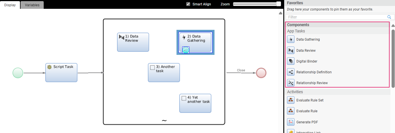
General Properties
After following the installation steps for each App Task, the App Task Components will be available in the Process Editor. You can drag and drop the desired App task into the central composition area, as shown in the image below.
Process Properties
Most of the general properties of the App Tasks (title, type, and so on) can be set in the Process Editor, as illustrated in the table below. Note that these properties are also illustrated with examples for each specific App Task in each separate App Task document.
| Property | Description | Configuration |
|---|---|---|
| App Task Title (Process Editor) | Name of the App Task in the Process Editor. | Process Editor Properties tab > Name field. |
| Page Title (UI) | Name of the App Task page in FNZ Studio Runtime | Process Editor Properties tab > Runtime Title field. You need to select a Label Business Object. In case the property is not set, it shows 'FNZ'. This property is mandatory for App Tasks included in Ad-Hoc Sub-Processes, in which case, the page title is displayed at the top of the content area. |
| App Task Title (Task List) | Name of the page on a Task List (backend) Process Editor. | Properties tab > Task List Name field. You can select a Label Business Object or enter a text. Set the name of the page, as it should appear on a Task List (it may contain a Label or not). |
| Type of App Task | Type of navigation pattern to use inside the App Task | Properties tab > Task type dropdown. Select the Task pattern between Sequential (tasks form a linear sequence, where users navigate through each Task step-by-step, and can typically only move forward or backward) and Drill Down (multiple different Sub-Tasks can be opened from one main Task). This influences navigation and page structure. See configuration details. |
| App Task initialization | Logic to be executed when initializing the App Task | Properties tab > Setup Script field. Specify the Script Function Business Object that contains the logic to be executed when initializing the context of the App Task (if any). This can be used, e.g., to set any necessary Process Instance or Token Attribute. The script is executed once for each token when it becomes Active. |
| Unique ID | Unique Identifier for the App Task | Properties tab >Unique Identifier field. Applies to any App Task contained in anAd-Hoc Sub-Process. It is used when evaluating the Process Properties Script Function so that the Ad-Hoc navigation structure can be better interpreted. |
Home Button
The Home button is rendered as the logo on the top-right of the FNZ Studio Runtime page.
The Home button is not configured in the App Task, instead it is managed by the global configuration property nm.window.start. For example, you configure the Home button to start a Process, the property would look as follows: nm.window.start=REDIRECT:/process/ExamplePackage:MyProcess.
Redirecting vs Forwarding
The user can either be redirected to the provided URL (using the prefix REDIRECT, as shown in the example above), or forwarded (using the prefix FORWARD). Forwarding is immediately done by the application server, and preserves the original URL in the browser address bar, whereas redirecting is done by the browser, and updates the URL in the address bar to the one the user is being redirected to.
If the property uses a mode other than REDIRECT or FORWARD, the user is redirected to the context path as a fallback.
Version Filter
Moreover, you can add a version filter to the URL directly. For example:
nm.window.start=REDIRECT:/process/ExamplePackage:MyProcess?versionFilter=HeadFilter
If no version filter is provided, the following logic is used to generate a version filter:
- If the source Process (i.e. the Process from which the user clicked on the Home button) is running on a head version filter, then that same version filter is also used for the URL opened by the Home button.
- In all other cases, no version filter is used, and as a direct result, the Platform uses a timestamp version filter instead.
The purpose of this behavior is ensuring that FNZ Studio Runtime keeps using the head filter when developers open FNZ Studio Runtime using a head filter to test uncommitted changes. However, for all regular FNZ Studio Runtime users, a new timestamp version filter is generated instead, to ensure that they are using the newest committed versions of all Business Objects.
Feature Overview
Following is an overview of the features provided by App Tasks. The example below is based on the Data Gathering App Task.
In summary, App Task features may be collected as follows:
- Features different in each App Task: Content
- Features used by all App Tasks with specificities: Navigation, Actions, Content Structure, and Validation
- Features common to some App Tasks: Collaboration
- Features common to all App Tasks: Developer Toolbar
The sections below guide you through all the features and configurations with links to specific documents.
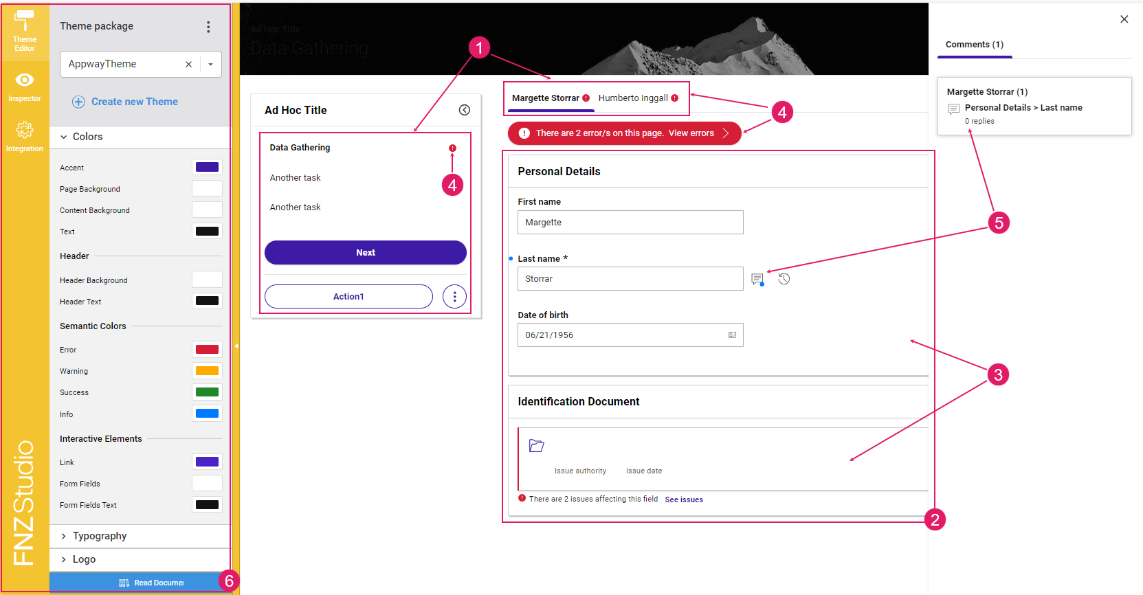
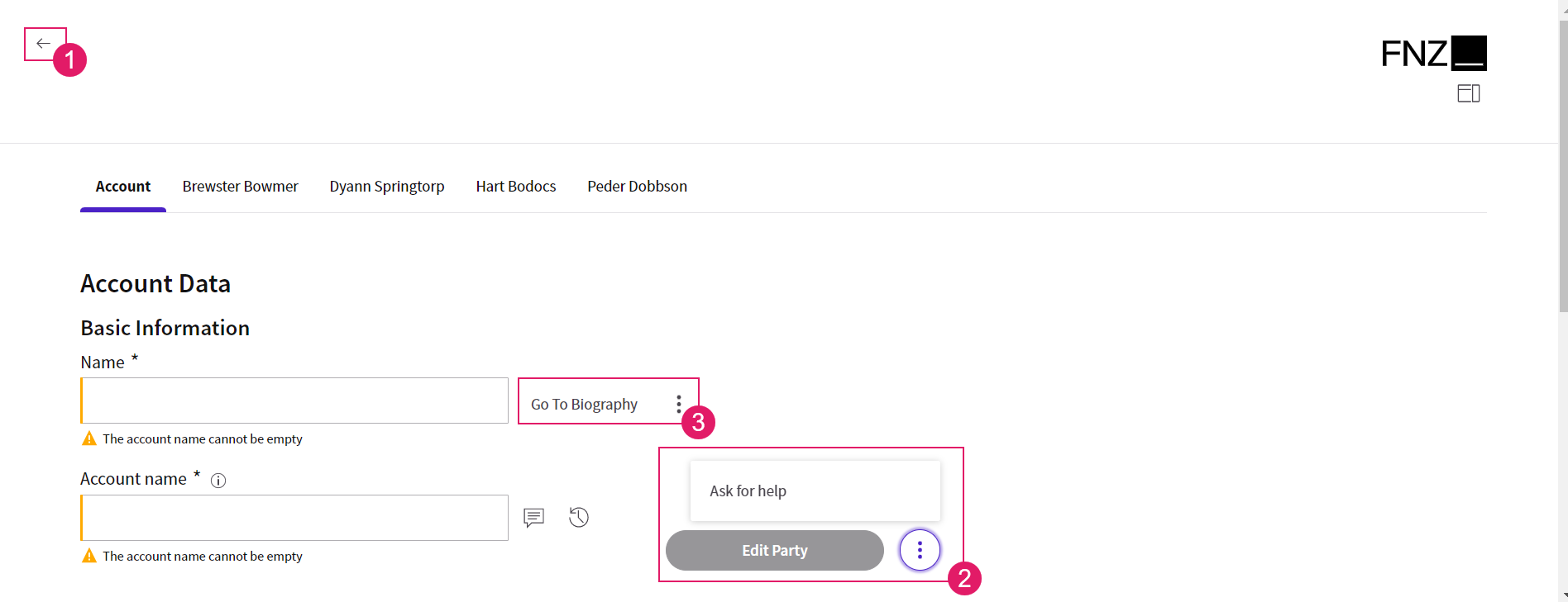
- Navigation and Actions (
1) — A bird-eye overview of the page structure allows you to find fields easily. Moreover, actions allow going back or forward in the process, deleting items or move to a different task, among others. See Navigation and Actions section. - Content Entry/Editing (
2) — The content area UI guides the end user in filling performing the main activity provided by the ABC (filling or reviewing forms in data Gathering and Data Review, managing documents in Digital Binder, tracking business relationships in Relationship Definition. See each separate App task document. - Content Structure (
3) — On the developer's side, content can be structured in sections and groups to make the end user work easier. Moreover, content can also be arranged through tables, summaries, and files organized in folders. See the Content Structure section. - Information framework (validation) (
4) — Continuous feedback and annotations are provided on blocking issues and warnings, as long as suggestions on how to fix them. See the Information Framework section. - Collaboration (
5) — Comments and Review Requests provide an easy way for reviewers to cooperate among them and with editors. This feature is available only for Data Gathering and Data Review App Tasks. - Developer Toolbar (
6) — The Developer Toolbar provides three main tools: the Theme Editor, which allows styling your Solution; the Inspector Tool, used to navigate to the Business Objects where the elements of the current page in FNZ Studio Runtime are configured and fixed any issues; the Integration Console, which shows all the integration calls performed for easier contextual debugging. See the Developer Toolbar section.
Navigation
Feature Overview
A bird-eye overview of the page structure allows you to find fields easily.
Navigation in App tasks is based on the following elements:
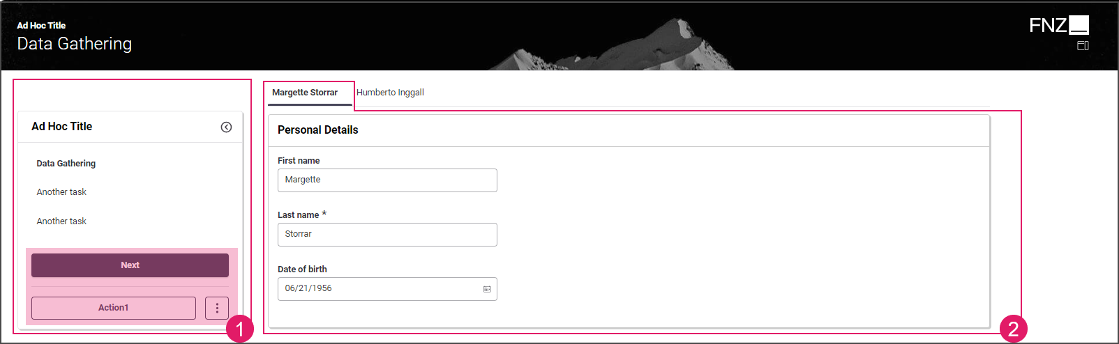
- Page Structure (Sidebar and Action position): (
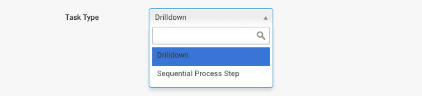
1) Page structure determines the way the App Task page is organized (whether there is a sidebar or not) and where Actions are positioned on the page itself. Page structure is configured through a combination of the following elements:- Task Type: The Task Type property (Sequential or Drill-Down) set at Process level determines where Actions are positioned on the page. See Task Type configuration details.
- Ad-Hoc Sub-Process: If an App Task is contained in an Ad-Hoc Sub-Process Component, a navigation sidebar may be displayed. With the Sidebar, users are constantly provided with an overview of the steps that are needed to reach the end of the process. They can either follow a predefined path or jump to a specific step directly by clicking on any task. See Ad-Hoc Sub-Process configuration details.
- Content Navigation: (
2) This type of navigation is specific to each App Task (the example below is based on the Data Gathering App Task). See each separate App Task document.
Task Types
The Task Type property (Sequential or Drill-Down) set at Process level determines where Actions are positioned on the page.
Processes consist of Tasks that are arranged using two different patterns:
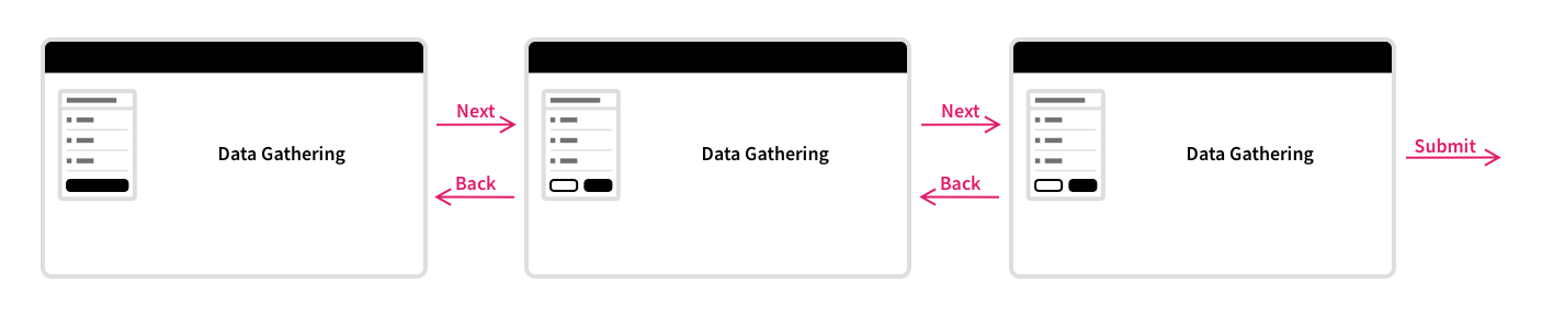
- Sequential Process Step — Tasks form a linear sequence, where users navigate through each Task step-by-step, and can typically only move forward or backward. This pattern is suitable for guided systems, and for systems where Processes go through multiple different phases.
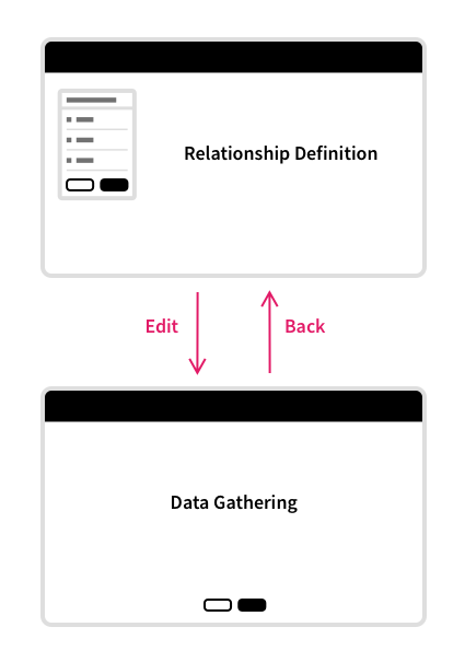
- Drill down — Multiple different Sub-Tasks can be opened from one main Task.
In a real-world scenario, a typical Process would use both patterns, and mix-and-match these patterns where they are appropriate.
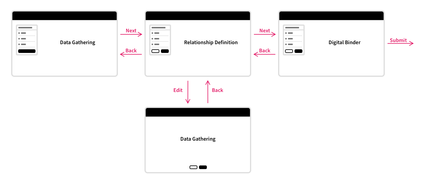
Note that, in this case, FNZ Studio Runtime needs to render differently, depending on the pattern currently being used. For example, a Process Task that is part of a Sequential Process Step pattern has a phase chevron which communicates progress to the user, and will typically have 'Next' and 'Back' buttons at the bottom. A Process Task that is part of a Drill down pattern, on the other hand, does not have a phase chevron, and will have the 'Back' button at the top of the screen (similarly to a drilldown screen on an iPhone or Android device).
Actions
Feature Overview
App Task Actions allow developers to define all aspects of an Action in the Process editor directly. This allows reusing the same Data Logic in different situations, and with different actions. Moreover, only the Process Business Object is altered when actions need to be added, removed, or updated.
App Tasks Actions may be of three types (configuration details are illustrated in the table below):
Configuration Overview
App Task Actions are configured in the Actions tab of each Process Editor.
| UI element | Description | Configuration |
|---|---|---|
Back Action (1) |
Back button. Depending on the type of type of App Task, it may be visible at the at the top left or at the bottom center of the page. | This is a predefined, static Action, which allows ensuring a consistent developer experience across different solutions. It is configured in the Actions tab > Global Actions > Back option. See configuration details. |
Custom Action (2) |
Any kind of Action applied to the Process (e.g., Go to documents, Ask for help) | This Action is entirely defined by the developer. It is configured in the Actions tab > Global Actions > Custom Actions option. Two types of Custom Actions are available: Process (impacting the Process flow by moving the token) and Script Actions (reload/update actions with no impact on the Process flow). See configuration details. |
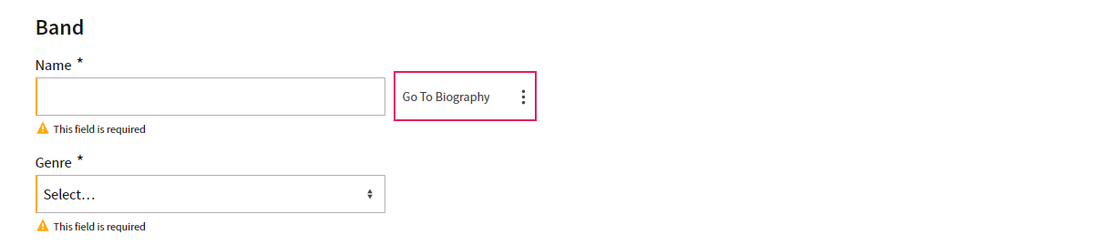
Inline Action (3) |
(Available in Data Gathering only) Action available for a specific field or section in the UI (Go to personal file next to the client's data section). | It is configured in the Actions tab > Inline Actions option. Two types of Inline Actions are available: Process (impacting the Process flow by moving the token) and Script Actions (reload/update actions with no impact on the Process flow). See configuration details. |
Setting App Task Actions
To define App Tasks Actions, select the App Task and click on the Actions tab. Select either:
- Global Actions, applied to the whole App Task, which include:
- Back (
1) — Predefined, static Action - Custom Actions (
2) — Actions defined by the developer
- Back (
- Inline Actions (
3) — Actions applied to specific fields or sections in the UI
For most Actions (see details below), when the user triggers the action from FNZ Studio Runtime, the Process $action variable is set to the Action Value set for the action, and can be used in Process connections to move the Process Token.
Global Actions
Predefined Actions (Back)
Predefined Actions are Actions that are commonly used in an App Task, and are predefined to ensure a consistent developer experience across different solutions. Predefined Actions currently include the Back action, as almost all Process steps have a Back button.
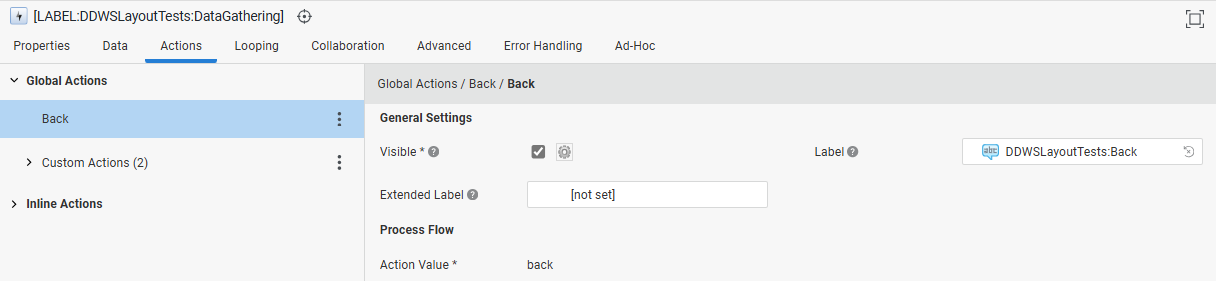
The Back action has the following properties:
General Settings:
- Visible — Determines whether the Back button is visible. You can also set this option dynamically by using a Script Function. If your App Task does not need a Back action, deselect this property.
- Label — The button label.
- Extended Label — The button tooltip.
Process Flow:
- Action Value — Static value set to 'back'.
In FNZ Studio Runtime, the Back button is shown:
- For Process Tasks with a Sequential Process Step Task Type, at the bottom center of the screen.
- For Process Tasks with a Drill down Task Types, at the top left of the screen.
Custom Actions
Unlike Predefined Actions, which are provided by the Platform, Custom Actions are entirely defined by the developer.
 There are different types of Custom Actions available:
- Process Action — They have an impact on the Process flow, either by ending the App Task and moving further in the Process, or by creating a new activity.
- Script Action — They allow executing a Script Function with no impact on the Process Flow (no token is moved or created). They can be used when an update or calculation logic triggered by the user is necessary in the context of the current App Task with immediate reload/update.
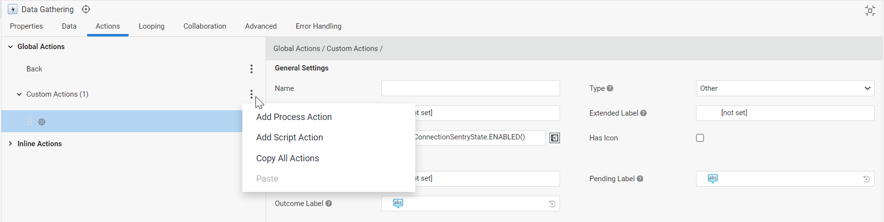
When you click on the three-dot menu next to the Custom Actions header (left tab), a dropdown list is displayed where you can chose the type of Custom Action you want to add. Moreover, you can copy-paste and delete actions:
- The Copy All Actions option (three-dot menu next to the Custom Actions header) allows copying all available Custom Actions.
- The Copy Action option (three-dot menu next to each Action) allows copying a specific Custom Action. The Paste Before and Paste After options allow pasting the copied Action.
- The Delete Action option (three-dot menu next to each Action) allows deleting a specific Custom Action.
Custom Actions have the following properties:
General Settings (common to Process and Script Actions):
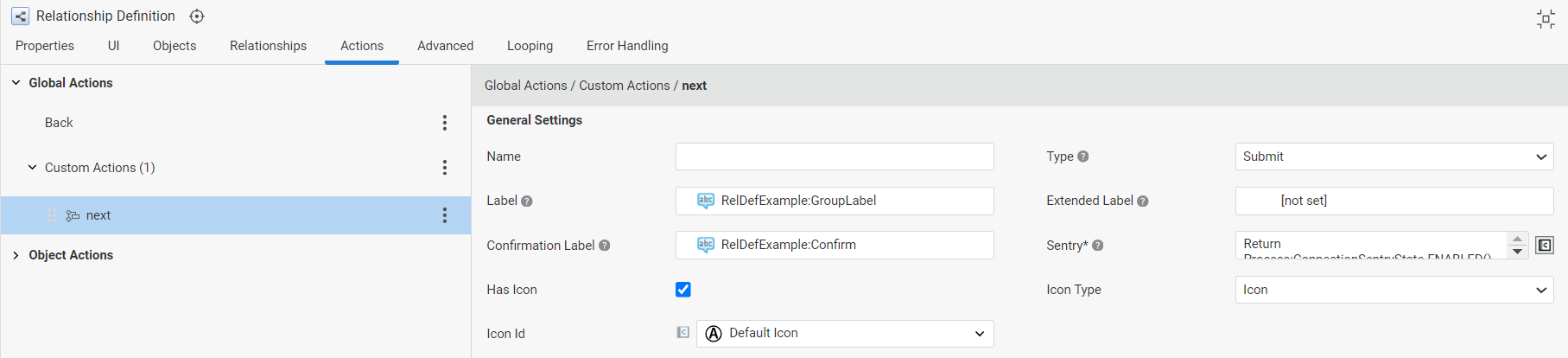
- Name — Define a name for the current Action to make it easier to identify it during configuration.
- Type — Custom Actions can have three types (see details below):
- Submit for actions that submit the current form, i.e. they trigger a Process step that cannot be undone.
- Destructive for actions that have destructive effects, such as deleting an object from a collection.
- Other for all other actions.
- Label — The button label
- Extended Label — The button tooltip
- Confirmation Mode — (for Actions of Type Submit or Destructive):
- Proceed but allow cancelling: The Action is executed immediately, but the user can cancel execution if needed (default setting for Actions created in ABC 2025.2 and lower).
- Confirm before proceeding: The user is asked to click a confirmation button before the Action is executed (default setting for Actions created in ABC 2025.3 and higher). In this case, two additional fields are available:
- Yes Button Label: Label Business Object containing the text to be shown on the button to confirm Action execution.
- No Button Label: Label Business Object containing the text to be shown on the button to cancel Action execution.
- Confirmation Label — The message to be shown when confirming a Submit or Destructive Action.
- Sentry — Script determining whether the button is currently shown as enabled, disabled, or hidden altogether. The Sentry script must return one value among the following:
Process:ConnectionSentryState.ENABLED()Process:ConnectionSentryState.DISABLED()Process:ConnectionSentryState.HIDDEN()
- Has Icon — Select this checkbox to specify an icon to identify this Action. The icon is then displayed next to the action value for easier visual identification.
- Icon Type — (available if you selected Has Icon above) Select theIcon option to choose from the set of default icons provided by the Platform, or the Resource option to indicate a Resource Business Object.
- Icon ID/Resource — Select the desired Icon ID or Resource Business Object (depending on the selected Icon Type above).
- Is Primary Action — (available for the fist action on the list) Select this checkbox to make this action prominent in the UI (the corresponding button is visible on the page, while the other actions are available after clicking on the three-dot menu).
Process Flow (for Process Actions):

- Action Value — String that is stored in the Process
$actionvalue when the Custom Action is triggered - Process Behavior — Allows Specifying the Process behavior when the action is executed:
- Move Current User Token — The user leaves App Task and follows the created Action
- Stay on Task, Spawn New Token — The user stays on the App Task and a separate token is created to follow the created Action (the Action can be assigned to other users).
- Open in new tab (available if you selected Stay on Task, Spawn New Token above): Select this checkbox if you want the new App Task token to open in a separate tab, while keeping the current token opened in the current tab.
Script (for Script Actions):
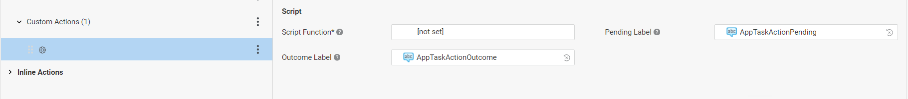
- Script Function — Script Function that defines the logic to be executed when the Action is triggered by the user. If the Script Function returns a String or Label reference, such value is used to indicate the outcome of the Action to the user instead of the value defined in the Outcome Label field.
- Pending Label — Label Business Object containing the message to be shown when the Action is triggered in FNZ Studio Runtime and while the Script Function is being executed.
- Outcome Label — Label Business Object containing the message to be shown upon execution of the Script Function. However, If the Script Function field returns a String or Label reference, such value is used to indicate the outcome of the Action to the user instead of the value here defined
Further Notes:
- Functions: Script Function
AppTask:HasBlockingViolationscan be used to check if the App Task contains any violation to Data Rules which are defined as Blocking in the Data Logic and, for example, disable one or more of the Custom Actions accordingly. - Order: The order of Custom Actions is meaningful. The order in which they are shown in the Actions tab is the same order in which they are shown in FNZ Studio Runtime. To reorder Custom Actions, drag them by using the drag handle, and move them up or down.
Custom Actions Types: Details
As mentioned above, Custom Actions have one of three different types:
- Submit for actions that submit the current form, i.e. they trigger a Process step that cannot be undone.
- Destructive for actions that have destructive effects, such as deleting an object from a collection.
- Other for all other actions.
These types impact how Actions are rendered in FNZ Studio Runtime. Let's analyze them, starting with the most simple type.
- Custom Action Type: Other Custom Actions of type Other are rendered as a regular button, and trigger the action immediately when the user clicks on a button. This is the type you should use for all non-destructive, safe, or harmless actions
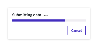
- Custom Action Type: Submit Custom Actions of type Submit are rendered as a primary button. Clicking on such a button artificially creates a delay, during which time the user has the opportunity to cancel the submission. The purpose of this behavior is to prevent accidental submissions. Usually, this is done using a confirmation dialog. However, user research shows that confirmation dialogs are ineffective at preventing mistakes, since users are used to automatically confirming them. The Platform's approach is to force a delay during which the action can be canceled, thus preventing the automation issue, as it is impossible for the user to confirm the dialog. The enforced delay before submission guarantees that the user has time to reconsider submission, and cancel the action if this happened by accident.
-
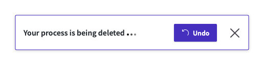
- Custom Action Type: Destructive
Custom Actions of type Destructive are shown as red buttons in FNZ Studio Runtime. Similarly to the Submit type, clicking on such a button creates an artificial delay before the action is executed, during which the user can undo the action. As with the Submit action, this pattern avoids the pitfalls of a confirmation dialog.
Inline Actions
Inline Actions can be made available for specific fields or sections in the UI, as opposed to Global Actions. You can set one or more Inline Actions for each field or section.
As happens with the other Custom Actions, Inline Actions can be:
- Process Action — These Actions have an impact on the Process flow, either by ending the App Task and moving further in the Process, or by creating a new activity.
- Script Action — These Actions allow executing a Script Function with no impact on the Process Flow (no token is moved or created). They can be used when an update or calculation logic triggered by the user is necessary in the context of the current App Task with immediate reload/update.
When you click on the three-dot menu next to the Inline Actions header (left tab), a dropdown list is displayed where you can chose the type of Inline Action (Process or Script Action) you want to add. Moreover, you can copy-paste or delete Actions:
- The Copy All Actions option (three-dot menu next to the Custom Actions header) allows copying all available Inline Actions.
- The Copy Action option (three-dot menu next to each Action) allows copying a specific Inline Action. The Paste Before and Paste After options allow pasting the copied Action.
- The Delete Action option (three-dot menu next to each Action) allows deleting a specific Inline Action.
This section describes Inline Action-specific properties. For all other properties, refer to Custom Actions.
 General Settings section:
- Bulk Action — (optional) If selected, FNZ Studio Runtime users can select multiple objects, and apply this Action to all of them at once. For Process Actions, the variable selected in the Selected Instance property (see section below) contains all the objects selected for the bulk action. For Script Actions, instead, the selected Script is executed only once and can access the objects selected for the bulk action using the implicit variable
$instances. Note that this feature is currently available through custom renderers (FNZ internal use only - see Release Notes) and is disabled by default.
Location Where this Action Will be Shown section:
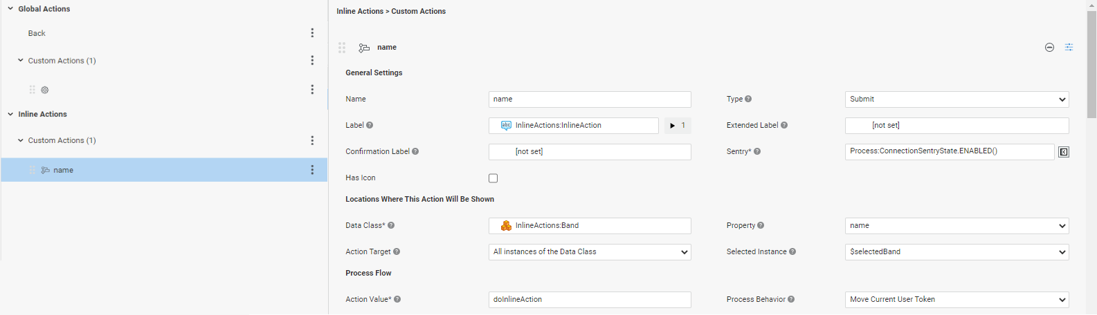
- Data Class — (mandatory) Data Class for which the Inline Action should be available. Actions are applied to all instances of the selected Data Class type, including instances of children Data Classes.
- Property — (optional) Data Class property for which the Inline Action should be available. If not defined, the Action is available at the level of the whole Data Class instance. Action Target — The specific set of Data Class instances for which the Inline Action should be available. If set to All instances of the Data Class, the Action is available for all Data Class Instances of the selected type in the App Task scope. If set to Specific instances of the Data Class, the Action is available only for the Data Class Instances returned by the Target Instances field.
- Target Instances — Specific set of Data Class instances for which the Inline Action should be available. The script should return a Collection of Data Class Instances of the selected type (or one of its sub-types) which are part of the App Task scope.
- Selected Instance — (only for Actions of Type Process) Local variable of the selected Data Class type. This variable will be populated at runtime with the Data Class instance on which the Action was executed. Only variables whose type is compatible with the selected Data Class can be selected. If the Bulk Action property is selected (see above), the variable must be an Indexed Collection.
For Inline Actions, the target instance is available as an implicitly defined variable $instance in the sentry script of the Action, so that the Action can be conditionally enabled/shown depending on the specific item. It is also defined in the Variable Assignments section of the Label and Extended Label settings so as to create more specific labels for the current action. The type of the $instance variable is the selected Data Class.
Content Area
Primitive Types
Feature Overview and Configuration
The content area is where the end user enters or reviews data. The content area may include different types of item such as, text fields, date pickers, dropdown lists, and so on.
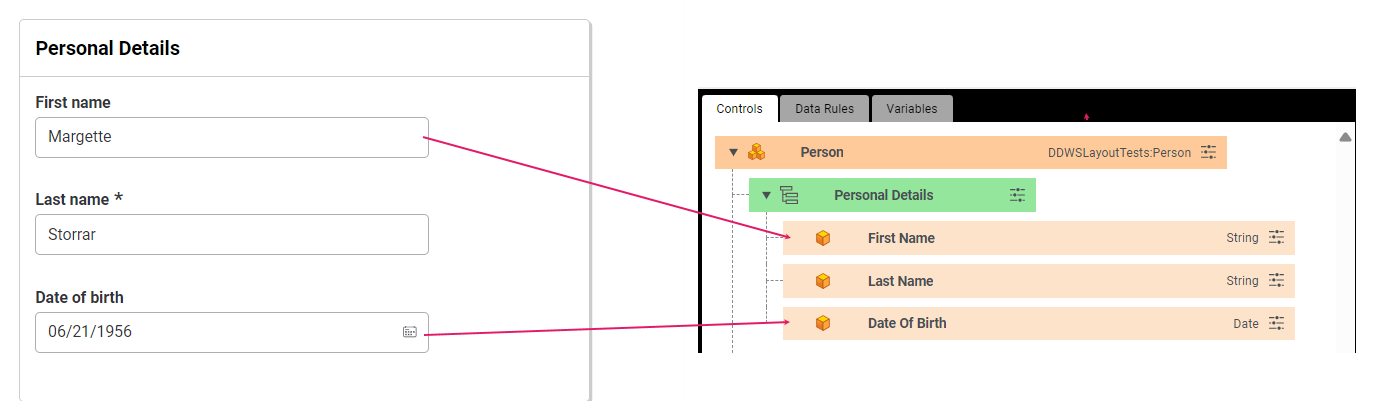
The elements included in the content area are usually configured starting from Data Logic Controls. The Primitive Types configured in the Data Logic are mapped into input control elements such as text, date picker and so on. Data Logic Rules may also apply to certain Primitive Types.
For example, a text field component is displayed when the Primitive Control is of type String, while a date picker is displayed when the Primitive Control is of type Date (without any Data Rules configured).
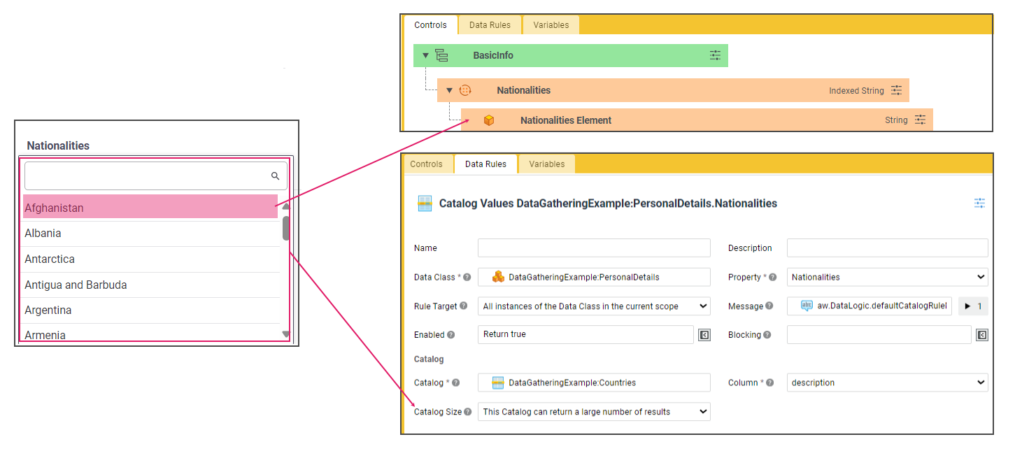
On the other end, to render a dropdown list, you will need to set a Primitive Control of type String (or Integer, Date, Float etc.) and add a Catalog Values Rule with the Size property set to can return a large number of results.
Read-only mode is supported for Primitive Types. Note the following behavior: if the Sentry state for the component is disabled, Primitive Types are shown as text (read-only) when first loaded to the page. If, instead, a control switches its Sentry state from enabled to disabled, it is shown as disabled, meaning that the look and feel of the component is preserved, but it is grayed out and becomes unusable until the state switches back to enabled.
The following sections describe various aspects of the content area and how to configure them.
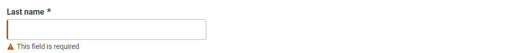
Text
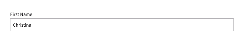
- Primitive type: String, Integer/Long, Double/Float
- Configuration: No Catalog Values Rule, Allow Multiline property (Single Property Expression Data Rule) set to
false. See configuration details.
Text Area
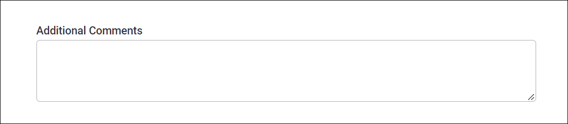
- Primitive type: String
- Configuration: No Catalog Values Rule, Allow Multiline property (Single Property Expression Data Rule) set to
false.
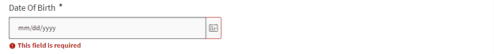
Date Picker
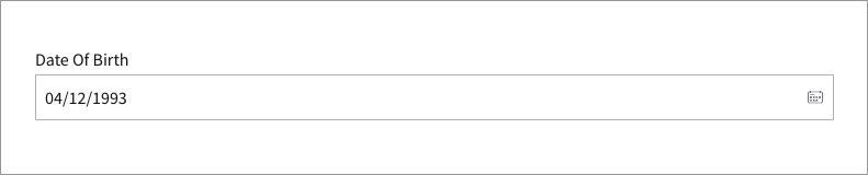
- Primitive type: Date
- Configuration: No Catalog Values Rule
Dropdown List
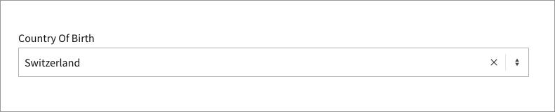
- Primitive type: String (Integer/Long, Date)
- Configuration: Catalog Values Data Rule with Size property set to can return a large number of results. See configuration details.
Radiobutton List
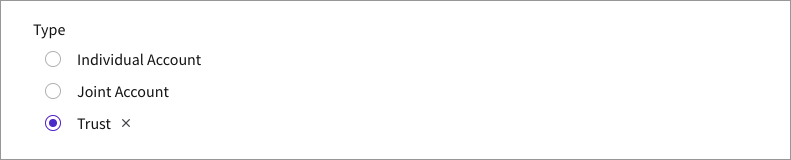
- Primitive type: String (Integer/Long, Date)
- Configuration: Catalog Values Data Rule with Size property set to always returns a small number of results.
Radiobutton

- Primitive type: Boolean
- Configuration: Optionally, Catalog Values Data Rule
File Uploader
- Primitive type:
Blob:file - Configuration: Data Class Control.
String
- Primitive type: String
- Configuration: String Data Rule.
- Primitive type: String
- Configuration: Email Data Rule.
Phone Number
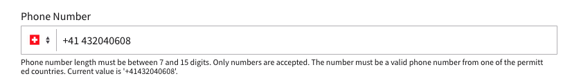
- Primitive type: String
- Configuration: Phone Number Data Rule.
Typehead
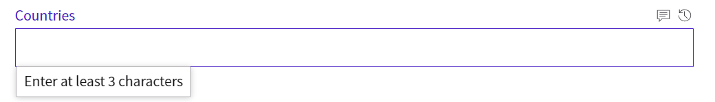
- Primitive type: String
- Configuration: Catalog Values Data Rule with Lazy Loading configured.
Link
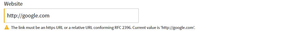
- Primitive type: String
- Configuration: Link Data Rule. In read-only mode, the link is displayed as an anchor element.
BigInteger / BigDecimal

- Primitive type: BigInteger or BigDecimal
- Configuration: Number Data Rule.
Object Search
Feature and Configuration Overview
It is possible to search and add elements from an existing collection (external or not). The main use cases are Party search and Account search. However, it is possible to search for any Object.
The Search UI is mainly made up of three main sections, which are configured through various items, as shown in the image below:
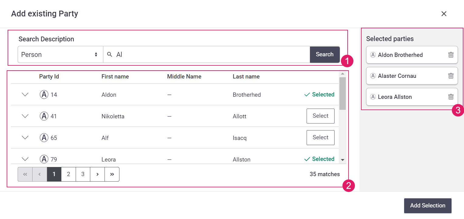
- Search Criteria (Catalog Business Object)
- Search Results (Data Logic Business Objects)
- Selected Objects (Data Class Behaviors)
The Search feature in your Data Gathering or Relationship Definition App Task is mainly driven by the Search Data Rule in the Data Logic Business Object, which defines all the settings necessary to allow searching for existing objects in a source (typically an external system) and adding them to a Collection property.
File Uploading
Feature Overview
The Data Gathering and Digital Binder App Tasks provide features for file uploading. These are provided by the File Uploader Component (see details).
Configuration Overview The configuration of the File Uploader consists of two steps:
- Blob Storage configuration (performed by the system administrator)
- Data Class configuration (performed by the developer configuring the App Task)
Blob Storage Configuration
- File uploading in the Data Gathering or Digital Binder App Tasks use Blob Storage capabilities. As a system administrator, check the Blob Storage User Guide for full information. You might also want to check your System Installation guide.
- Moreover, there are three Blob Storage-related properties that you need to consider:
nm.ddws.blobStorageSilo— Holds the name of the silo that is used by the App Task. Check the Blob Storage documentation for full information.nm.blob.storage.rest.blob.max.size— Acts as a hard file upload limit on the Platform, and specifies the maximum size of the accepted files. Its value is expressed in bytes and its default value is 209715200 (200 MB). Consider that this configuration property has precedence over the File Constraints defined in the Data Class (see section below), e.g. if you try uploading a 10GB file, this setting protects the Platform by already aborting the upload after 200 MB.nm.blob.storage.rest.preview.media.types— Comma-separated list of Media Types for which a preview is displayed. Consider that, forimagetypes, a preview is always displayed, while you need to set this property for other media type to be previewed.
Data Class Configuration
To configure a Data Class for file uploading, you need to perform the following operations:
- As a prerequisite, you must declare a dependency on the BlobPlatform Package in the properties of your current Package.
- Add a property of type
Blob:FileorIndexed Blob:Fileto your Data Class. This step is necessary to provide file uploading capabilities (a validation warning is issued otherwise):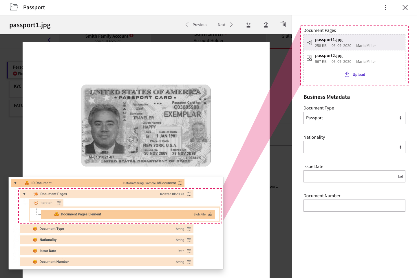
- To so so, in the Properties tab of your Data Class (e.g., Passport), select
Blob:Fileas a Type. For indexed collections, selectIndexed Elementsas a Collection Type. - (Optional) Select a Catalog Business Object from the File Constraints selector. This allows applying constraints on the type and maximum size (in KB) of the files that can be uploaded. Such constraints must be defined in a Catalog Business Object containing columns named exactly MediaType (e.g.,
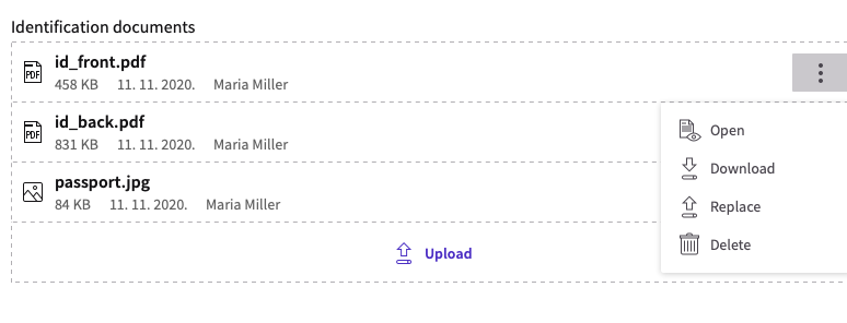
image/jpeg) and MaxSize (e.g.,5000). Media Type aliases are supported when specifying File Constraints, therefore, if a given Media Type is added to the related Catalog (e.g.,application/zip), all its aliases (e.g.,application/x-zip-compressed) are automatically supported. Note that aliases work interchangeably (by addingapplication/x-zip-compressedto the Catalog,application/zipis automatically supported). See the attached File Constraints - Media Types with Aliases PDFs for a full list of supported media types and their main aliases. Note also that the MediaType column can also contain placeholders, as in the examples below: *image/*: Any image type can be uploaded **/*: Any file type can be uploaded (this is used for specifying only the 'MaxSize')Drag this Data Class Control in your Data Logic Business Object. - At this point, a File Uploader is already in place. However, you can use a Document Behavior to add Solution-specific business metadata, as well as organize files in folders. You can see a File Uploader configuration example below.
Notes on file uploads:
- If multiple types match the uploaded file, the most restrictive one applies as for the
MaxSize, e.g. if the Catalog containsimage/png,image/*and*/*, and a.pngfile is uploaded, the maximum size restriction fromimage/pngapplies. Moreover, if there are two rows with the same or equivalent media types (e.g.application/xmlandtext/xml) but differentMaxSizevalues, the most restrictiveMaxSizevalue applies. - Consider that the
nm.blob.storage.rest.blob.max.sizeset by the Platform administrator acts as a file upload hard limit on the Platform ans takes precedence over the file constraints set on the Data Class.
Configuration Example
Following is an example of how you can configure a File Uploader with a Document Behavior in a Data Gathering App Task. A similar example may apply for a Digital Binder App Task.
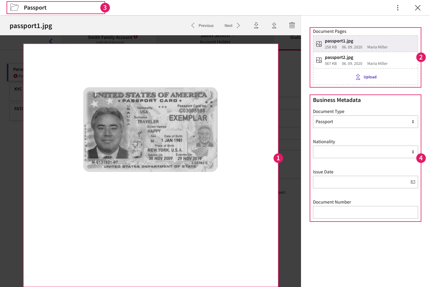
- The capability of previewing a file is managed by the
nm.blob.storage.rest.preview.media.typesconfiguration property set by the Platform administrator (see details above). - The File Uploader Component is configured by adding a property of type
Blob:FileorIndexed Blob:Fileto your Data Class. Constraints on the type and size of files can also be set at Data Class level. - The organization of files in a folder is possible by adding a Document Behavior to your Data Class.
- The Document Behavior also allows adding business metadata (e.g., ID issuing country) to your uploaded files. For this you need to configure Data Class properties.
Content Structure
When building a solution that uses Data Driven UIs, the User Interface is automatically generated based on:
- The specific App Task used in the Process (e.g., Data Gathering App Task)
- The business logic defined in one or more Data Logic Business Objects
- The data model defined through Data Classes
When the Data Logic is translated in a data-driven UI, controls are rendered as form elements by default.
Moreover, depending on your App Task, you can structure content based on:
-
Field Sets and Sections — Allow grouping related fields together on a single line or in a card. These are configured through Data Logic Controls.
This feature is available for: Data Gathering App Task.
-
Display Modes — Allow showing data in tiles, tables, folders, and so on. These are configured through Data Class Behaviors (Summary, Table Row, Document, and so on).
This feature is available for: Each separate App Task.
Information Framework
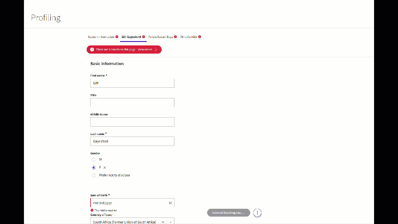
Validation Overview
The information framework in App Tasks provides continuous feedback and annotations on the fixes and actions necessary to continue in the data gathering activity.
The information framework may consists of two different types of validation (the example below is based on Data Gathering):
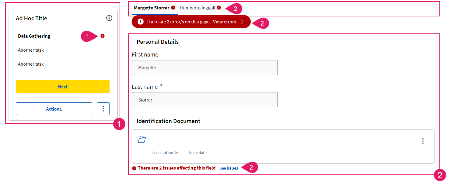
-
Sidebar (Navigation Validation) (
1): The sidebar (if available) shows the validation status of each step in the navigation (i.e. if the step is complete or incomplete). This way, the user is provided with an overview of missing steps and can take action to complete all his/her tasks. This is configured through Ad-Hoc Sub-Processes and is valid for all App Tasks. -
Content Area (Content Validation) (
2): This area highlights the violation of predefined rules at content level (missing or unexpected data, wrong data format and so on). This way, the user can address and correct any issues and continue with their task. This is configured through the Data Logic BO and the Rule BO (for Relationship Definition App task only) and may differ for each App Task.
Navigation Validation (Ad-Hoc Sub-Processes)
Feature Overview
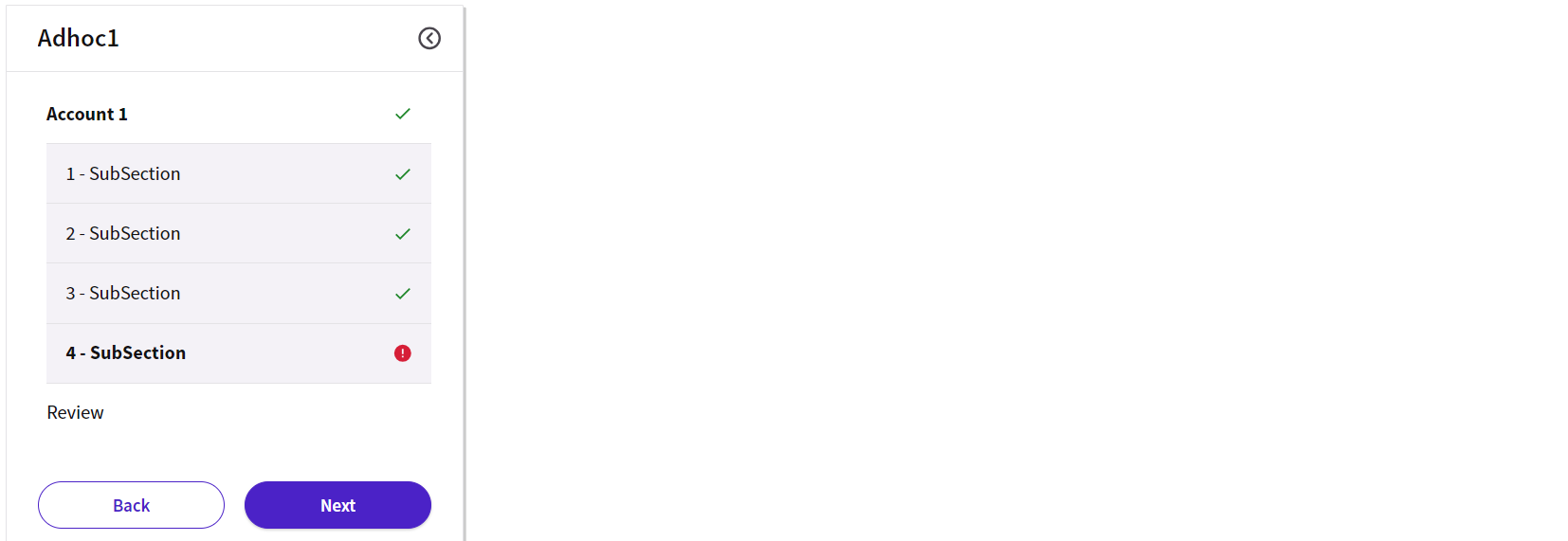
The sidebar shows the validation status of each step in the navigation (i.e. if the step is complete or incomplete). When validation is configured, users are provided with an overview of errors and can quickly take action where needed. Valid /invalid Navigation Items are visually indicated by a badge. This is valid for all App Tasks.
Configuration
To have navigation validation rendered in your App Task, you need to perform the following basic step:
- Your App Task must be contained in an Ad-Hoc Sub-Process Component.
- Configure Validation Badges in the Ad-Hoc tab of your App Task, as illustrated in Validation Badges (Ad-Hoc Sub-Processes).
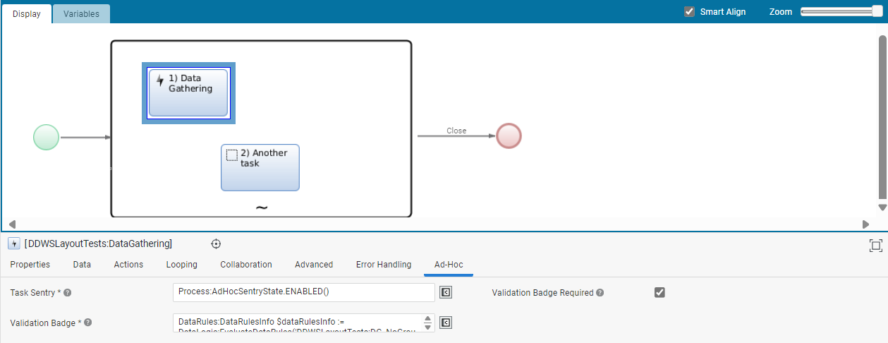
- Moreover, the Review Mode setting, configured at the Ad-Hoc Sub-Process level, allows specifying whether the Ad-Hoc Sub-Process content is to be reviewed by a given user at runtime (e.g., a page containing client data to be reviewed by a compliance officer). This setting influences the way validation messages and statuses are displayed in FNZ Studio Runtime for App Tasks contained in an Ad-Hoc Sub-Process itself.
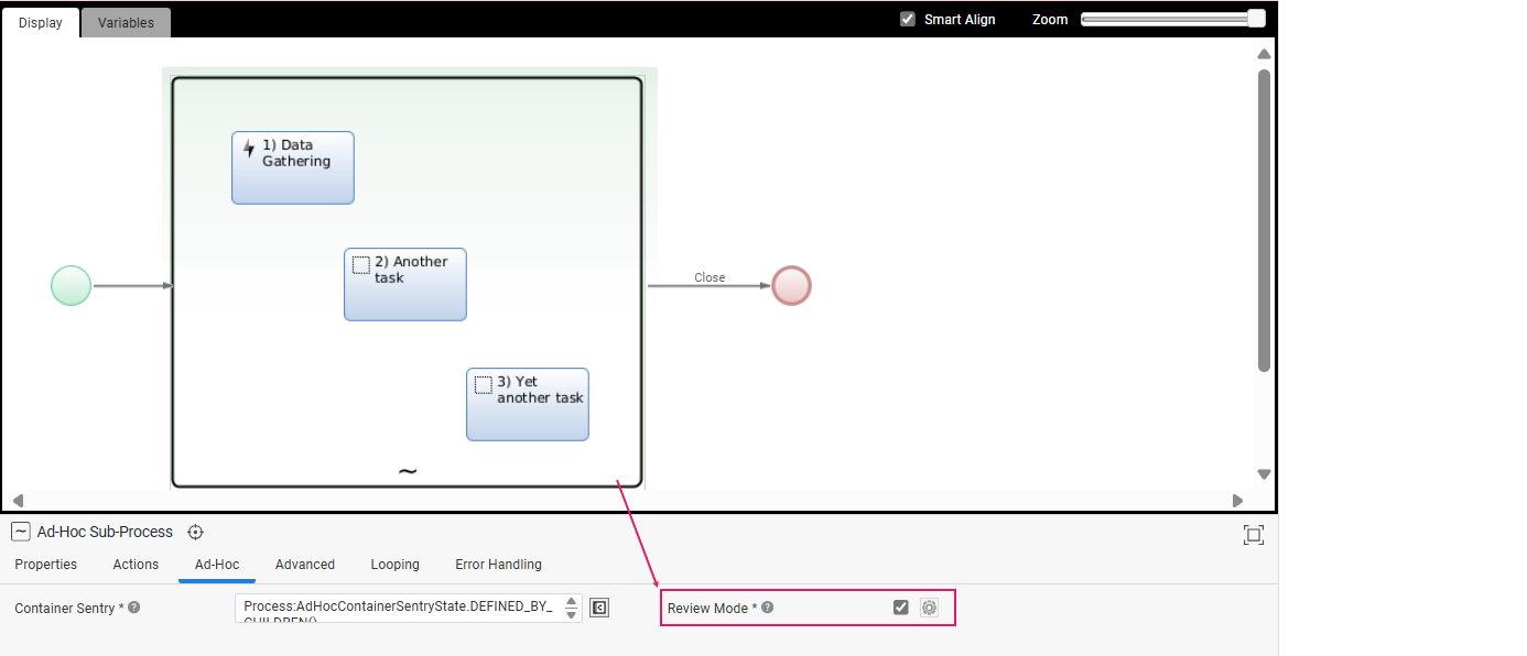
- Finally, it is even possible to override the Review Mode specified at the level of the Ad-Hoc Sub-Process for each specific App Task contained inside the Ad-Hoc Sub-Process itself (e.g., for the Data Gathering App Task in the image below).
Note that Review Mode disabled behaves in a slightly different way in each App Task. Check both Review Mode (general behavior) and each separate App Task document.
Content Validation (Data Logic)
Feature Overview
Content validation highlights the violation of predefined rules at content level (missing or unexpected data, wrong data format and so on).
These content violations may be shown in three areas, depending on the specific App Task (the example below is based on Data Gathering):
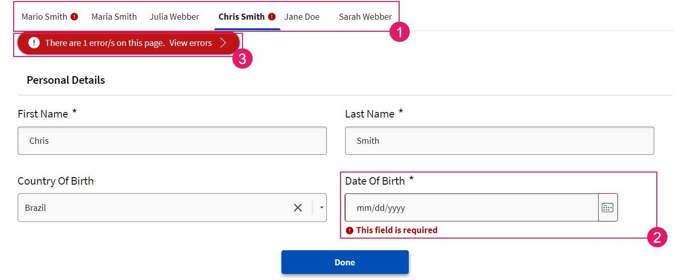
- Tab Bar (
1) — An icon shows whether there are any issues to be solved in the current page. - Content Area (
2) — An icon and a text message under the field affected by the issue/s provide information on how to fix the problem. - Violation Panel (
3) — The Violation panel under the tab bar can be opened to show a list of all the issues affecting the current page and allows jumping to the issue to be fixed directly.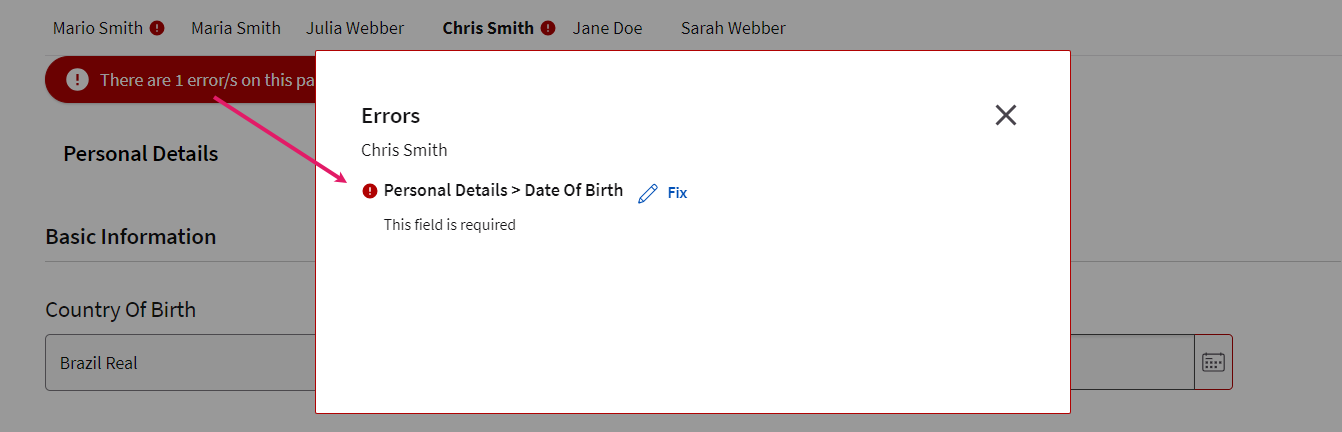
The content area may show two types of violations, which are marked by an icon and/or a text message:
- Blocking issues (errors) — These must be fixed to proceed and end the task. They are marked in red.
- Non-blocking issues (Warnings) — These are suggestions on how to improve the quality of entered data. Fixing them is not required to proceed and end the task, but it is recommended. They are marked in yellow.
Configuration
To have content validation rendered in your App Task, you need to perform the following basic steps:
- Configure a Data Logic Business Object with a set of Data Rules. Data Rules, in fact, prevent content violations in the first place, and determine how content violations are highlighted in the UI in case violations occur.
- The configured Data Logic BO must then be referenced in the Data tab of your App Task Process Editor.
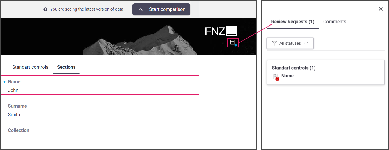
Collaboration: Comments and Review Requests
Data Gathering and Data Review allow reviewers to cooperate among them and with editors by highlighting data which needs to be fixed and checked, thus improving efficiency. Collaboration features include:
- Comments
- Review Requests
Comments
Comments help the collaboration among team members working on the Data Gathering or Data Review page. By clicking on the Comment icon next to a data field, a user can enter a comment for other team members. By clicking on the blue dot, the Comments sidebar is opened, and the list of open comments with relevant details is shown. Note that comments are grouped in cards by 'user' (user who entered comment) ans keyboard navigation is supported.
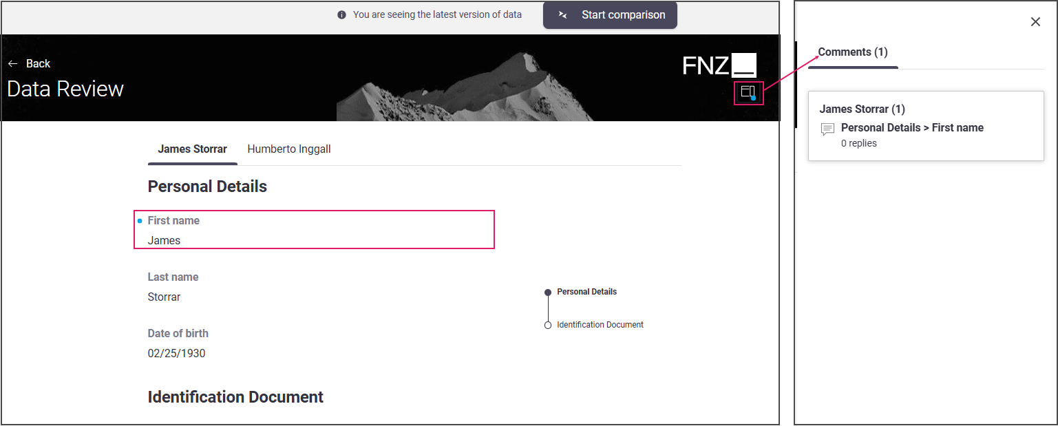
Review Requests
Review Requests simplify cross-team collaboration between data reviewers (e.g. a Risk Officer) and editors (e.g. a Front Officer) working on the Data Review and Data Gathering pages, respectively.
By clicking on the Review Requests icon next to the affected field, a reviewer sends a review request to an editor (e.g., Front Officer) working on the Data Gathering page. By clicking on the blue dot, the Review Requests sidebar is opened, and the list of open requests with relevant details is shown.
Developer Toolbar
The Developer Toolbar allows your to access two important developing features:
- The Theme Editor, which allows editing the look-and-feel of FNZ Studio Runtime. See Theming (Theme Editor).
- The Inspector tool, which allows navigating to and editing the Business Objects responsible for the FNZ Studio Runtime page. See Inspector
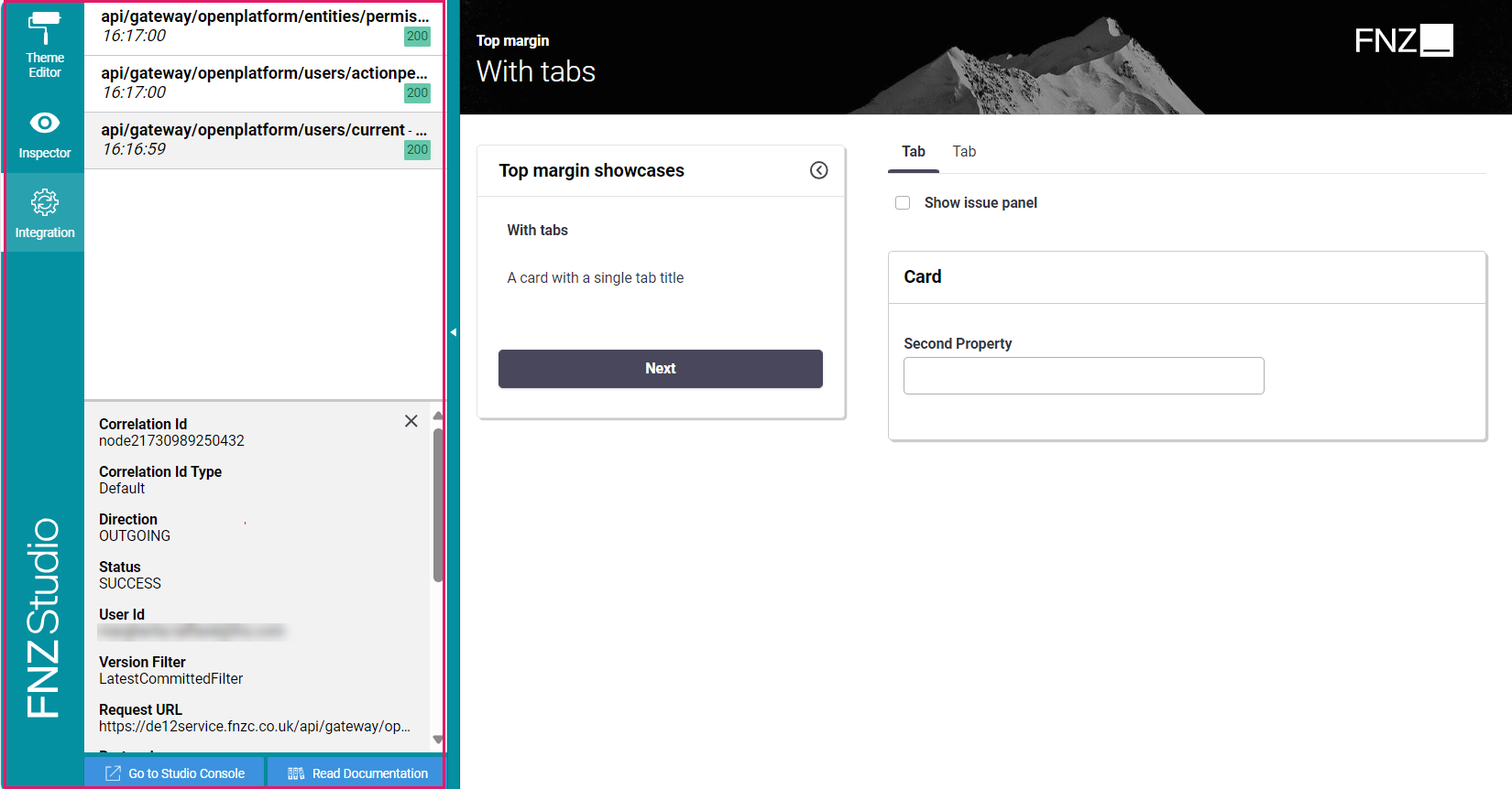
- The Integration console, which shows all the integration calls performed by the current Process Instance for easier contextual debugging. The content is a filtered version of the data contained in the Integration Troubleshooting Console available in FNZ Studio (Data & Integration module). See Integration.
- The Debug tool in the Developer Toolbar allows opening the Interactive Script Editor (ISE) in the context of the current App Task with the aim of inspecting its variables and evaluating its expressions for debugging purposes. See Debug.
You can open the Developer Toolbar from your ABC page by clicking on the arrow displayed on the left-hand side when hovering. Note that you need Studio Permission to access the tool.
Theming (Theme Editor)
The Theme Editor is a tool available in the runtime side of the App Tasks out-of the-box, which allows editing the look-and feel of the FNF Studio Runtime itself to achieve the desired branding.
Trough the Theme Editor, the end user is exposed to a set of master style elements (such as colors, and fonts). Behind the scenes, all the elements required to style the entire solution are consistently auto-generated according to the values entered and saved inside a Theme Package in the form of Style Value Business Objects (see details below).
Creating and Configuring a Theme Package
To use the Theme Editor capabilities, you first need to create and configure your Theme Package following these main steps:
- Checking the prerequisites for Theme Editor access and Theme Package creation
- Creating a Theme Package
- Configuring your Theme Package
- Assigning your Theme Package to your Solution
Prerequisites for Theme Editor Access and Theme Package creation
- You can create and configure Theme Packages in the Theme Editor only if you have the Packages Permission (Full-Access level). Note that, if you have the Packages Permission, but you see a certain Theme in locked mode, this means such Theme Package is read-only.
- You cannot create and configure Theme Packages, but you can access the Theme Editor, select a Theme and preview it if you have Studio Permission.
- You cannot see the Theme Editor if you have none of the Permissions described above.
Creating a Theme Package
- You can create a Theme Package as follows:
- (Recommended approach) In your ABC page directly, open the Developer Toolbar by clicking on the arrow on the left-hand side, and select Create a New Theme.
- In FNZ Studio Composition, go to Solution Design > Create New , and select the Theme Package checkbox. Package properties, such as logo and Permissions can only be configured in FNZ Studio Composition.
- The newly-created Theme Package is now empty, as its Business Objects are created during its configuration (see next section).
Configuring a Theme Package
- (Only if you created your Theme Package from FNZ Studio Composition) Open the Developer Toolbar by clicking on the arrow on the left-hand side of your page.
- Select the Package from the Theme Package dropdown list.
- The default values for the Theme Package are displayed in the Theme Editor. When you change the first value, the selected Theme Package is initialized automatically. Changes to Business Objects are saved automatically.
- Apply your branding strategy by applying the desired configurations:
- Colors, typography and the logo are managed in the Theme Editor directly
- The favicon and banner are managed in the Theme Package
- (Optional) Go back to FNZ Studio Composition and commit the Style Value Business Object.
Assigning your Theme Package to your Solution
Finally, assign the desired Theme Package to your Solution. You have two options:
- You can assign a default Theme Package to your Solution by setting the global configuration property (System Configuration > Configuration Properties)
nm.ddws.defaultThemePackage(e.g.,nm.ddws.defaultThemePackage = DefaultThemePackage). - You can assign different Theme Packages to specific users. In this case, each client using a Solution may see a different Theme. To do so, set the user preference
nm.ddws.themePackage(System Configuration > Users/Groups/Roles > Users > [Your User]> [right-click] > Preferences) to the desired Theme Package (e.g.nm.ddws.themePackage = ThisUserThemePackage). Note that this user preference overrides the system configuration property, if set.
Theme Editor Configurations
The Theme Editor is composed of three different sections to customize your branding:
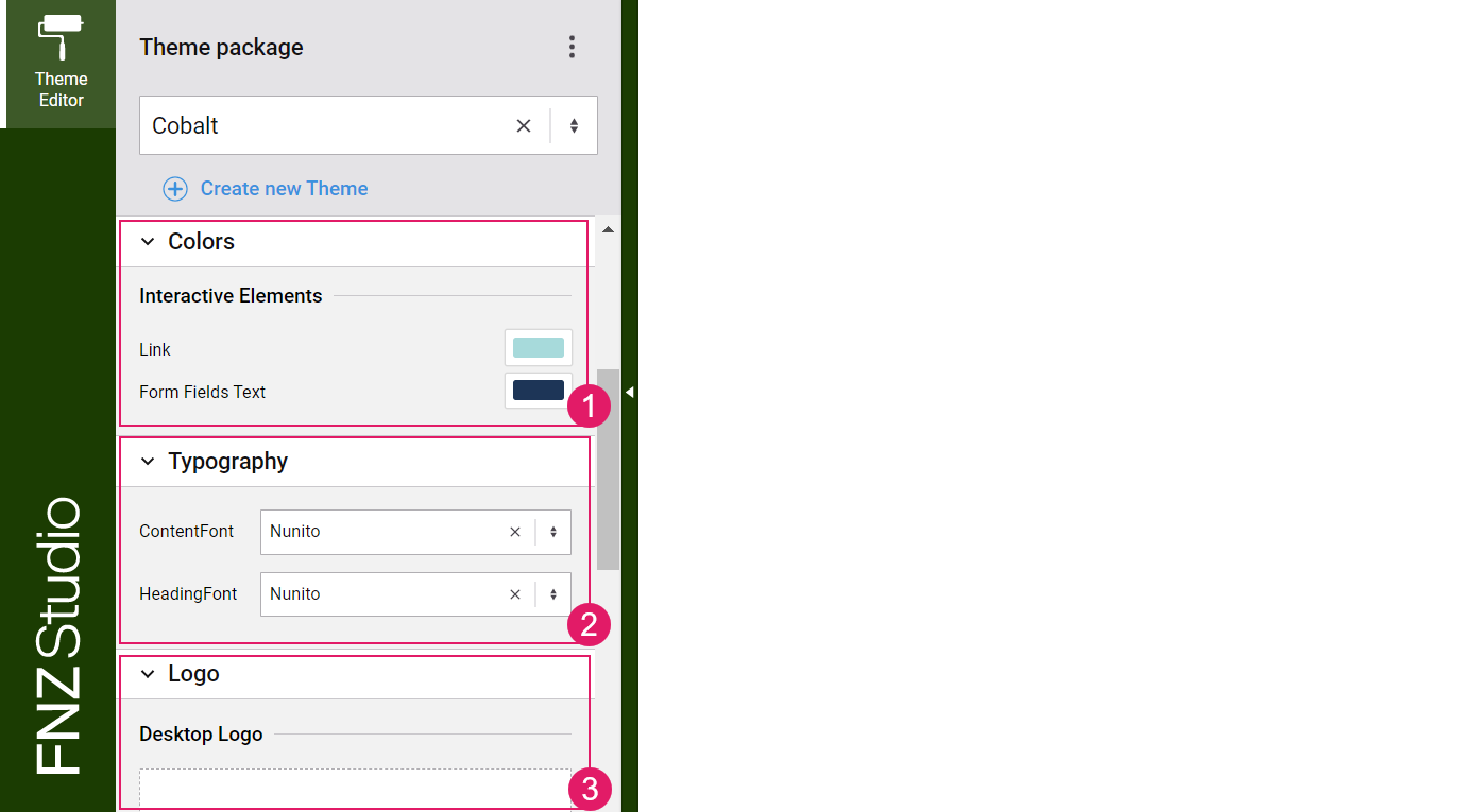
- Colors — The Color Editor exposes a master set of colors for the header, interactive elements and so on which drive the whole subset of colors used in the App Task.
- Typography — The Typography Editor allows defining the font that is used for the two main areas of the App Task: header and content. See the Typography section below for full configuration details.
- Logo — The Logo Editor allows configuring a logo for the desktop and the mobile version of your application.
Typography
You can change the fonts used in App Tasks in FNZ Studio Composition and apply them to your Theme Editor. To do so:
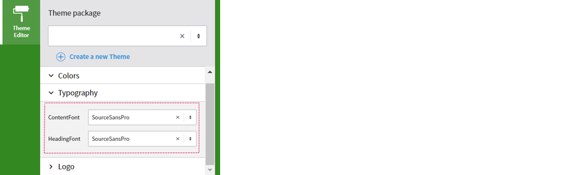
- In FNZ Studio Composition, upload all the Font Resources associated to the Font Family Style Value. Supported font formats currently are:
ttf,woff,woff2. - Create a new Font Family Style Value and assign the Font Resources.
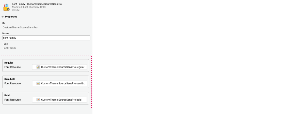
- Go back to the Theme Editor, and select the font.
Logo
You can configure a logo both for the desktop (larger than 720px) and mobile (smaller than 720px) versions of your App Task in the Theme Editor directly.
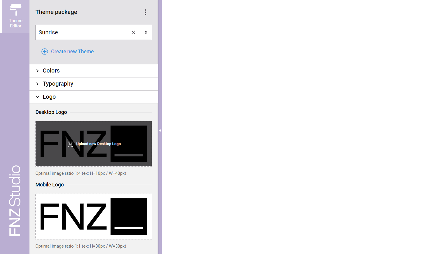
To do so:
- Hover or drag a new file over the existing logo to display the Upload new Logo button.
- Select the desired logo. The suggested optimal image ratio is:
- 1:4 for the desktop logo (e.g 10x40px)
- 1:1 for the mobile logo (e.g 10x10px)
Theme Package Configurations
Other items, namely the favicon and banner in your App Task, are configured in the Theme Package. See details in the section below.
- Favicon
- Banner
Favicon
In your Theme Package, you can configure a favicon to be displayed on your browser tab. To do so, follow these steps:
- Open your Theme Package and, on the left-hand Business Object Types panel, select Resource.
- In the central area, select the
Icon - FaviconResource. - On the right-hand Properties panel, click on the Replace File button to upload a new favicon image:
- Supported image formats include PNG, JPEG, GIF, and SVG. To achieve a better experience, we recommend that image files meet the following conditions:
- Shape: Square or round (e.g. 32*32 pixels)
- Size: Lower than 30KB (bigger sizes do not ensure better resolution, but they do affect the loading performance of the application.
- Supported browsers include Chrome, Firefox, and Safari.
- Supported image formats include PNG, JPEG, GIF, and SVG. To achieve a better experience, we recommend that image files meet the following conditions:
- Consider the following information:
- If you delete the
Icon - FaviconResource, the favicon is not shown in your Solution. Images can still be uploaded using the Replace File button, but they are not shown until theIcon - FaviconResource is undeleted. When undeleting theIcon - Favicon, the latest uploaded image is shown. - Due to the way browsers cache files, changes to the favicon can sometimes take a few minutes to be displayed. However, clearing the browser’s cache causes new images to be loaded immediately.
- If you delete the
Banner
In your Theme Package, you can configure a background image (banner) to be displayed on your header. To do so, follow these steps:
- Open your Theme Package and, on the left-hand Business Object Types panel, select Resource.
- Create a Resource Business Object containing the desired banner image and name it
Banner. - Once you select your Theme Package in the Developer Toolbar, the banner image is displayed.
Theme Editor Updates
The Theme Editor allows performing the following update operations:
- Update Themes — Allows adding newly created Style (see details below).
- Recompute Values — Allows recomputing Style Values (see details below).
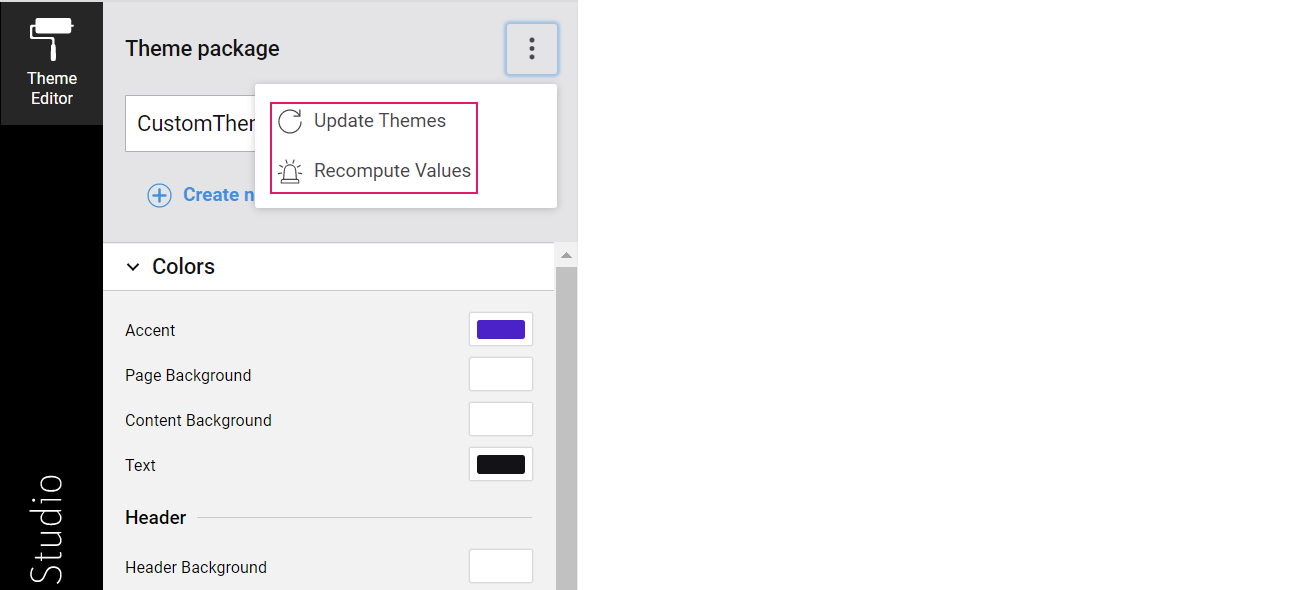
Update Themes
You can easily upgrade your Theme Packages every time new App task versions are available (updates are announced in the App Task Release Notes linked in the Releases Page). The Update function adds missing Style Values, creates new Style Values as result of token split or renaming, and properly derives secondary colors from primary colors.
To do so:
- Open the Theme Editor from any Application Business Component (ABC).
- Click on the Update Themes button available on the three-dot menu at the top-right of the Theme sidebar. This update adds the new Style Values to all the Theme Packages that are editable by the developer who performs the update. Note that, if the Package is locked or the developer does not have Permissions to edit one or more Packages, such Packages are not updated and, therefore, the ABCs will use default values for the missing Style Values. See the Theme Editor Prerequisites section for information on Permissions.
Recompute Values
You can use the Recompute Values function to fix wrong values related to calculation algorithm errors in previous Platform versions (these updates are announced in the App Task Release Notes linked in the Releases page) or also in case you mistakenly changed any Style Values in your Theme Packages manually and you want to reset their default values.
To do so:
- Open the Theme Editor from any Application Business Component (ABC).
- Click on the Recompute Values button available on the three-dot menu at the top-right of the Theme sidebar.
Inspector
The new Inspector tool in the Developer Toolbar allows navigating to the Business Objects (Data Logic, Data Class and so on) where the elements of the current page in FNZ Studio Runtime are configured.
- To access the Inspector tool, open the Developer Toolbar by clicking on the arrow appearing on the left-hand side of your FNZ Studio Runtime page when hovering. Note that you need Packages Permission (Full Access) to use the Inspector tool. If you have this Permission in Read-Only Access mode, you can open the related Business Object in read-only mode.
- On the Inspector tab, click on the Enable Inspector checkbox. Once the Inspector is enabled, hover the mouse cursor over an element, this will highlight the selected element with a color box. When the desired element is highlighted, click on the Inspect (eye) icon at the top right of the box, or press Alt+click.
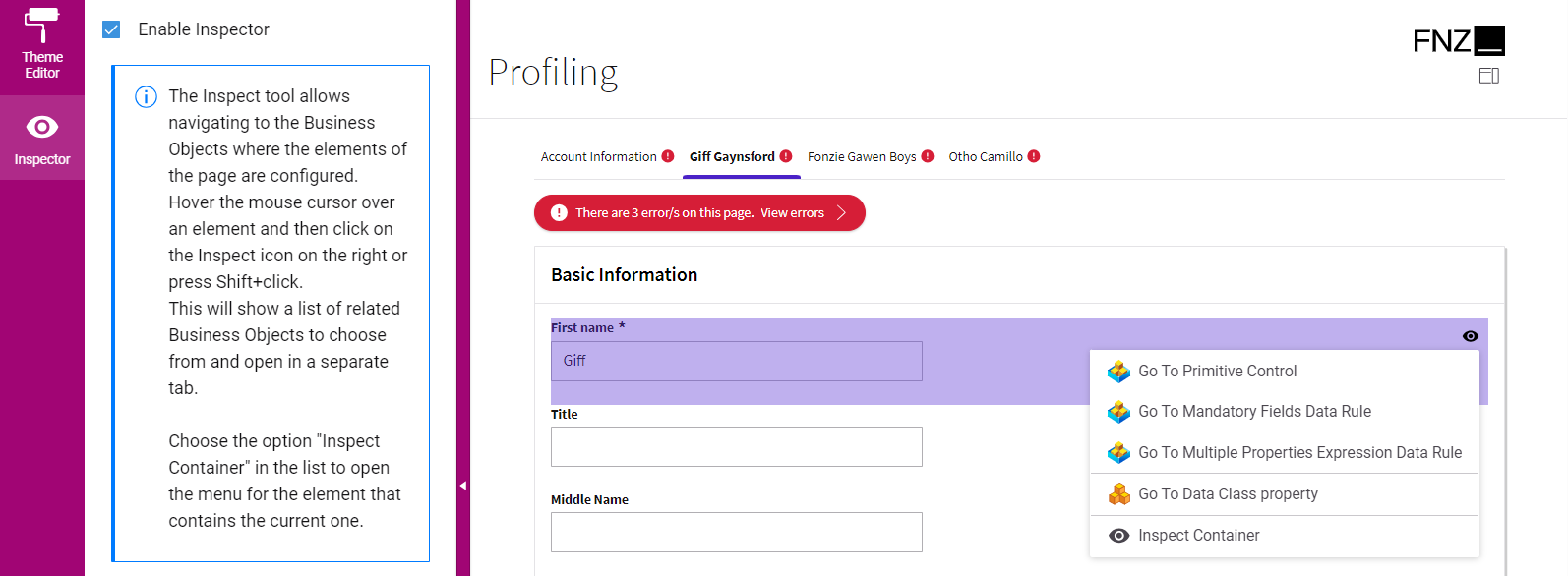
- This opens a context menu with a list of related Business Objects (or their properties) you can choose from. Click on the desired option to open it in a separate tab (note that you need to allow pop-ups for the FNZ Studio instance to be able to open the editors in a separate tab). Currently supported options are (the available options may vary depending on each App Task):
- When a property field is selected: Opens the Data Class property corresponding to that field.
- When a container component is selected: Opens the whole validation message (error or warning) is selected: Opens the Data Logic BOs where the violated Data Rule is defined.
- When the validation panel is selected: Opens the BOs that causes the violation (if possible).
- When a field with an associated catalog is selected: Opens the Catalog BO and the Data Logic BO where the Catalog Values Data Rule is defined.
- When a component with an associated Behavior (e.g., a card displaying data in condensed mode linked to a Summary Behavior) is selected: Opens the Data Class where the associated Behavior is defined.
- When a tab in the Tab Bar is selected: Opens the Data Logic BO where the associated Section Group Control is defined.
- When any action (Global, Inline Action and so on) is selected: Opens the Process BO where the action is configured.
- When the page header is selected: Opens the Process BO where the App Task is configured.
- When an Ad-Hoc Sub-Process navigation item is selected: Opens the Process BO where the Ad-Hoc Sub-Process is configured.
- Finally, for a nested element, you can choose the Inspect Container option to open the menu for the element that contains the current one.
Integration
The Integration console shows all the integration calls performed in the current Process instance for easier contextual debugging. The content is a filtered version of the data contained in the Integration Troubleshooting Console available in FNZ Studio Composition (Data & Integration module), i.e. only HTTP calls related to the current Process Instance are visible.
If the Integration Troubleshooting Console is not enabled in FNZ Studio Composition, a message is displayed in the Developer Toolbar. In this case, you just need to click on the Enable button.
Once the feature is enabled and you start interacting with your page, the integration calls for the current Process Instance are shown in chronological order (newest on top) on the left section. Click on an entry to display the details of the selected item in the lower part of the Toolbar.
If the list of entries is scrolled down and new entries appear at the top of the list, you are notified with an icon indicating the number of undisplayed notifications  .
.
You can click on the Go to Studio Console button to navigate to the FNZ Studio Integration Troubleshooting Console, where you can see the integration calls performed in all Process Instances, or even disable the Troubleshooting Console (Disable Troubleshooting for HTTP button). However, consider that this disables the console for all users.
Debug
The Debug tool in the Developer Toolbar allows opening the Interactive Script Editor (ISE) in the context of the current App Task with the aim of inspecting its variables and evaluating its expressions for debugging purposes.
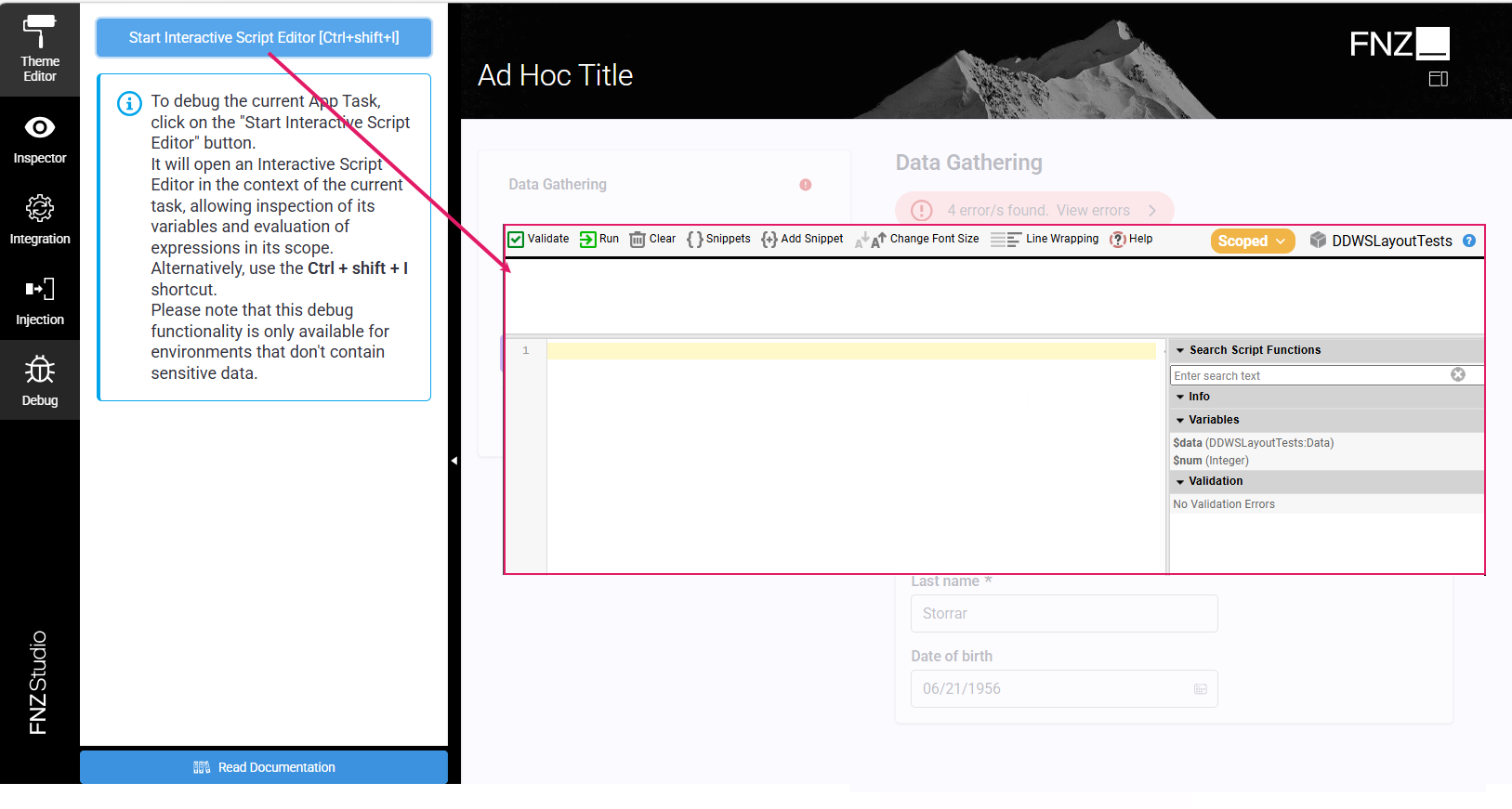
Note that its usage is possible only for environments that do not contain sensitive data, for example development environments. This is configured by explicitly setting the Environment Variable NM_SYSTEM_CONTAINS_SENSITIVE_DATA to false (default is true).
To access the "scoped" version of the ISE, open the Developer Toolbar by clicking on the arrow displayed on the left-hand side when hovering, then navigate to the Debug tab. Alternatively, use the Ctrl + Shift + I shortcut while on the App Task Runtime page.
Note that you need the Interactive Script Editor (Full Access) Permission to use the Debug tool. See Advanced Studio Permissions.
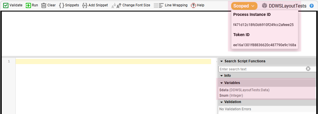
When the ISE is opened this way, the tag Scoped is shown at the top right of the window. If you click on it, he current Process instance and Token Ids are shown. In the Variables section of the ISE, all Variables of the current task are shown, making it possible to use them in expressions and inspect their value.
Note that you can also access the ISE under Solution Maintenance > Script Language > menu] > Start Interactive Script Editor section in FNZ Studio Composition. When right-clicking on a Token, choose the option Open Interactive Script Editor for this scope to open a Scoped Interactive Script editor for the selected task.
Localization
Labels and Translations
All basic labels used for App Tasks (e.g. calendar months) are included in the following Platform Packages:
- AppTask
- DataGathering (specific to the Data Gathering App Task)
- DataReview (specific to the Data Review App Task)
- RelationshipDefinition (specific to the Relationship Definition App Task)
- DigitalBinder (specific to the Digital Binder App Task)
Moreover, consider the following information:
- The language displayed in users' web browsers is determined by language priority criteria.
- You can edit the displayed text and add translations: we strongly recommend using the Overriding Translations approach described in the Languages and Labels document. 
- The Data Logic Editor features a Translations tool that allows editing labels from the Business Object directly.
Number and Date Localization
App Tasks define the localization of numbers and dates according to a Locale configured at FNZ Studio Composition level. To determine what locale is used in the user's web browser, the Platform processes the same steps used for language priority, with the addition of a first step, where it checks if a specific Formatting Locale preference has been defined at User level. See the following table for details:
| Configuration Type | Priority | Description |
|---|---|---|
User Preferences: format_language |
1 | The Formatting Locale preference can be stored as a User property for registered users in the Platform. The Platform provides a set of Script Functions to get and set User Preferences (see code snippet below the table*). Preferences are stored as long as the User exists within the Platform's user management (System Configuration > Users). |
| Query Parameter | 2 | Same as language priority |
| URL Path | 3 | Same as language priority |
| Session Attributes | 4 | Same as language priority |
| Cookie | 5 | Same as language priority |
| User Preferences | 6 | Same as language priority |
| Browser Language | 7 | Same as language priority |
| Default Language | 8 | Same as language priority |
| Java Configuration | 9 | Same as language priority |
| System Setting | 10 | Same as language priority |
| Nothing Found (Fallback) | 11 | Same as language priority |
*Script Functions to get and set User Preferences:
User $user := User:Get();
// Set the user preference
$user.setPreference('format_language', 'en_US');
// Get the user preference
String $language := CAST(String, $user.getPreference('format_language'));
// returns 'en_US'
.
The Locale determined above automatically generates the correct formatting for dates and numbers according to standard rules. The following reference table contains some examples of which date and number formatting corresponds to each Locale (note, however, that App Tasks support all browser Locales):
| Locale | Date Formatting | Number Formatting |
|---|---|---|
| en_US | MM/dd/yyyy | 12,345.67 |
| de_CH | dd.MM.yyyy | 12’345.67 |
| en_CH | dd.MM.yyyy | 12’345.67 |
| fr_CH | dd.MM.yyyy | 12 345,67 |
| it_CH | dd/MM/yyyy | 12’345.67 |
| de_DE | dd.MM.yyyy | 12.345,67 |
| en_CA | yyyy-MM-dd | 12,345.67 |
| fr_CA | yyyy-MM-dd | 12 345,67 |
| en_NZ | dd/MM/yyyy | 12,345.67 |
Further Resources
- Ad-Hoc Sub-Processes and Navigation
- Data Logic Business Object contains details information on Data Logic Controls and Data Rules.
- Data Class Business Object contains details information on Data Classes
- Languages, Labels and Translations contains information on label and overriding translation management.