Inbox
Inbox serves as a personal hub for end-users working with business applications developed with FNZ Studio and is designed to boost the efficiency of their interaction with these systems. It acts as an entry point to most FNZ Studio applications and assists users in choosing what to work on next and getting their tasks done efficiently. When using Inbox, end-users benefit from the following characteristics:
- Their work is organized in an intuitive list, making it easy to gain an overview.
- Seamless navigation between the overview and further details without needing to leave the application. Inbox provides on-demand access to details without interrupting the user's flow.
- Inbox helps end-users focus on completing important issues first, avoid time-consuming multitasking.
- Inbox aggregates data relevant to specific work tasks and provides easy access to it, significantly reducing time spent searching information.
- Actions can be initiated directly out of Inbox, removing the need to navigate between different screens and applications.
The enhanced information layout of Inbox is based on entities, which group related information regarding a common business context, such as Tasks, Processes, or Data Tasks. Each entity is displayed as an individual tile providing relevant information at a glance and allowing end-users to quickly access more details as needed.
Inbox is delivered as a series of Packages which contain the pre-configured FNZ Studio Business Objects (Screens, Data Classes, Scripts etc.) out of which Inbox is built. This modular approach makes Inbox straightforward to customize, allowing you to extend the default solution and adapt it to your specific requirements directly in the FNZ Studio Composition. Typical types of customization include:
- Adapting the information displayed within individual entities to meet the specific needs of end-users when working with the overview.
- Advanced searching, sorting, and filtering capabilities, to help users reduce the amount of data that is displayed according to what they are looking for.
- Catering to different user roles (manager, front office etc.) by providing them with the information they require to fulfill their respective work duties. E.g., managers are interested in monitoring overall business performance, whereas front office employees complete their workload on a task-by-task basis.
Principles
Inbox complies with the principles of the Appway Design System. In particular, Inbox is designed to comply with FNZ Studio guidelines governing the following areas which are vital to Inbox:
- Screen types
- Entities
Architecture
Inbox is a collection of “Entities” – a way to group the most relevant information regarding a common element.
The following image shows the Inbox home and explains which elements and components the page is composed of:
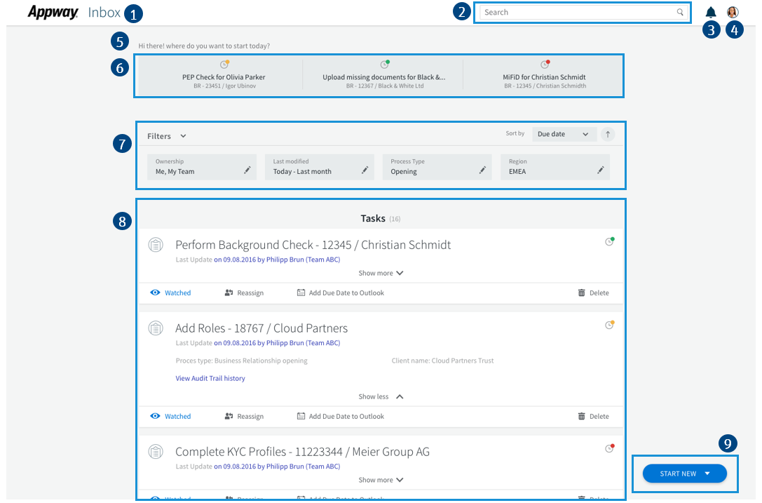
Legend:
- Application Name
- Search Field Screen Component Allows searching for specific Workitems on a set of criteria (account number, name etc.)
- Notification
- User Icon / Tooltip
- Welcome Message
- Quick Access Menu Workitems preselected by FNZ Studio and offered as suggestions (e.g. 'Workitems I recently worked on')
- Filter Tray Screen Component, A set of filters allowing users to narrow down the number of Workitems presented to them.
- Entities The Task, Data Task, or Process to work on.
- Start menu Allows selecting the next Process to start.
The Inbox front end shown above is built on the following architecture which integrates with the back end:
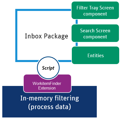
The front end, which is assembled by the Packages for Inbox. Among other things, the Packages for Inbox contains all Business Objects required for building your customized Inbox.
The back end consists of:
- Existing in-memory filtering (from FNZ Studio core), integrated through the WorkitemFinder extension.
- Additional search and paging on top of the capabilities of the pre-existing backend, provided by the WorkitemFinder extension.
Note: This solution does not use a database; all data is kept in memory. Additionally, it contains only Process data, business data is currently not available and entities are always Workitems.
The Packages for Inbox interact with the WorkitemFinder extension with FNZ Studio scripting.
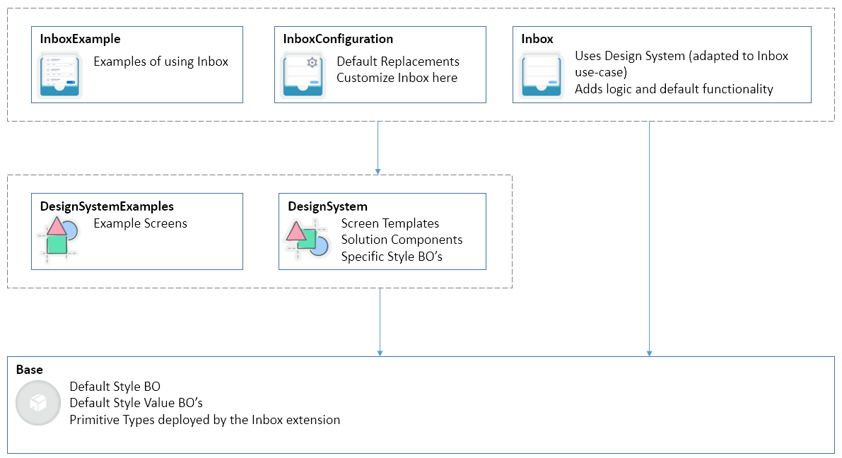
Packages for Inbox
The Packages for Inbox contain all Business Objects used in the Inbox solution. The Packages for Inbox are delivered as an AWDEPLOYMENT file, which contains three individual Packages:
- Inbox Package – Managed and maintained by FNZ Studio. Do not change this Package. You can use Replacement Business Objects (available in the Inbox Configuration Package) to configure the Inbox Package.
- Inbox Configuration Package – Contains Business Objects you can modify to configure a customized Inbox solution according to your specific requirements. This Package contains all default Replacements for the Replaceable Business Objects available in the Inbox Package.
- Inbox Example Package – Contains examples on how to use Inbox features.
The Packages for Inbox leverage the Design System templates and solution components. In addition, specific logic, a data model, and configurations are added. Inbox provides clear Package interfaces, enabling easy customization and contains functional examples.
The following out-of-the-box functionality is available after importing the Packages for Inbox:
- Display Workitems as entities
- Quick access to tasks which the user recently worked on
- Search on default fields
- Filter for ownership, creation time, and more
- Sorting on creation date and name
- Watch and delete Workitems
- Possibility to start an example process
- Multi-language capabilities
Note: See the Packages documentation for general information on the concept and usage of Packages.
Configuration
All features of Inbox can be customized by replacing the according Business Objects of the Inbox Package. The architecture is as follows:
- The Business Objects defining the functionality of Inbox are located in the Inbox Package, but should not be changed there.
- All Business Objects relevant for configuration are defined as Replaceable in the Inbox Package.
- By default, the Business Objects relevant for configuration are replaced by Business Objects of the same name which are located in the Inbox Configuration Package. These Business Objects in the Inbox Configuration Package can be changed to customize the Inbox solution.
General Settings
General Settings are specified in:
- Catalog: Settings – General Settings
- Screen: Header – User Tooltip
General Settings apply to Inbox as a whole, e.g. they define which fields are available.
The following options are available in the Settings – General Settings Catalog:
- dateFormat – Defines the date format used. Default: dd/MM/yyyy HH:mm
- pageSize – Defines the number of entities displayed per page. Default: 10
- applicationName – Defines the name of the application which is displayed on the main page.
Default: 'Inbox' / Label:
application.name - searchVisible – Determines whether the Search field is displayed.
Default:
true - quickTasksVisible – Determines whether the Quick Access menu is displayed.
Default:
true - notificationVisible– Determines whether notifications are displayed.
Default:
true - slaVisible– Determines whether the SLA status is displayed on the entity and on the items in the Quick Access menu.
Default:
true
Note: Displaying the SLA status requires the use of BAM (FNZ Studio Business Activity Monitoring). If you are not using BAM, the SLA icon is not displayed regardless of the setting of this property.
- startMenuVisible– Determines whether the Start menu at the bottom right of Inbox is displayed.
Default:
true - welcomeMessage – Defines the welcome message displayed at the top of the main Inbox page.
Default: 'Hi there! Where do you want to start today?' / Label:
welcomeMessage - entitySecondaryInfoVisible – Defines if the Show more / Show less option allowing users to view secondary information is available within Entities.
Default:
true - searchWhenUserEndsTyping – Determines the behavior of the search field. If set to
true, the search triggers automatically when text is entered and the user is then inactive for 500ms. If set tofalse, the user has to trigger the search manually after entering the search string by clicking on the Search icon. Default:true - subTitle – Defines the sub-title displayed at the top of the task list.
Default: 'Tasks' / Label:
subtitle - searchPlaceholder – Defines the text displayed inside of the Search field.
Default: 'Search' / Label:
search - emptyInboxMessage – Defines the text displayed when there are no Workitems to display.
Default: 'Your Inbox is empty. There are no tasks available. You can start one of the following processes:' / Label:
empty.inbox.message - newTaskNotificationEnabled – Determines whether the notification for a new task is enabled.
Default:
false - newTaskNotificationInterval – If
newTaskNotificationEnabledis true, it defines the time interval (in seconds) after which the task list is checked. Default: 30
The Header – User Tooltip Screen can be used to configure the content of the tooltip displayed when clicking on the user icon in the header. By default, there are two entries: One shows the user's first and last name and the other shows the logout button. Only the logout button is functional.
Search Field
The settings for the Search field are specified in:
- Catalog: Search – SearchDefaultFields
- Catalog: Search – SearchTokenAttributes
- Catalog: Search – SearchProcessInstanceAttributes
Different aspects of Search, such as the scope can be defined. The following three Catalogs are available for customizing the Search functionality of Inbox:
- Search – SearchDefaultFields
Defines the default fields which are considered when searching. By default, all fields are set to
true, meaning that they are considered when searching. - Search – SearchTokenAttributes Defines the Token attributes to search. In the first column, enter the name/ID of attribute. In the second column, specify the type of the attribute (e.g. Date, Number, String). By default, this Catalog is empty so no Token attributes are considered when searching.
- Search – SearchProcessInstanceAttributes Defines the Process Instance attributes to search. In the first column, enter the name/ID of attribute. In the second column, specify the type of the attribute (e.g. Date, Number, String). By default, this Catalog is empty so no Process Instance attributes are considered when searching.
Quick Access Menu
The settings for the Quick Access Menu are specified in:
- DataClass: Quick Access Menu – QuickAccessDataProvider
You can customize the sub-title used for items in the Quick Access menu. The sub-title can be configured by modifying the Quick Access Menu – QuickAccessDataProvider Data Class. By default, the Quick Access Menu displays the items which were last modified by and are still assigned to the current user. This logic is not configurable.
Note: The Title and SLA icon are the same as used by the Entity.
Example:
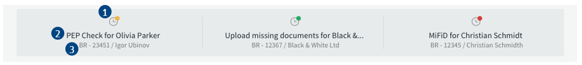
Legend:
- SLA icon The icon shows the same status as the one on the entity.
- Title The title is the same as on the entity.
- Sub-title By default, the sub-title is the last modified date but this can be customized.
Filtering and Sorting
The settings for Filtering and Sorting are specified in:
- Screen: Filter Tray – FilterTray
- Data Class: Filter Tray – FilterSelectionManagerConfig
You can customize which filters are shown, how the filters interact, and the sort criteria to be applied. All these settings are made in the Filter Tray - FilterTray Screen.
Note: The corresponding logic needs to be defined in the FilterSelectionManagerConfig Data Class which is inheriting from the FilterSelectionManager Data Class. Inside the FilterSelectionManagerConfig Data Class, you can define custom properties for filtering and sorting. By default, properties for paging, searching, and sorting are already available as well as the following functions:
- `getFilterChain` FunctionnThis function chains the implementation of your custom filters. There are several examples of such custom filters e.g. `GetOwnershipWorkitemFilter`, `GetCreationTimeWorkitemFilter`.
- `getSortCriteria` FunctionnDefines the logic of the sort criteria. In the default implementation, the label is defined in the SortingSelectorOptions Catalog.
Entities
The settings for Entities are specified in:
- Screen: Task Entity – TaskEntitySecondaryInfo
- Screen: Task Entity – TaskEntityActions
- Screen: Task Entity - TaskEntityDetails
- Data Class: Task Entity – TaskEntityDataProvider
- Function: TaskEntityActionUrl
You can customize many different aspects of Entities, like title, metadata, link, or actions. Use the Business Objects indicated in the legend below the image to implement these customizations to the different parts of the Entity:
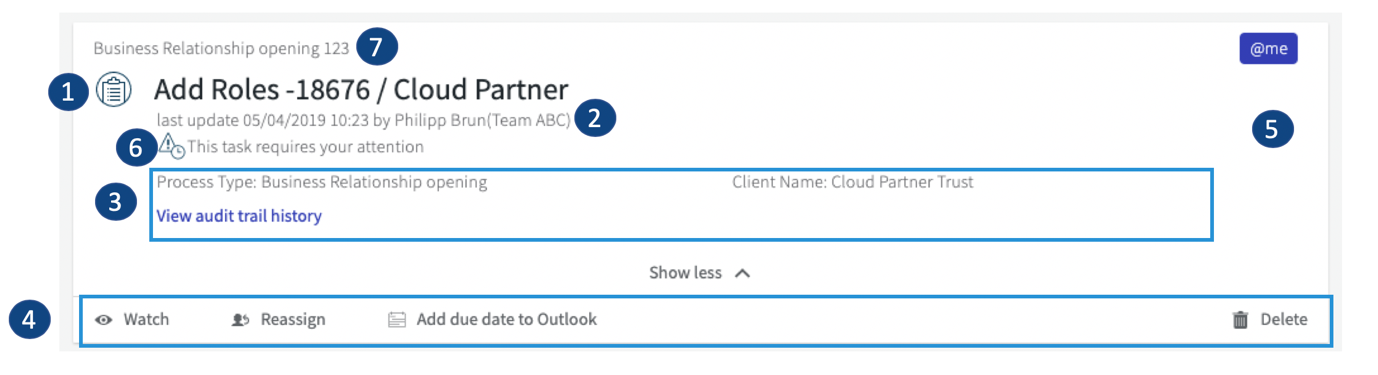
Legend:
- Title Use the Task Entity – TaskEntityDataProvider Data Class to customize.
- Metadata Use the Task Entity – TaskEntityDataProvider Data Class to customize.
- Secondary Information Use theTask Entity – TaskEntitySecondaryInfo Screen to customize the secondary information (shown in the expandable area) displayed for Task Entities.
- Actions Use the Task Entity – TaskEntityActions Screen to customize the actions available on the action bar of Task Entities as well as the appearance of the action bar.
- Entity Link (whole white area is actionable) Use the TaskEntityActionUrl Function to customize the action performed when clicking on a Task Entity, e.g. when the Workitem is not assigned to a user. By default, the Workitem is opened by clicking on the Entity.
- Task Detail Use the Task Entity – TaskEntityDetails Screen to customize the details area displayed for Task Entities.
- Process Information Use the Task Entity – TaskEntityDataProvider Data Class to customize (processName or LinkPlaceholderText properties).
Start Menu
The settings for the Start Menu are specified in:
- Screen: Start Menu – StartMenu
You can customize the title, sub-title, and link of each menu item, as well as determining the logic according to which Processes can be started by a given user. The Start Menu – StartMenu Screen iterates over all items in the StartMenuConfiguration Data Class. The default values for the StartMenuConfiguration Data Class are set when it is initialized in the Inbox Process. An example can be found inside the Inbox Example Package.
Example:
Legend:
- Title
- Sub-title
- Link per item
Multi-language Support
Translations to your required target language(s) for all text used in Inbox can be provided in the Labels available in the InboxConfiguration Package.
See these articles for more information on labels:
Dependencies
Packages
- InboxExample
- InboxConfiguration
- DesignSystem
Extensions
- WorkitemFinder
- Component
- DefaultIcons
- Functions
FNZ Studio Platform
- Supported versions: 9.0.1 and higher