Button Screen Component
Introduction
The Button is a Screen Component that triggers different kinds of actions. Depending on the type of button, it can be used to:
- trigger a specific action on a Screen (e.g. ‘Send Feedback’)
- navigate through a series of steps (‘Back’ or ‘Next’)
- navigate through hierarchical levels (‘Back to Parent’)
Button Screen Component Configuration
Properties Tab
The Button Screen Component has the following properties:
- Text – Text displayed on the button.
- Tooltip – Tooltip text displayed when button is hovered.
- Type – Sets the type of HTML attribute for the button among the following options: Button (default), Submit (submits the form), and Reset (resets the form fields). This option does not affect the button appearance.
- Has Descriptive Icon – If checked, the Descriptive Icon Id dropdown list is displayed. This allows you to select an icon to be displayed to the left of the button label. A descriptive icon visually describes the meaning of the action.
- Has Qualifier Icon – If checked, the Qualifier Icon Id dropdown list is displayed. This allows you to select an icon to be displayed to the right of the button label. A qualifier icon indicates the action status.
Style Tab
For more information on the styling of the Button Screen Component, see the Button Style Business Objects section.
Note: If you set the Use Legacy Style option, the following legacy properties become available in the Properties tab: Inline, Visual Type, Border Type. From Appway 7 onwards, these styling properties are replaced by the Button Style Business Object.
Actions Tab
The Button exposes the following Actions:
- onclick
- onblur
- onfocus
- onkeyup
For complete information on Actions, see the following articles:
Button Style Business Objects
A Button usually contains a text, an icon, and has a background.
States
The Button Style Business Object has four states:
- Hovered
- Focused
- Disabled
- Active
Styling Properties
These are the properties that allow customizing the Button component. Depending on the type of Button being styled, they can refer to different Style Business Objects.
- Background – Sets the background color for the Button.
- Border – Sets the color, thickness and type of line (dotted, dashed, and so on) for the Button.
- Shadow – Sets the color, type and blur effect of the shadow applied to the Button.
- Cursor – Sets the style of the cursor (text, pointer, and so on) used when hovering over a Button.
- Size – Sets both the width and height of the Button.
- Inner Spacing – Defines the space between the element inside the Button itself and the border.
- Outer Spacing – Defines the space between the element outside the Button itself and the border.
- Text – Sets the style of the text to be displayed on a Button.
- Descriptive Icon – Allows selecting a Button_IconDescriptive Style Business Object for the Icon Screen Component. A descriptive icon is used to visually describe the meaning of the action. The icon is displayed to the left of the Button label.
- Qualifier Icon – Allows selecting a Button_IconQualifier Style Business for the Icon Screen Component. A qualifier icon is used to visually describe the status of the action. The icon is displayed to the right of the Button label.
Note: The Qualifier Icon and Descriptive Icon properties allow selecting the Style Business Object for the Icon Screen component. The type of icon is selected in the Screen editor.
For more information on the listed properties, see the Style Business Object: Styling Properties section.
Types of Button and Button Style Business Object
A number of predefined Button Style Business Objects are available to be used according to the action performed by the Button component and its position on the Screen.
Default Button (Button Style Business Object)
The Default Button provides an archetypal button shape and is used for main actions.
The style of the Default Button is defined by the 'Button' Style Business Object, which refers to other Style Business Objects to define the appearance of the text and icons.
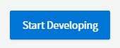
Primary Button (Button-primary Style Business Object)
The Primary Button is used for actions that affect the content of the whole Screen, or part of it, e.g. adding an item to a list. The Primary Button can be accompanied by an icon describing the action.
The style of the Primary Button is defined by the 'Button-primary' Style Business Object, which refers to other Style Business Objects to define the appearance of the text and icons.
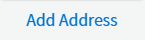
Secondary Button (Button-secondary Style Business Object)
The Secondary Button is used as an alternative to the primary button, or within a container. It can be accompanied by an icon describing the action.
The style of the Secondary Button is defined by the 'Button-secondary' Style Business Object, which refers to other Style Business Objects to define the appearance of the text and icons.
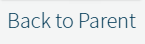
Back to Parent Button (Button-navigationToParent Style Business Object)
The Back to Parent button is used in the header to navigate up one hierarchy level. It is used in the headers of the Space, Activity and End Screens.
The Back to Parent button style is defined by the 'Button-navigationToParent' Style Business Object, which refers to other Style Business Objects to define the appearance of the text and icons.
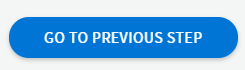
Navigation Button (Button-navigation Style Business Object)
Navigation buttons are used to move back and forth in the steps of a task sequence. They are used for scoped navigation on activity Screens. The inverted navigation button is used for a secondary action, in combination with the main navigation button.
The Navigation button style is defined by the Button-navigation Style Business Object, while the Inverted Navigation button style is defined by the 'Button-navigationInverted' Style Business Object.
Related Links
- For design suggestions, see the Button section of design.appway.com.