Screen Components: General Properties
Introduction
Most Screen Components, as well as the Screen itself, have a set of Properties that change how the Component looks and behaves. If one or several Components are selected, these Components' Properties are shown. If no Component is selected, the Screen's properties are shown. To configure a Screen Component, click on it on the Screen editor.
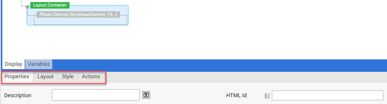
Different Screen Components display different properties. The following tabs may be displayed:
- Properties
- Data Source
- Style
- Variable Assignments
- Converter
- Validators
- Actions
- Layout (available for some Screen Components).
Properties Tab
The general properties displayed on the Properties tab depend on the selected component. For more information, see the documentation for each specific Screen Component.
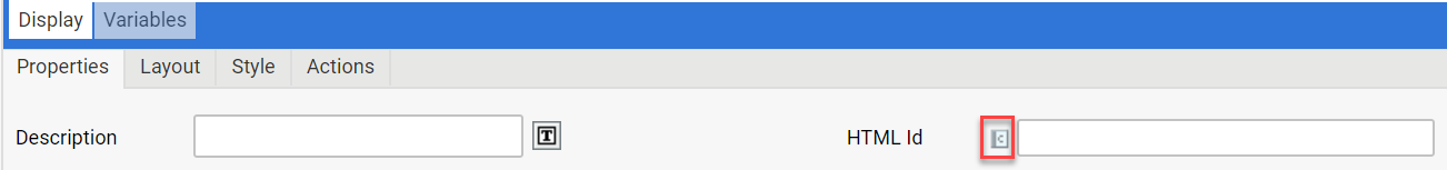
Static and Dynamic Properties
Some component properties can hold either a static value or a dynamic value (that is, an Expression). Such properties have a special marker icon containing a 'c' to the left of the input control. You can click on this icon to switch between static and dynamic mode:
- In static mode, the Property's main input control is displayed (Text Field, Dropdown List or Text Area).
- In dynamic mode, an Expression Area is displayed (with an icon to start the Expression Editor).
Some examples of dynamic properties are:
- Property Text on the 'Label' Component
- Properties URL and Resource on the 'Image' Component
- Property Code on the 'Java Script Action' Action
Dynamic properties are usually evaluated at runtime when the Screen Component is rendered. Some property expressions are expected to return plain text while others are expected to return special values (e.g. an id of a certain type of Business Object).
Data Source Tab
The Data Source Tab is displayed for components displaying a list of options, such as the Checkbox and Checkbox List Screen Components, Dropdown List Screen Component, Multiple Selection Field Screen Component, Radiobutton and Radiobutton List Screen Components.
Some Control Screen Components give the user a number of options to choose from. In order to know what options such components have to display, a Data Source has to be specified. A Data Source basically returns a list of options where every option has an ID and a Label:
- The ID is the internal value used to identify the option, therefore it should be unique within a Data Source. The ID is also used as an input value for the component and is saved in the Data Model if the user selects the option.
- The Label is the display value presented to the user on the Screen. It may contain Language Label references in the form
[LABEL:<packageId>:<labelId>].
Assigning a Data Source to a Screen Component
In order to assign a Data Source to a Screen Component, follow these steps:
- Select a Screen Component that requires a Data Source.
- Click on the Data Source tab.
- From the dropdown list, select the desired type of Data Source: Static, Catalog, Expression or User.
- Enter the properties for the selected Data Source type.
Static Data Source
A Static Data Source is a simple list of IDs and labels, saved directly within the Screen Component. The order of options in the Data Source reflects the order of options in the rendered Screen. Available properties are:
- ID – A text used to identify the selected option. This is the value that is saved in the Data Model.
- Label – The label to display in the list. The label is ordinary text and may contain Language Label references.
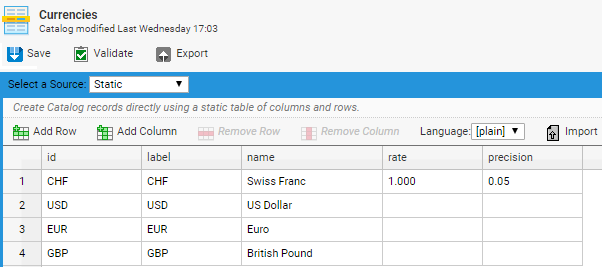
Catalog Data Source
A Catalog Data Source is backed up by a Catalog Business Object The order of the options in the Screen depends on the configuration of the Catalog.
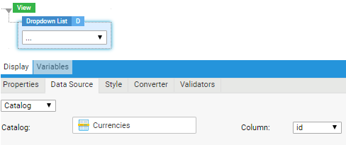
Catalog Data Source properties are:
- Catalog – The Catalog used as a Data Source for the option list.
- Column – Select the Catalog column that you want to display e.g. on the dropdown list. For example, if you select the id column in the example below, your dropdown list or other component will display the currency ids (CHF, USD, and so on).
Expression Data Source
Expression Data Sources are the most powerful but also the most complex Data Sources. They are based on 3 Expressions: a Collection Expression, an ID Expression and a Label Expression:
- The Collection Expression is evaluated first and is expected to return a collection of objects: Accounts, Persons, Integers, Strings etc. Every object in the collection is "transformed" into an option.
- The ID Expression and the Label Expression are the used to calculate an id and a label from every object in the collection.
Expression Data Source properties are:
- Collection – The Collection Expression must evaluate to a collection of objects (Accounts, Persons, Strings etc.)
- Variable – The name of the implicit variable used to hold an object in a collection while evaluating the ID and Label Expression.
- ID – The ID Expression used to calculate an option id based on an object in a collection.
- Label – The label Expression used to calculate an option label based on an object in a collection.
If the collection returned from the Collection Expression contains null objects, these objects are omitted.
If the id Expression or the label Expression evaluates to null for a given object, no option is generated for this object.
While evaluating the id and label Expressions and generating options, the Expression Data Source maintains 2 implicit variables:
$index– holds a counter, starting at 1 and incremented for every object in the collection$id– holds the evaluation result of the id Expression, which may be useful when calculating the Label in the Label Expression
Example: The Data Class Account has a Property called persons of collection type Collection with Indexed Entries containing instances of the Data Class Person. The Data Class Person has Properties id, lastname and firstname (all of type String). The Screen contains a Variable Definition for the variable account of type Account.
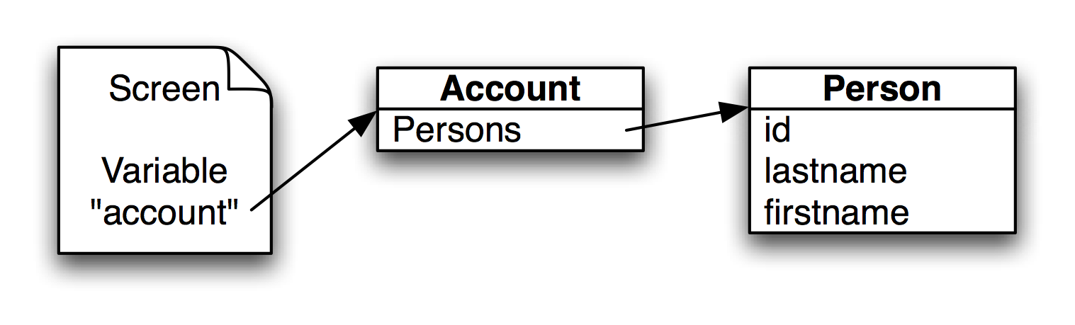
Data Layout for Expression Data Source Example
The task is to create an Expression Data Source returning the ids and names of the persons in the account. Solution:
- Collection –
$account.persons - Variable –
$person - ID –
$person.id - Label –
CONCAT($person.firstname,' ',$person.lastname)
The order of the objects in the Collection determines the order of the options on the Screen.
User Data Source
This option can be used to populate the list with information about the users on the environment. You can select:
- Individual users
- Roles
- Groups
Style Tab
Most of the Screen Components that are visible in the rendered HTML screen have a Style property tab.
Legacy Styles
For Screen Components using legacy styling, you can style the component by selecting the styling property and its value (e.g. Font: Helvetica; Margin: 5 pixel) from the Common Styles dropdown list and then clicking the Add button. You can also edit the name and style fields directly.
Style Business Objects
With the introduction of Style Business Objects, you can perform a comprehensive styling of components and solutions removing the need to use custom CSS. See Style Business Object.
The Style tab properties are:
- Outer Spacing Top
- Outer Spacing Bottom
- Outer Spacing Right
- Outer Spacing Left
Note on spacing: When you apply the Style tab properties, you are defining the space among components at Screen level, e.g. the space that separates two or more Button components on the current screen. To define the space between the component itself and the border (e.g. a Button), you need to configure the Inner Spacing and Outer Spacing styling properties on the Style Business Object (in this case, the Button Style Business Object ) editor.
Variable Assignment Tab
The Variable Assignment tab is available for the Template and Include Components. Variable Assignments are used when other Screens are included in the current Screen. Since the included Screens may use a different set of variables (different Variable Definitions), the Variable Assignments can be used to assign values to the variables of the included Screen. See Variables and Scopes for more details.
Converter Tab
The Converter Tab is available for Control Screen Components. A Converter is used to convert a Control's input value (a simple textual representation) into the model value (a complex data object) and viceversa. If conversion fails, this results in a converter error. An error message is displayed on the screen (similar to a validation error).
Sometimes, a special user-defined conversion is needed. In this case, an explicit Converter can be selected and assigned to the Control component. Only one Converter can be assigned to a Control at a time. All Components with a Converter display a 'C' icon next to their names. Click on the icon to go directly to the Component's Converter Properties.
Note: Converters can be used in combination with Validators. When the two are combined, the Converter is applied first, converting the input `$value` during the Update phase. After conversion, the Validate phase takes place where the Validators are evaluated. This means that the Validators validate the converted value. nnIf a Conditional Validator is used, the type of the variable has to be changed to match the type selected as output for the Converter. nnIf the purpose of the component is to confirm that Conversion was successful, specify a Conditional Validator that checks if the converted `$value != null`.
Assigning a Converter to a Component
To assign a Converter to a Component, follow these steps:
- Select a Component that requires a Converter.
- Click on the Converter tab.
- From the dropdown list, select the desired type of Converter.
- Enter the properties for the selected Converter type.
Converter Type: Expression Converter
The Converter Type dropdown list in the Converter tab allows you to select an Expression Converter. This is based on two Expressions:
- Input Expression – used to convert text entered by the user into an object to be stored in the Data Model.
- Output Expression – used to convert the object stored in the Data Model into a text that the Control can display on the Screen.
Expression Converter properties are:
- Input – Input Expression used to convert text into an object when the data in the Control has to be saved in the Data Model.
- Output – Output Expression used to convert the object in the Data Model into a text that he Control can display when the Screen is rendered.
- Variable – The implicit variable holding the value to convert.
Examples:
- The user wants to enter a number with a percent sign (e.g. '75%'). However, in the Data Model, the value should not get stored as a text but as a number of type
Double(0.75), so that rules can calculate with this value. The input Expression first has to strip off the percent sign, convert the value into an number and divide it by 100. The output Expression has to do the reverse action: Multiply the value by 100 and append a percent sign. - The user wants to enter dates without a year (e.g. '02.03.'). An ExpressionConverter could append and remove the current year automatically.
- A value entered by the user has to be rounded up automatically (useful for instance for currency values).
- A phone number is entered in a single Text Field, but should get parsed and stored as a complex Data Type implemented using a Data Class
Phone. The Data Class contains separate properties for country code, location code, number and extension. A custom Converter can be used to parse the input value and return a newPhoneinstance. In the other direction, the Converter can concatenate the property values read from thePhoneinstance into a single text to be displayed by the Text Field.
Built-In Converters
If a Control does not have a Converter assigned to it, the system automatically tries to select a predefined (built-in) Converter. The Binding Expression is evaluated and the Data Type of the referenced Data Property is used to select a Converter. If a Text Field has a Binding Expression of type $person.dateOfBirth and dateOfBirth is a Property of type Date, a Date Converter is selected to convert the user's input into a valid date object. The same converter is used if the Text Field needs to display the value. This time, the converter has to convert the date object in the Data Model into a text that the Text Field can display.
Some of these predefined Converters have special handlers for null or empty texts, or they have "side effects." Therefore, it is important to know their behavior.
String Converter
The String Converter is selected if the Binding Expression evaluates to a Data Property of type String. This is the simplest Converter since it does not perform any actions: the input value submitted to the server is already a text and therefore no conversion has to be performed. This is the only Converter that keeps empty texts and null input values unchanged. All other built-in Converters usually convert empty texts either to null or to an other predefined model value.
Boolean Converter
The Boolean Converter is able to convert the input values true and false into the Boolean model values true and false. An empty text and null is converted to null by default. There is an exception to this rule: if a Checkbox is not selected, null is submitted to the server. The Boolean Converter checks if the submitted input value is coming from a Checkbox Component. If so, null is converted to false. Input values other than true, false, empty text or null result in an error.
When converting a model value into an input value, only instances of the Java Class java.lang.Boolean or null are allowed. Null is converted to null, which is interpreted as "not checked" by the Checkbox Component (because it's different from the text "true").
Date Converter
The Date Converter is able to detect different date formats and convert them safely into a date object. If the text does not match the known date formats, the Date Converter generates an error. An empty text or null is converted to null.
In order to generate an input value from the model value, only instances of the Java Class java.util.Date or null are allowed. The date value is converted using the default date format of type "short" defined in the system (usually "dd.MM.yyyy").
Number Converters (Short, Integer, Long, Float, Double)
The Number Converters are selected if the Control is bound to a Data Property of a number type like Integer or Float. These Converters will check that the input value is within the allowed range of the Data Type. An empty text is converted to null.
By default, floating point numbers are rounded to 3 decimal digits when displayed in a text field. Use an expression converter to control and override the default number format.
Validators Tab
The Validators tab is available for Control Screen Components. Sometimes, Converters are not restrictive enough. There are different use cases: a number entered into a Text Field need to be checked to be in a specified range, the user must select at least one option from a Checkbox List, or a text entered into a Text Field must conform to a special format (e.g. a social security number).
In these situations, Validators can be attached to Controls. A Validator checks the value entered by the user and if the value is not valid, the user gets an error message (usually a red frame around the Control). A Control can have multiple Validators. If at least one Validator fails, the input value is considered "illegal".
Common Validator properties are:
- Message – Specify a text that is displayed to the user if the Validator detects an illegal value. The text may contain Language Labels.
Validation is performed AFTER conversion. Therefore, it is not the textual input value that is validated, but the converted model value.
All Components with Validators display a 'V' icon next to their names. Click on it to go directly to the Component's Validators.
Mandatory Validator
The Mandatory Validator is the simplest type of Validator. It checks that the user has entered a value into the Control (or selected an option in case of a list). The Mandatory Validator requires no additional configuration.
You can determine how the Mandatory Validator treats entered white spaces using the
nm.workspace.validation.mandatory.ignoreWhiteSpacesAsInput configuration property. When this is set to true, white spaces are not regarded as input, i.e. the validator is triggered if a user enters only white spaces (the default valu is true).
Condition Validator
The Condition Validator uses an Expression to validate the model value. The Expression is expected to return a Boolean value: true means that validation was successful (no error), false means that the model value is not valid. Condition Validator properties are:
- Condition – An Expression that is expected to return true if the value is valid and false otherwise. The value can be accessed using the variable defined in the property Variable.
- Variable – The implicit variable holding the value to be checked.
Examples for Condition Validators:
- A text must have a length of at least 5 characters
LENGTH($value) >= 5 - A number must be between 0 and 100 (including the borders)
$value >= 0 and $value <= 100 - A text must start with an uppercase character that is followed by 3 to 6 digits
MATCH($value,'[A-Z][0-9]{3-6}')
Editing the Validators on a Control
In order to add a new Validator to a Control, follow these steps:
- Select a Control
- Click on the Validators property tab
- Scroll down to the bottom of the Validators tab content (if you need more space, you can drag the corner above the tabs to enlarge the tab's content)
- Select the desired Validator type
- Configure the selected Validator
- Click on Add Validator
Existing Validators can be changed or removed. To remove an existing Validator, do the following:
- Click on the round icon with a minus sign (-) inside it to remove a Validator. The icon can be found at the bottom right of each Validator.
To change an existing Validator, do this:
- Change the Validator's type on the Validator Type dropdown list, or change any of the options inside the other fields.
Actions Tab
Various Screen Components are capable of starting Actions, such as opening a new Screen. Usually, these Actions are triggered by something the user does. This is called an Event. For example, the user clicks on a button (amouseclick Event), which triggers an Action such as the validation of the user's input.
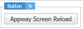
A Component that can trigger Actions has a list of Events. Each Event has its own list of Actions triggered if the event occurs. In Studio, all the Components that have Actions display an 'A' next to their names. Click on it to go directly to the Actions tab and set the Component's Action properties.
Events and Actions in Appway:
- Screen Components can listen to their own Events, as well as to other Screen Component Events.
- Screen Components can listen to Events generated by the entire Screen.
- When an Event is triggered, defined Actions for all the listeners are executed.
- For Screen Events (such as resizing), Actions defined on the listener components are triggered.
Types of Events
Screen Component Events
Screen Components can listen to their own Events, as well as to other Screen Component Events. The component that is listened to is referenced through its HTML Id.
Following is a list of Screen Component Events:
- onchange — The event is triggered when the selected option in the component itself or the value associated to the component change.
- onblur — The event is triggered when the focus is no longer on the component (e.g. when you leave a field).
- onfocus — The event is triggered when the focus is set on the component.
- onkeyup — The event is triggered whenever you release a key.
- onenterkey — The event is triggered when you press the Enter key (e.g. in a Password Field).
- oncreate — The event is triggered when you click on an element.
- onclick — The event is triggered when you click on a component (e.g. a Button).
- onmousedown — The event is triggered when you press the mouse button over the component.
- onmouseup — The event is triggered when you release the mouse button from the component.
- onmouseout — The event is triggered when you move the mouse pointer out of the component.
- onmouseover — The event is triggered when you move the mouse pointer onto the component.
- onslide — For the Slider Screen Component, the event is triggered when you are sliding.
- onstart — For the Slider Screen Component, the event is triggered when you start sliding.
- onstop — For the Slider Screen Component, the event is triggered when you stop sliding.
- onsearch (available for the Search Field Screen Component) — The event is triggered when you write something in a search field.
- ontabclick (available for the Adaptive Tab Screen Component) — The event is triggered when you click on a tab.
Screen Events
Screen Components can listen to Events generated by the entire Screen.
Following is a list of Screen Events:
- onrender — The triggering event is the rendering of the screen.
- onresize — The triggering event is the resizing of the browser window.
- onscroll — The triggering event is a scrolling action on the page.
- onload — The event is triggered when all the resources are loaded.
- onready — The event is triggered when everything is visible.
Types of Actions
Actions can be grouped in three categories:
- Server-Side Actions – require a submit of the Screen to the server in order to execute the Actions.
- Client-Side Actions – are executed without a submit of the Screen.
- Logic Actions – allow setting If/Then/Else Logic Types for triggering Actions.
It is possible to define multiple Actions for the same Event on a Screen Component. Actions of the same category get executed in the order they are defined in the component. However, consider that all Client-Side Actions are executed before Server-Side Actions.
For example, if the user triggers an Event on a component, all Client-Side Actions for this Event get executed (if any). Then, if there is at least one Server-Side Action registered for this Event, the Screen is submitted to the server, which executes the Server-Side Actions registered for the current Event and the triggering component.
The different types of Actions can easily be distinguished according to their icons in the editor. Server-side Actions have a cloud icon; Client-side actions have a desktop-screen icon, while Logic Actions have a workflow icon.
In Studio, all the Screen Components that allow Actions display an 'A' next to their names. Click on it to go to the Actions tab and set the Screen Component's Action properties.
Common Action properties are:
- Name – Display name of this action (used only in the Screen Editor).
Server-Side Actions
Before a Server-Side Action can be executed, the Screen has to be submitted to the server. If not explicitly disabled, the server goes through all Screen Life Cycle Phases from Update to Validate, and Process. By default, events get processed in the third Phase called Process. Therefore, this is also the Phase where Actions get executed.
Common Server-Side Action properties are:
- Phase – The Screen Life Cycle phase in which the action should get executed. The default value is Process. Actions are executed before the other activities of a Phase.
- Condition – An Expression used to decide at runtime if the Action should get executed. If there is no Condition, the Action is executed. This Expression can be used to put a veto on the execution of the Action.
- Ignore Errors – Whether the Action should get executed if there have been Validation Errors (i.e. the user's input did not validate). By default, Server-Side Actions do not get executed if there have been errors in previous phases.
Script Action
The Script Action is used to executed an arbitrary script on the server.
Script Action properties are:
- Script – Expression Script to be executed.
Reload Screen Action
A Reload Screen action can be used to reload the Screen, going through the Screen Life Cycle phases.
Process Action
A Process Action is used to navigate to the next Screen of the current Process. When a Process Action is executed, the Screen Life Cycle is not interrupted. Instead, the server remembers this Action and continues executing other Actions (if any). After processing all actions and phases, it triggers the Process Engine in order to evaluate which Screen has to be shown next.
There can be different Components on the screen that potentially trigger a Process Action. A typical example is a screen with Next and Back Buttons to navigate between screens. In order to distinguish between the different Event Sources (Buttons), the Process Action can be used to set a variable to a certain value. The variable is usually called $action and has to be of the type String. In order for this to work, this variable has to be defined in a higher scope (e.g. the Process). This way, the Process Action on the Next Button could set the variable $action to next, and the Process Action on the Back button could set the variable $action to back.
Process Action properties are:
- Action Variable – The name of the variable that holds the Action Value. The default value is $action.
- Action Value – The value stored in the Action Variable (String).
URL Action
URL Action is used to navigate to a URL, usually outside of this web application. The effect of the URL Action is deferred until all actions and phases have been processed. URL Action properties are:
- URL – The URL to navigate to.
- Logout – If the current user's session should get invalidated.
The placeholder that can be used within the URL is:
- : this is replaced with the web application's context path.
The URL Action can be used to implement a Logout procedure. Follow these steps:
- Create a Button or Link with a Logout Action.
- Enter the following URL:
/workspace/publicor/workspace/internal. - Select the Logout option.
Client-Side Actions
Client-Side Actions are executed on the client without a submit to the server. Client-Side Actions are implemented in Java Script. While properties of Server-Side Actions are evaluated if the Action is executed, properties of Client-Side Actions have to be pre-evaluated when the Component holding the Action is rendered. The Action's Java Script code is then integrated into the Screen's HTML output. Therefore, Client-Side Actions can usually not "react" to data entered on the current Screen.
There are a couple of actions used to display content in a new or existing window. These actions are called Window Actions and start with the word Display in the name: Display Generated PDF, Display Link, Display Resource etc.
Common Window Action properties are:
- Target (Window Name) – The name of the target window (or frame). If no value is specified, the content is displayed in the current window. Use the value _blank to display the content in a new window. Characters allowed: a-z, A-Z, 0-9 and _
- Window Width – Window width (only if a new window has to be opened).
- Window Height – Window height (only if a new window has to be opened).
Action Timer Action
The Action Timer Action stops the execution of an Action Timer Screen Component. This allows having an Action on a Screen that is triggered automatically, but it can also be turned off or on without the need of writing custom code.
Action Timer Action properties are:
- Enabled – enter a condition that disables this Action dynamically if it returns
false.- Server-side Actions – the condition is evaluated before the action is executed. If it returns
false, the action is not executed. - Client-side Actions – the condition is evaluated at render time. If it returns
false, the action's code is not added to the client-side event handler.
- Server-side Actions – the condition is evaluated before the action is executed. If it returns
- Action Timer – enter the name of the Action Timer Screen Component you want to stop.
Ajax Update Area Action
The Ajax Update Area Action is used to redraw an Ajax Update Area Screen Component.
Ajax Update Area Action properties are:
- HTML Ids – A comma-delimited list of HTML IDs for Ajax Update Areas. Each given Area is updated. Leave the property empty to update all Areas.
- Async – If checked, the update is executed asynchronously. This means that the use can continue working on the Screen while the Server re-renders and updates the Ajax Update Area. If you want to force the user to wait until the Screen is updated, uncheck this property.
- JavaScript Callback Code – JavaScript code entered here is executed after the Ajax Update Area has been updated. You can use this to remove any "please wait" signs you may have shown before redrawing the Ajax Update Area.
Block User
This Action displays a blocking overlay that prevents users from interacting with the Screen
Block User properties are:
- Enabled – enter a condition that disables this Action dynamically if it returns
false.- Server-side Actions – the condition is evaluated before the action is executed. If it returns
false, the action is not executed. - Client-side Actions – the condition is evaluated at render time. If it returns
false, the action's code is not added to the client-side event handler.
- Server-side Actions – the condition is evaluated before the action is executed. If it returns
- Timeout – time (in ms) before the overlay is displayed.
- Text – message shown on the overlay (e.g. 'Please, wait').
- Throbber / Image – set the type and size of the throbber shown on the overlay.
- Close after Ajax Update – disables the Action (and closes the overlay) once the following Ajax Update Area Action is finished.
Close Window
This Action closes the current window or tab.
Close Window property:
- Enabled – enter a condition that disables this Action dynamically if it returns
false.- Server-side Actions – the condition is evaluated before the action is executed. If it returns
false, the action is not executed. - Client-side Actions – the condition is evaluated at render time. If it returns
false, the action's code is not added to the client-side event handler.
- Server-side Actions – the condition is evaluated before the action is executed. If it returns
Confirm
This Action generates a Javascript Confirm box. The user needs to click either OK (returns true) or Cancel (returns false) to proceed.
Important note: The Confirm Action acts as a gate for subsequent actions. If the user clicks on Cancel, no other action is executed by the action list manager, meaning that all previously applied actions are not rolled back. As an example, if you use a Confirm Action to act on a dropdown list when changing the dropdown value e.g. from "a" to "b", when the user clicks on Cancel, the new value "b" is still displayed. This is the intended behavior of the Confirm Action.
Confirm properties:
- Enabled – enter a condition that disables this Action dynamically if it returns
false.- Server-side Actions – the condition is evaluated before the action is executed. If it returns
false, the action is not executed. - Client-side Actions – the condition is evaluated at render time. If it returns
false, the action's code is not added to the client-side event handler.
- Server-side Actions – the condition is evaluated before the action is executed. If it returns
- Message – Message displayed on the Confirm box (e.g. Do you want to continue?)
Display Entry Point
The Display Entry Point Action is used to integrate Entry Points defined in Packages into solutions. When the Action is triggered based on events occurring on the Screen or with a Screen Component, it calls the defined Package Entry Point.
The available properties are:
- Package / Entry Point – Define a Package and which Entry Point of the Package the Action opens.
Note: Only Packages on which the current Package has a dependency defined can be selected. Set dependencies on the Package Properties tab, in the Package Dependencies section.
- Internal – If checked,
/internalis added to the URL between the context path and the servlet path. This way, an authenticated user can access the URL directly, while an unauthenticated user is redirected to the login page first.
- Query Parameters – A query string which is appended to the Entry Point URL. (
parameter1=value1¶meter2=value2) - Version Filter – The Version Filter used to retrieve the Entry Point version and the version of the Business Object associated with the Entry Point (Process, Screen, or Script Function):
- Same Version (Inherited) – Uses the same Filter as the Screen the user is currently in.
- Newest committed Version – Uses the latest committed version of the linked Entry Point.
Note: If the Business Object associated with the Entry Point is a Process, then the Version Filter used to select the Entry Point and the Process version is also used at runtime during execution of the Process Instance.
Display Generated PDF
This action can be used to display a PDF generated by the PDF Render Service.
Display Generated PDF Action properties are:
- Configuration – An Expression that evaluates to a
PdfRenderConfigurationobject (usually a variable like$configuration)
Display Link
The Display Link Action shows an arbitrary URL.
Display Link Action properties are:
- URL – The URL to show in the window (or frame).
Display Resource
The Display Resource Action shows a resource in a new window or in a frame. This Action can be used to display PDF, Word or other documents uploaded and registered as Resource Business Objects.
Display Resource Action properties are:
- Resource – The resource to display. This is a dynamic property. If an Expression is specified, it is expected to return the id of an existing Resource.
Display Screen
The Display Screen Action is used to link to a Screen.
Display Screen Action properties are:
- Screen – Screen opened by the Action.
- Internal – If checked,
/internalis added to the URL between the context path and the servlet path. This way, an authenticated user can access the URL directly, while an unauthenticated user is redirected to the login page first.
- Language – The language used to render the linked Screen.
- Path Parameters – Variable values sent to the Screen as part of the Screen's path (
parameter1/value1/parameter2/value2/). - Query Parameters – Variable values sent to the Screen as part of its query string (
parameter1=value1¶meter2=value2). - Version Filter – The Version Filter used to get the Screen's version:
- Same Version (Inherited) – Uses the same Filter as the Screen the user is currently in.
- Newest Committed Version (Timestamp) – Uses the latest committed version of the linked Screen.
Display Process
The Display Process Action is used to trigger a Process and create a new Process Instance.
Display Process Action properties are:
- Process – The Process to start. This is a dynamic property. If an Expression is entered, it is expected to return the ID of an existing Process.
- Internal – If checked,
/internalis added to the URL between the context path and the servlet path. For example, for the Process 'AOP', the URL becomes/internal/process/AOP. This way, an authenticated user can access the URL directly, while an unauthenticated user is redirected to the login page first.
- Complete Action – The action to perform when the Process ends. Possible values are: Show Portal, Show URL... and Close Window.
- Complete Action Parameter – If Complete Action is set to Show URL..., specify the URL here.
- Variable Assignments – Variable Assignments are used to initialize the Process variables and must be supplied in the form of query parameters (
name1=value1&name2=value2&... ), where the parameter names correspond with the variable names within the Process Variable Definitions and the parameter values contain Expressions. Variable Assignments is a dynamic property. Therefore, it is constructed at runtime.
The parameter values are expected to be valid Expressions. Therefore constant values of the type `String` have to be quoted. Special characters might have to be encoded using the `ENCODEURL` function. Examples:
- `dossierId='D012911'`
- `date=NOW()\x26sortOrder=2\x26displayDeleted=false`
- `JOIN("employeeId='",ENCODEURL($employeeId),"'")`
Display Sub-Process
This action is similar to Display Process. But instead of a Process Instance, a Sub-Process is started and a new Sub-Process Instance is created. After the Sub-Process has been started, the Sub-Process Instance is scanned for Workitems assigned to the current user. If there is at least one Workitem of the type Sub-Process, the first Screen of this Sub-Process is displayed. Display Sub-Process Action properties are:
- Process – The Process to start.
- Internal – If checked,
/internalis added to the URL between the context path and the servlet path. This way, an authenticated user can access the URL directly, while an unauthenticated user is redirected to the login page first.
- Complete Action – The action to perform when the Process ends and no more Workitems of the type Sub-Process are assigned to the current user. Possible values are: Show Portal, Show URL... and Close Window.
- Complete Action Parameter – If Complete Action is set to Show URL..., specify the URL here.
- Variable Assignments – Variable Assignments are used to initialize the Sub-Process variables.
Display Workitem
This action can be used to display a Workitem.
Display Workitem Action properties are:
- Workitem Id – The ID of the Workitem to display.
The Workitem Id property is a dynamic property. If you use the
WORKLISTExpression function to fetch the Workitems for the current user, the methodgetTokenId()can be used on the elements returned to get the Workitem Id: -
Copy
    Local Indexed Any $worklist;
    $worklist := WORKLIST();
    Local String $workitemId;
$workitemId := $worklist[1].getTokenId(); - Complete Action – The action to perform when the Process ends. Possible values are: Show Portal, Show URL... and Close Window.
- Complete Action Parameter – If the Complete Action is set to Show URL..., the URL has to be specified here.
Java Script Action
This action can be used to execute arbitrary Java Script code.
Java Script Action properties are:
- Code – The Java Script code to execute
Skip Phase Action
The Skip Phase Action is used to tell the server to skip certain Screen Life Cycle phases if the next submit is executed.
Skip Phase Action properties are:
- Skip Update Phase – Whether to skip the Update Phase.
- Skip Validate Phase – Whether to skip the Validate Phase.
- Skip Process Phase – Whether to skip the Process Phase.
Set Layer Action
This Action can be used to add depth to a Screen. In fact, it allows stacking layout containers on different layers, each associated with a given level of depth. Moreover, the layout container can be set to stick to the border of the screen. This allows implementing features such as: sticky footers, sticky navigation links and buttons, or any other kind of component that sticks to the screen border.
Set Layer Action properties:
- Enabled – Enter a condition that disables this Action dynamically if it returns
false.- Server-side Actions – The condition is evaluated before the action is executed. If it returns
false, the action is not executed. - Client-side Actions – The condition is evaluated at render time. If it returns
false, the action's code is not added to the client-side event handler.
- Server-side Actions – The condition is evaluated before the action is executed. If it returns
- Context – The Position (see below) of the Screen Component is determined in relation to the selected element:
- Parent – The position of the Screen Component is relative to the parent layout container element.
- Screen – The position of the Screen Component is relative to the whole viewport.
- Static – This option is used to reset the original conditions after a Set Layer Action has been applied. In this case, the options selected in the Layer and Position properties have no influence.
- Layer – Determines the stack order of the Screen Component. Set the highest number (e.g. 2) for the component that you want to place in front compared to the other components on the back (e.g, 0 and 1)
- Position – Determines the position of the Screen Component on the Screen. The position can be set either dynamically, relative to the rendered screen, or statically, by setting the custom offset:
- For the dynamic setting, you can choose among a number of options (e.g., Top, Bottom, Fill Space and so on).
- For the static setting, chose the Custom option, and then set the exact position of the layout container by filling the Top, Right, Bottom, and Left fields.
Set Visibility Action
This Action can be used to show or hide a given Layout Container. For instance, it can be used to selectively hide a sidebar when the resolution of the target device is not high enough.
Set Visibility Action properties:
- Operation – Determines whether the Screen Component is visible (Show), invisible (Hide) or changes from visible to invisible or viceversa (Toggle) when the event is triggered.
Slide Action
This Action can be used to animate a region of the Screen. For instance, the menu icon on the header can trigger a Slide action for the left sidebar, so that the sidebar can be hidden and then reappear from the same side when the button is clicked.
Slide Action properties are:
- Operation – Determines whether the Screen Component gets visible (Show), invisible (Hide) or changes from visible to invisible or viceversa (Toggle) when the event is triggered.
- Direction – Determines the sliding direction.
- Duration – Determines the duration of the operation (in ms).
Set Style Action
This triggers an action that changes a Style Business Object on a component. For example, you can associate an onclick Event with a Button component to trigger a SetStyle Action for a Layout Container. Therefore, when you click on the button, the Style Business Object you selected is applied to the Layout Container.
Set Style Action properties:
- Style Id – Select the Style Business Object you want the Screen Component to switch to when the action is triggered.
Show as PopUp Action
This Action shows a component (for example, a Layout Container) as a popup. The configuration for this Action allows showing the popup as a full screen, or determine the popup position and transition mode.
Show as PopUp Action properties:
- Preferred Position – Position of the popup in relation with the Screen Component the Actions was set for (e.g. if if you set the Action for a Layout Container and select the Top option, the popup will open above the Layout Container). In this case, set the *HTML ID of Reference Component property.
Some restrictions may apply depending on the Screen layout.
- HTML ID of Reference Component – Enter the HTML ID of the Screen Component the Actions was set for if you want the popup to open next to it. If you leave this field empty, the popup opens next to the Screen Component triggering the event (e.g. a Button).
Stop Action
This Action is used to prevent the Actions placed below it from being executed.
Stop Action properties are:
- Enabled – enter a condition that disables this Action dynamically if it returns
false.- Server-side Actions – the condition is evaluated before the action is executed. If it returns
false, the action is not executed. - Client-side Actions – the condition is evaluated at render time. If it returns
false, the action's code is not added to the client-side event handler.
- Server-side Actions – the condition is evaluated before the action is executed. If it returns
Logic Actions
You can select the If/ElseIf/Else options to set a Condition for triggering an Action. For example, you may want to execute a certain Action only if your screen is wider than 500 pixels.
Both Screen and Screen Component Events can trigger Logic Actions. The list of properties that can be exposed on the components can vary depending on the type of component.
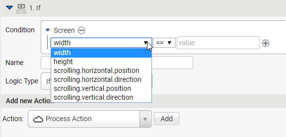
List of Screen Events exposing properties
List of Screen Component Events exposing properties
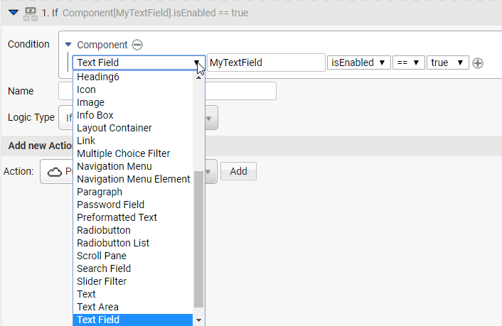
There are three Logic Actions:
- If: it triggers the action if the condition is true.
- Else: it triggers the action if the condition is false.
- ElseIf: used in combination with an If condition, it triggers the action when the If condition is false and the ElseIf condition is true.
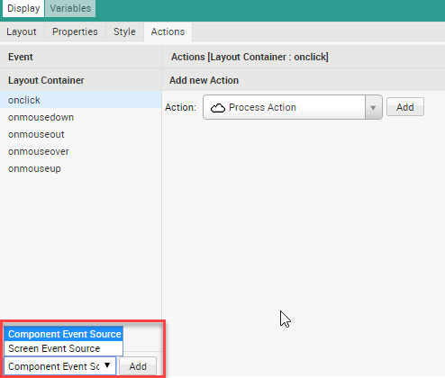
Adding an Event
To add an Event, follow these steps:
- Select one of the following options, and then click the Add button:
- Component Event Source
- Screen Event Source
- If you selected a Component Event Source, click on the Component field and choose the component that triggers the event, for example the Button.
- A list of possible events for the selected component is displayed on the Event panel.
- Fill in the HTML Ids field with the Id(s) of the component(s) listened to, in this case the Button Id.
Removing an Event
To remove an Event Source, hover the mouse over the component and select the Delete icon.
Adding an Action
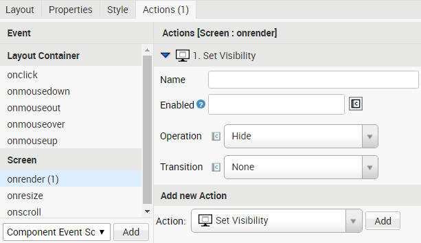
In this example, you want to set an initial state for a certain component, for instance make it invisible from the start.
- Click on the Screenonrender event on the Event panel.
- From the Action dropdown list, select the Set Visibility option.
- From the Operation dropdown list, select the Hide option.
Setting a Logic Type for multiple Actions
You have the possibility to set the same Logic Type for more than one Action. To do so, you can set a Flow Control Action:
- Select the If/ElseIf/Else from the Action dropdown list, and then click on the Add button.
- Drag the If/ElseIf/Else row above the previously created Actions. The Condition now applies to all the Actions below. For example, you can specify an If condition such as ‘If the screen is wider than 300 pixels’ to trigger all the Actions below.
You can have different logic Type for different groups of Actions, but you cannot nest a Logic Type inside another Logic Type (for example, you cannot have an If Logic Type hanging from another If Logic Type).
Setting an Event for Multiple Actions
It is possible to define multiple Actions for the same Event on one Component. Actions get executed in the order they are defined in the Component.
There is one exception to this rule: the Client-Side Actions are always executed before the Server-Side Actions. Therefore, if the user triggers an Event on a Component, all Client-Side Actions for this Event (if any) get executed first. Then, if there is at least on Server-Side Action registered for this Event, the server executes it.