Multiple Selection Field Screen Component
Introduction
The Multiple Selection Field is a Screen Component that allows you to select more than one option from a dropdown list. For example, you can select all the countries that apply specific market restrictions from a dropdown list.
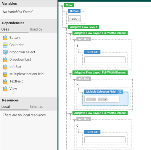
Fig 1: Multiple Selection Field Screen component: Composer mode
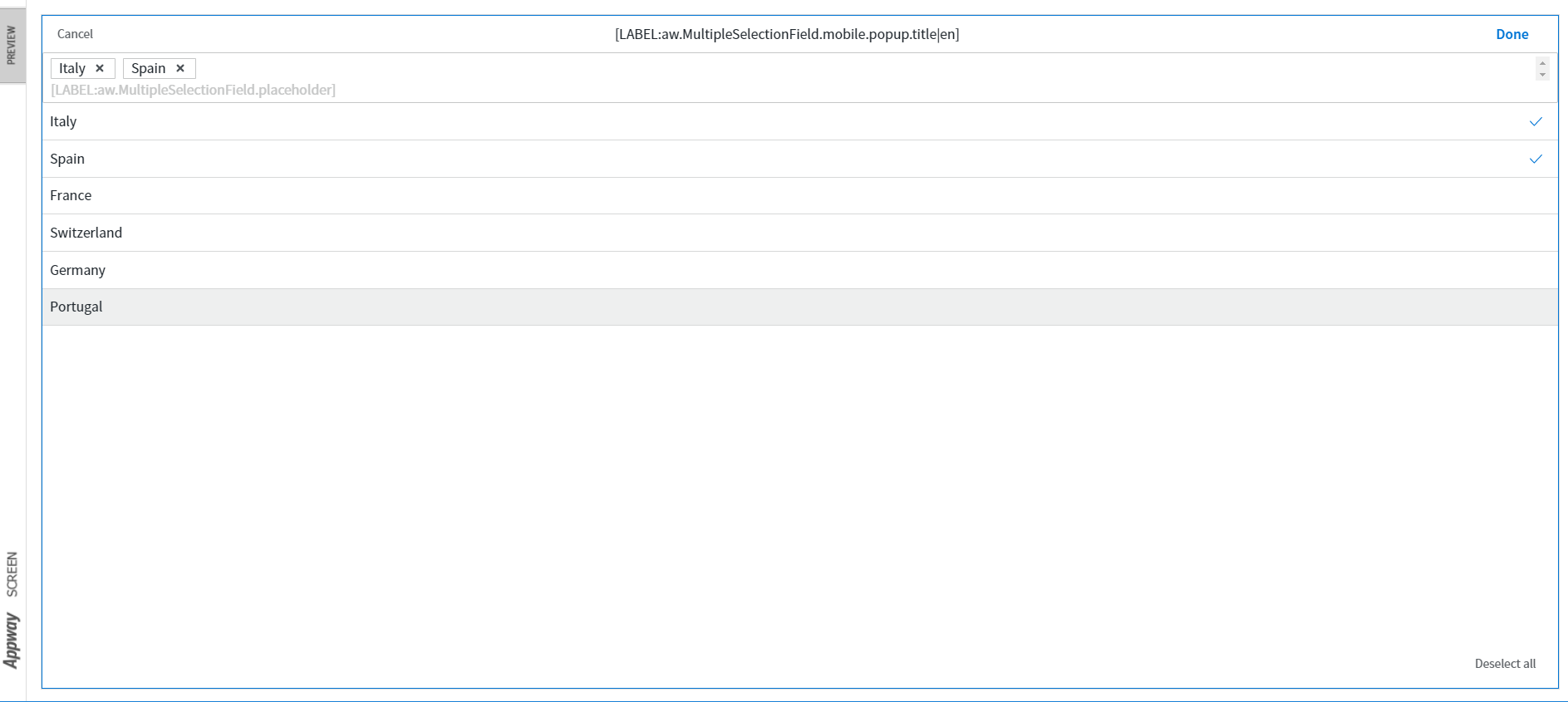
Fig 2: Multiple Selection Field Screen component: Preview mode
Migrating from Dropdown List [Legacy] to Multiple Selection Field
The Multiple Selection Field component replaces the Dropdown List [Legacy] Screen component with the Multiple property selected, which has been deprecated in Appway 7.
Following is the list of properties that are removed or replaced during the migration.
Note: Some properties are simply removed during migration without returning any warning messages, while others return a warning about a possible data loss.
Properties tab:
- Default value: removed (with warning)
- Show 'Select...': removed
- Select Text: name as changed to Placeholder
- Text If Disabled: removed
Searchable tab:
- If empty disabled selection, display: removed
- Searchable Dropdown: removed (with warning)
- Min. Search Length: removed
- Width: removed
- Multiple: removed
- Options URL: removed (manual migration needed)
- Options URL Query Parameter Name: removed
Actions tab:
- Keyup action: removed
Configuration
Properties
In the Screen Editor, go to Display > Properties.
- Placeholder: the label displayed when no item is selected. This property is specific to this Screen Component.
- Binding: as for other components supporting multiple choice, possible bindings are:
- A string concatenating the IDs of the selectable options (separated by the pipe character ‘|’)
- An indexed collection of strings, representing the IDs of the selectable options
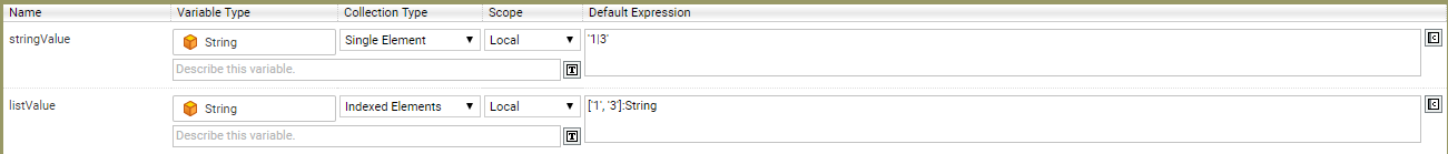
Binding example: 'Option 1' and 'Option 3' are bound to the Multiple Selection Field
Data Source
In the Screen Editor, go to Display > Data Source.
Consider the following information on the Data Sources:
- Static: all options are rendered in the dropdown.
- Catalog: options are available on demand.
The Deselect All option is available for all types of Data Sources, while the Select All option is only available for Static Data Sources.
- on Data Sources, see the Data Source section in the Screen Component Properties article.
- on Catalogs, see the Catalog Business Object article.
- on lazy loading, see the Lazy Loading section of the Dropdown List article.
Labels Specific to the Multiple Selection Field Component
The Multiple Selection Field component is associated with some specific Labels that allow customizing your Screens:
- Placeholder [aw.MultipleSelectionField.placeholder]: Label displayed when no item is selected. It is exposed as a property in the Properties tab.
- Deselect All [aw.MultipleSelectionField.deselect.all]: Label displayed on the dropdown list to deselect all items.
- Title [aw.MultipleSelectionField.mobile.popup.title]: Header (only for the mobile version).
Multiple Selection Field Style Business Object
The Multiple Selection Field 'Style' Business Object allows styling the Screen component.
States The Multiple Selection Field 'Style' Business Object has four states:
- Focus
- Error
- Disabled
Styling Properties These are the properties that allow customizing the component:
- Size: Defines the size of the entire component.
- Outer Spacing : Defines the space between the element outside the Multiple Selection Field and the border.
- Popup (virtual): Refers to a Popup (virtual) Style Business Object to define the style of the popup element containing the available options.
- Text Input (virtual): Refers to a Text Input (virtual) Style Business Object to define the style of the field.
- List Entry (virtual): Refers to a List Entry (virtual) Style Business Object to define the style of the popup options (in different states).
- Deselect button: Refers to a Button Style Business Object to define the style of the Deselect All button inside the popup.
- Error Box (virtual): Refers to an Error Box (virtual) Style Business Object to define the style in case of error.
- Selected Option (virtual): Refers to the Selected Option (virtual) Style Business to define the style of the selected option.
Selected Option (Virtual) Style Business Object
The Selected Option Style Business Object is a virtual component used to customize the option selected from the dropdown.
For more information on virtual components, see the Virtual Style Business Object article.
Related Links
- For design suggestions, see the Multiple Selection Field section of design.appway.com.
- For general Screen Component Properties, see the related article.